CHAPTER 5 REFINE TO IMPRESS AND PERSUADE GETTING TO THE “FEELING BEHIND OUR EYES”
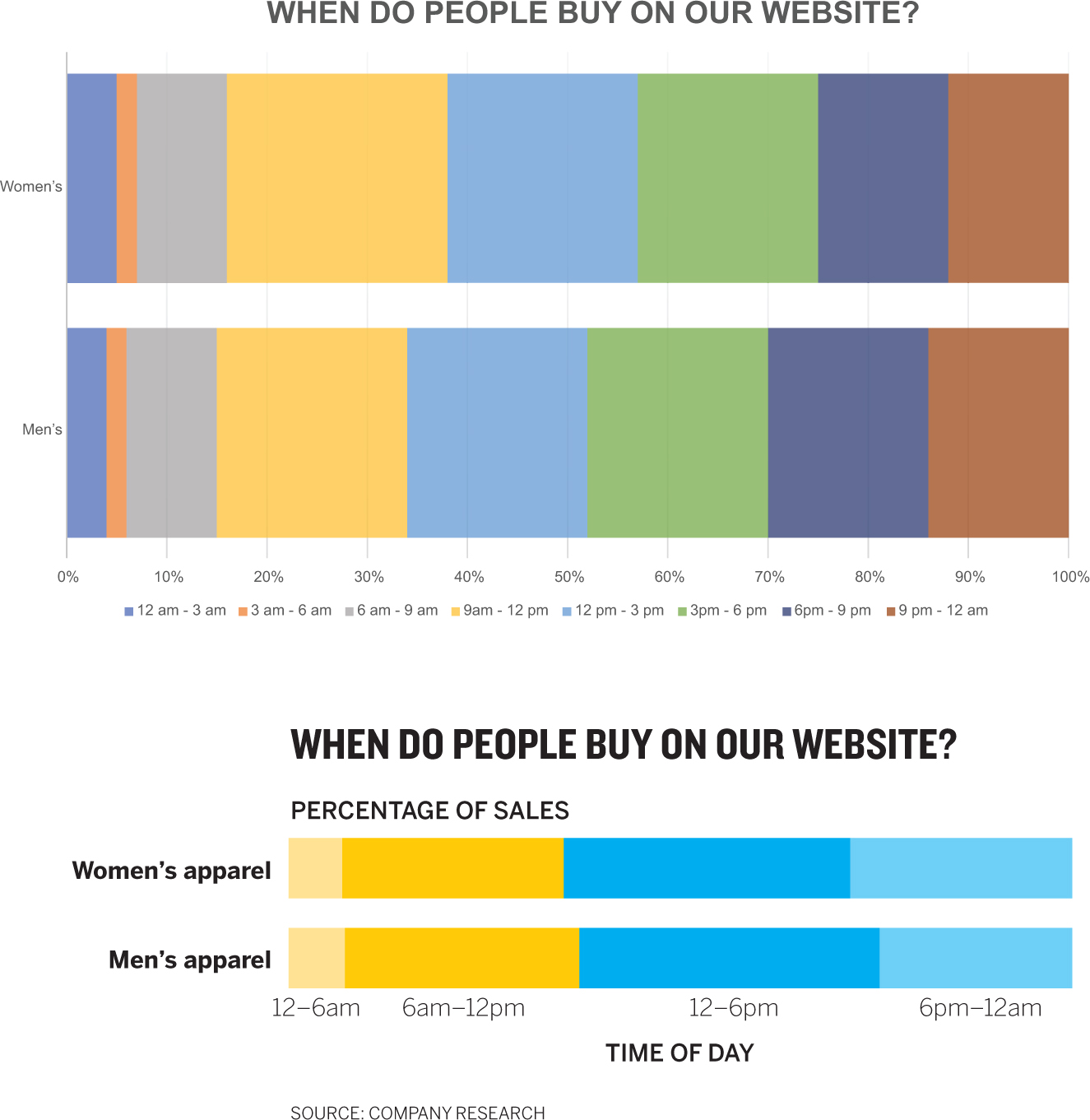
WHICH OF THESE visualizations is a prototype and which was created for a presentation to the CEO?

The top chart is obviously the prototype, generated in Excel with just a few clicks. Most of us would say the bottom chart (designed in Adobe Illustrator) looks better, is “airy” or “streamlined” or “clean,” whereas the top one is “busy” or “blocky” or “messy.”
In that great book on writing that I’ve referred to before, Style: Toward Clarity and Grace, Joseph Williams describes impressions of good and bad writing as “a feeling behind our eyes.”1 Charts get behind ...
Get Good Charts, Updated and Expanded now with the O’Reilly learning platform.
O’Reilly members experience books, live events, courses curated by job role, and more from O’Reilly and nearly 200 top publishers.

