Web Pages Designed for Mobile Devices
As you browse the Web, you may come across sites that look significantly different on your tablet than they do on a computer. That’s because web designers design pages specifically to be viewed on tablets and smartphones, taking into account that these devices have smaller screens than computer displays.
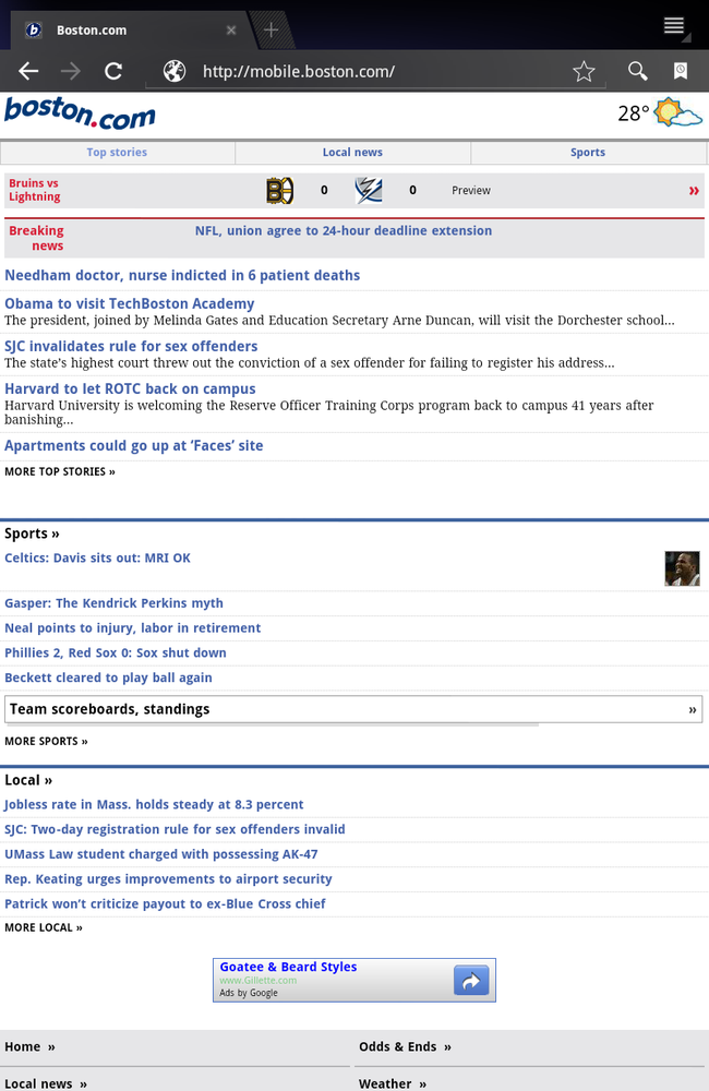
CNN and Boston.com, for example, have sites designed especially for mobile viewing. Head to the same site at the exact same time of day with a smartphone and a computer, and you see very different pages, even though the content of those pages is the same.

Pages formatted for the small screen often don’t include complex layouts, and instead present articles and other information in scrollable lists. They generally don’t let you zoom in and out; you navigate primarily by scrolling and clicking links. That’s good news for smartphone jockeys, but not necessarily good news for Galaxy Tab owners like you. Your 10.1-inch screen is generally capable of viewing the same web pages intended for computers. Because pages built for smartphones may leave out graphics, videos, and fancy layouts, you may end up being frustrated by what you see.
Over time, this may become less of an issue. Web designers will eventually start designing three types of pages for each website: ...
Get Galaxy Tab: The Missing Manual now with the O’Reilly learning platform.
O’Reilly members experience books, live events, courses curated by job role, and more from O’Reilly and nearly 200 top publishers.

