2The Population Explosion, Malthus, and the Ghost of Christmas Present
The population explosion is, in the broad sweep of history, just about over. It will almost certainly end in this century, with a world population about 11 times larger than when the Great Enrichment started about 250 years ago.
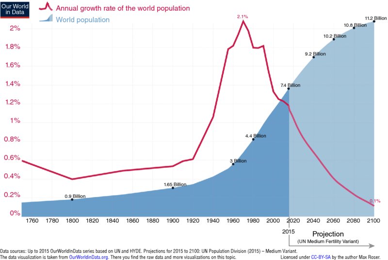
Let’s introduce the idea with a picture, which in this case is worth way more than a thousand words. Figure 2.1 shows the past and projected world population from 1750 to 2100. The annual rate of growth is also shown, represented by the red line.

Figure 2.1 World population growth, 1750 to 2015 with projections to 2100.
Data sources: Up to 2015 OurWorldInData series based on UN and HYDE. Projections for 2015 to 2100: UN Population Division (2015)—Medium Variant. The data visualization is taken from OurWorldinData.org. There you find the raw data and more visualizations on this topic
Source: Max Roser, Our World in Data, https://ourworldindata.org/wp-content/uploads/ 2013/05/updated-World-Population-Growth-1750-2100.png. Licensed under CC BY-SA; a version is in Pinker (2018), p. 125.
This graph depicts one of the two central ideas of this book. The other is Figure 1.1 in Chapter 1, showing the Great Betterment over the last 200 years. Between them, they convey the essence of “fewer, richer, greener.” The rest is elaboration.1
The graph in Figure 2.1 is on an arithmetic scale; ...
Get Fewer, Richer, Greener now with the O’Reilly learning platform.
O’Reilly members experience books, live events, courses curated by job role, and more from O’Reilly and nearly 200 top publishers.

