Chapter 1. Power BI Interface and Chart Anatomy
This chapter is for those who are opening the Power BI Desktop application for the first time. You’ll soon realize it’s quite similar to other applications you know, like Microsoft Office Excel and PowerPoint. But there are some features that work a bit differently.
As of the time this book was written, the Power BI Desktop is available for Windows but not for macOS. If you’re using macOS, you can use a virtual machine (VM) for Power BI Desktop on the Mac. The Power BI service is not really a like-for-like. The visualization side may be the same, but the queries, modeling, DAX, etc. are nothing like the same.
You can download the practice dataset and make first steps in Power BI. This dataset is utilized for all the chapters in Part I, allowing you to build the final dashboard.
Power BI Key Elements
Let’s go through the basic elements of the Power BI Desktop interface. When you launch the app, you’ll see a screen that looks like Figure 1-1.
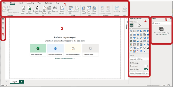
Figure 1-1. Key elements of the Power BI Desktop interface
The key elements of the Power BI interface are as follows:
-
The ribbon (top menu bar)
-
Workspace canvas
-
View mode selector
-
Visualizations pane for creating and editing visuals
-
Data pane, where loaded data is displayed
Top Menu Bar
The top part of the program looks like a ribbon, which is a common layout for Microsoft software. When you first open Power BI, you’re on the Home tab (Figure 1-2), where you’ll find the most commonly used buttons. These buttons are organized into groups based on what they do. For instance, in the group Data, you can import different types of data from various sources. The Insert group is where you add things like charts and text blocks.
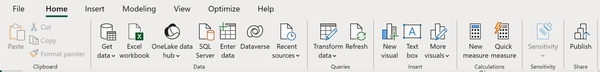
Figure 1-2. The ribbon (top menu bar)
Most of these functions can also be accessed from context menus and other parts of the interface, so you won’t need to use the ribbon very often.
Workspace Canvas
The main part of the screen is taken up by the blank page, which resembles a PowerPoint slide (Figure 1-3). This is where we’ll place visualizations.
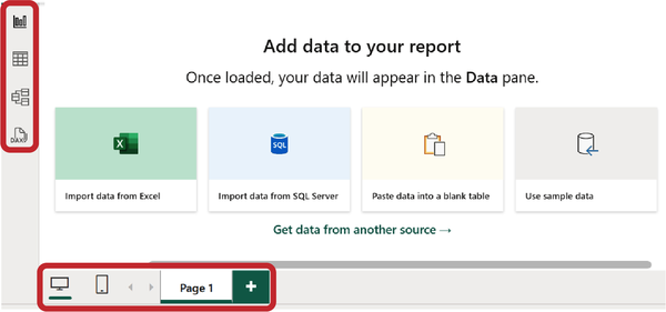
Figure 1-3. Page view mode and desktop/mobile view mode
In the bottom left corner, there are buttons to switch between desktop and mobile viewing modes. Right next to them is the page indicator. We can add pages similar to Excel sheets by clicking the plus button or remove them as needed.
View Mode Selector
In the top-left part of the screen, you’ll find buttons for selecting the display mode. We are by default in the Report view. The next icon, resembling a table (Table view), switches our canvas to the original data view. The Model view shows all data tables and the relationships between them in the form of a schema. In the scope of this book, we will only work with the Report view. The other modes are equally important, but each of them would require a separate book to cover in detail.
Visualizations Pane
The Visualizations pane (Figure 1-4) is essential for creating and editing visualizations. To accomplish these tasks, there are two tabs at the top of the menu: Build visual and Format visual. After building the first visual, a third tab may appear: Add further analysis to your visual. Appearance of the third tab depends on the selected visual capabilities (not all visuals support this feature).
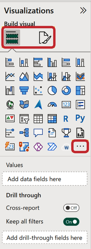
Figure 1-4. Visualizations pane
Below, there’s a list of default visualizations in the form of icons. By default, there are six icons per row (if you change the width of the Visualizations pane, the number of icons per row could change).
The first row of icons consists of familiar bar charts in various combinations (vertical and horizontal, stacked, and clustered). The second row includes line and area charts and their combination with column charts. Once again, these will look quite similar to Microsoft Excel. We’ll soon delve into their anatomy.
Next, you could find some charts we consider “advanced” and will discuss in the second part of this book: waterfall charts, funnels, and maps. Please don’t search for an increasing order of complexity here. Following these is the scatterplot, which we’ve categorized as exotic visuals in Part III, and next to it is the classic pie chart.
The last button on the visualizations list, the “three dots” (or “ellipsis”), allows you to load new types of charts not included in the Power BI basic set.
Beneath the visualization icons, you’ll find a block with field placeholders where you input the data to create a specific chart. Naturally, each visual requires its own set of fields, so when you select an icon, you’ll see specific fields that need to be filled with data from the Data pane.
Data Pane
To demonstrate how the data panel works, we will load data from Excel. To do this, click on the green button on the empty canvas (Import data from Excel), specify the path to the file, and click OK. Next we describe the steps of loading to get the Cycles table.
We’ve loaded the data in Figure 1-5 from an Excel spreadsheet. In this example, you’ll see planned and actual sales broken down by product categories and subcategories, by country, and by managers.
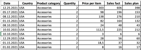
Figure 1-5. Source data
After loading the data to the model, in the Data pane you’ll see a field list similar to Excel pivot tables (Figure 1-6). This is where you can select fields, and they will appear in the Values section on the neighboring Visualizations pane (Figure 1-7).
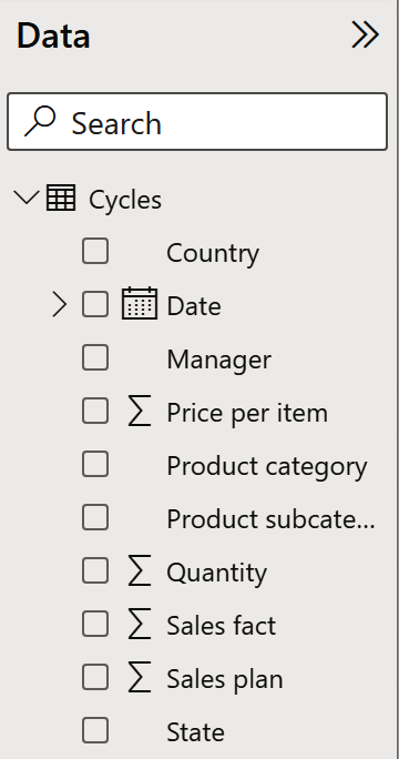
Figure 1-6. Uploaded data
Some fields have icons right away: a calendar icon for the Date field and a ∑ icon for numeric fields like Price per item, Quantity, Sales fact, and so on.
Unlike the data source, the fields are sorted in ascending alphabetical order. If you didn’t find a specific field right away, you can use the search function on top of the Data pane.
How Power BI Builds Charts
Let’s start building our first visualization. On the Data pane, click on the square to the left of the Sales fact field to choose it. You’ll see then a new chart has appeared on the report canvas, with a single column representing the sum of values in Sales fact. If the column you choose first is of a numeric type, Power BI will automatically create a clustered column chart. If we then add the Product category field in the same way, its values will appear on the chart as the x-axis and the new columns will appear per each product category (as shown in Figure 1-7).
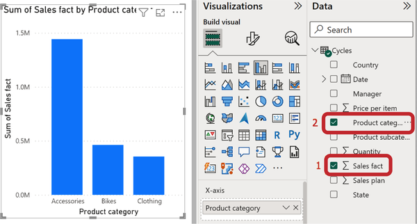
Figure 1-7. Default column chart drawn for numeric value
But you might get a different result. If you first select the Product category field and then Sales fact, you’ll get a table (Figure 1-8). This is because Power BI displays textual data as a table by default. Afterward, you can change the table to a column chart or another visual.
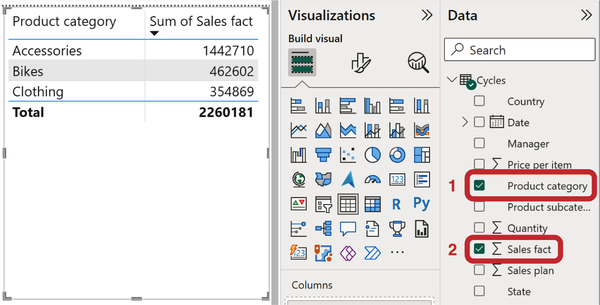
Figure 1-8. The table is drawn when text type data is selected first
To create a new picture or chart, first click anywhere on the empty area of the page to deselect the current one. Now, you can choose new data categories, and a new image will pop up for them. Let’s take the Country category as an example, and you’ll instantly see a map (Figure 1-9)! Even though this category doesn’t have a specific symbol, Power BI recognizes that it’s about places (like countries, states, cities, or addresses) and creates a bubble map for it. Next, choose the Sales fact field, which will determine the size of the bubbles on the map.
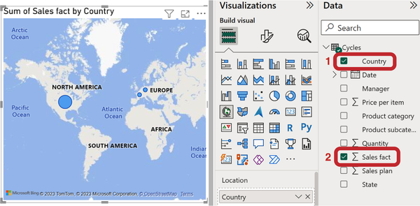
Figure 1-9. The default chart is drawn when geographic data is selected
If you think you don’t need a map but would like a different way to display the data, you have options like bar charts, tables, or something else. This is the secret to success: choosing the right type of visualization that accurately represents the data’s meaning. Throughout this book, we’ll focus on this. You’ll learn the fundamental rules for picking the right charts, and we’ll explore specific cases when we make exceptions to those rules.
Format Visual
Let’s go back to Figure 1-7, where we selected the fields Sales fact and Product category, which resulted in a column chart. In the Visualizations pane (Figure 1-10), click on the paintbrush icon (Format visual), and you’ll see a list of parameters you can customize for the chart. This section is further divided into two parts:
- Visual
-
Here, you can adjust parameters that are specific to this particular chart.
- General
-
These parameters apply to all charts and include things like titles, background colors, borders, and more. In some versions this section may be called Properties.
Most of our work will be within the Visual tab. You’ll notice that some options are active and enabled; however, the Legend section is inactive because we haven’t selected data for it. The Data labels section is active but turned off. Click the On/Off switch (Figure 1-10) on the Data labels section, and you’ll see them appear on the chart’s columns.
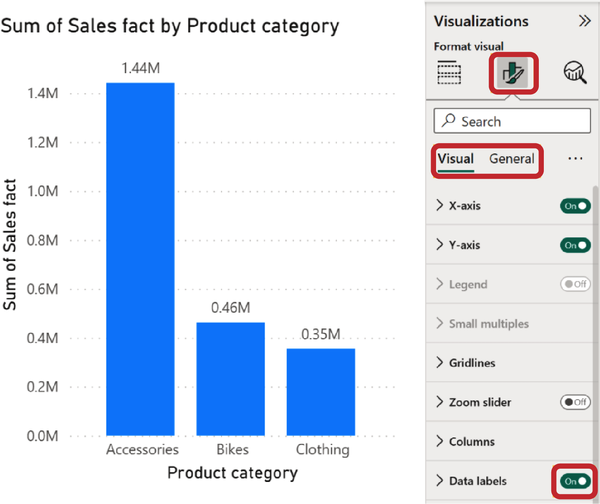
Figure 1-10. Enabling Data labels in the Format visual pane
You can fine-tune these items, and to do that, you need to open them up (see Figure 1-11). Since we turned on data labels, let’s explore what’s inside.
The structure of these parameters goes like this:
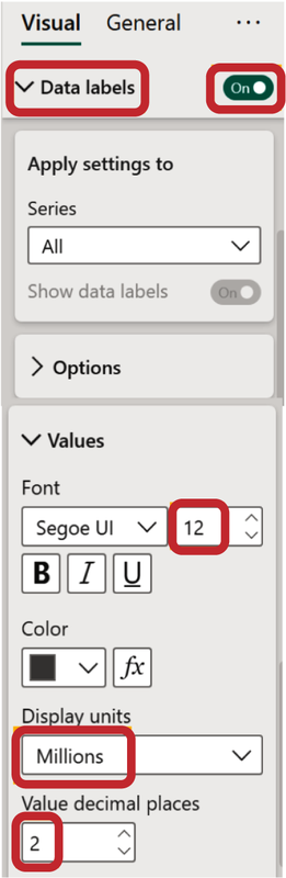
Figure 1-11. Data labels settings
- Apply settings to
-
In our case, there’s only one set of data, so nothing changes here.
- Options
-
This part includes things like orientation (horizontal/vertical) and positioning (top/center, etc.). For now, we don’t need to alter anything here.
- Values
-
This is a parameter that often needs some adjustments. Let’s dive into it.
Within this parameter, we can tweak the font and its size, style, and color. Let’s make the size a bit larger, say, 12 points. Pay attention to font color. It has a default color (dark gray), and it is adaptive. When the data label is positioned outside the bar, this default color will appear. When the data label will be inside the bar (or other shape), the font color will be switched to white to provide a contrast. But if you change the font color manually, your custom color will appear for both cases.
The next parameter is Display units. By default, it’s set to “auto,” meaning Power BI automatically decides whether to display values in thousands, millions, or billions based on the value range. We chose millions and 2 decimal places and the result is the same as settings by default. However, you can manually set the units and decimal places.
There are quite a few parameters, and it can be challenging to remember where each one is initially located. That’s why there’s a search field at the top. If you can’t recall where to set “decimal places,” just type these keywords, and you’ll find the corresponding menu item.
For numeric values, there is one more setting: the decimal separator. With its help, all values longer than three digits will be displayed with a space or comma between the digits (units, thousands, etc.). This makes it much easier to understand, especially in situations where you need to show the entire number without abbreviations (for example, in a drill-down table). But you cannot configure the division by digits in the visual settings panel; we can only do this in relation to a specific data field.
The first step is to select the required field in the data panel (we will work with Sales fact). Please note that we do not click on the field checkbox but rather select it by clicking on the text line. The top menu bar automatically switches to the Column tools tab. Here are all the settings related to the number format. We are interested in the Formatting tab, and on it there is a comma icon. After activation, the icon appears with a border and fill (Figure 1-12). Now the value of the Sales fact field on all visuals will be displayed with separated digits.
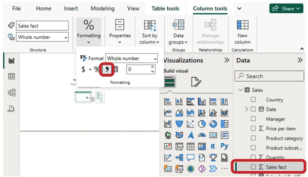
Figure 1-12. Value format settings on the top menu bar
Some parameters can be adjusted in a similar manner for all visuals, like data labels. However, others will differ; for instance, configuring the x-axis for a waterfall chart will be quite different from a Gantt chart. You’ll also come across parameters that are specific to certain visuals, such as tables and cell formatting.
Chart Anatomy
There are best practices for designing charts that have stood the test of time. They are discussed in Say It with Charts by Gene Zelazny (McGraw-Hill), Information Dashboard Design by Stephen Few (O’Reilly), and other classic books. No matter what tool you use, you still follow these general rules. The elements of a chart may have different names in various tools and even within different Power BI visuals, but their purposes remain the same.
Value Axis
When we created the first column chart (Figure 1-7), you saw a y-axis on its left side. On this axis, you’ll find data markers and an axis title. In the formatting pane, specifically for the column chart, this part is referred to as the Y-axis. If we were to create a horizontal bar chart, this part would be named the X-axis.
Once we turn on data labels on the actual columns (Figure 1-10), the value axis becomes less necessary because it essentially duplicates the data labels and takes up space. So, typically, we’ll turn it off for most charts. However, there are exceptions to this rule: for instance, when the axis range is changed, and the axis doesn’t start at zero.
Category Axis
The category axis displays the textual labels for categories. Depending on the chart’s orientation, it will be positioned either at the bottom (in a column chart, this is the x-axis) or on the left (in a bar chart, this is the y-axis).
We always display the category axis. Challenges with it arise when there are many categories or when they have long names consisting of several words. The text can get cut off or rotated, making it harder to read. In such cases, we’ll find a compromise by adjusting parameters like font size, text wrapping, and others. We will review these cases in detail in Chapter 3.
Legend
If your chart has different sets of data, like planned and actual numbers, these sets will have different colors. A legend explains which color represents which set. However, if your chart contains only one set of data, as in our column chart (Figure 1-7), you don’t need a legend at all.
Here’s an important rule: the legend should be positioned above the chart. The good news is that in Power BI, this is the default setup (unlike Excel, where the legend typically sits below the chart, and you have to move it up each time). You can change the legend’s position in the settings, but it’s usually fine as it is.
Shapes and Colors
The default color for visuals in Power BI is the classic blue. You can change it in the format options. For a column chart, this setting is called Columns, for a bar chart, it’s Bars, for a line chart, it’s Line, and so on.
The default settings for shapes in Power BI are quite neat and in line with minimalist business graphics. This is fortunate, because there’s no way to make fancy 3D columns with highlights and shadows like in PowerPoint 2003.
Data Labels
By default, in most charts, this feature is turned off, but we’ve activated it. It’s important to aim for showing data labels on your chart. This way, users won’t have to make rough estimates by matching dots to the scale; they can directly see the precise values.
Yet, there are exceptions; for example, when there are too many data points on your graph, and data labels overlap. In such cases, we intentionally switch them off and instead display the value axis.
You’ve already learned that Power BI automatically adjusts units of measurement, which is quite handy. Labels with six to seven digits make reading cumbersome. The optimal number of digits is three to four in a label. For instance, compare the range of 12,720,000 to 8,340,000 with 12.72 million to 8.34 million.
If we were working with presentation slides, we’d suggest limiting labels to two to three digits. For example, 12.7 million and 8.3 million. However, in reports, we always have data filtering, and it’s possible that after applying a couple of filters, your labels might display values around 0.1 or 0.4. We want to compare values starting from the first digit, not from zero.
Chart Title
By default, Power BI generates a title based on the selected fields’ names, for example, “Sum of Sales Fact by Product Category.” In our example, this is still a clear title. However, if we had chosen two or three more fields, the title would already span two lines. Besides, field names in the source data don’t always precisely convey the business context.
The rule of thumb is that the title should fit within one line. We always find ourselves editing the title. In our example, we could make it shorter, like “Sales by Categories.” You can adjust the Chart title parameter in the General section.
In each chapter, we’ll be configuring these and other chart parameters following a step-by-step guide. Even if you have to work with other visualization tools, you’ll consciously find the relevant chart element and make it clear. Just like in Power BI, new charts and options will keep emerging.
Responsive Mode
When reducing the chart size, there’s another nuance to consider: the font size of labels and captions will automatically shrink to smaller size, even if you’ve set it to 12 pt. A warning icon next to the section title will notify you of this change (Figure 1-13).
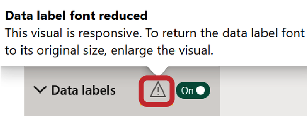
Figure 1-13. Warning icon informing that the size of data labels has been changed
You can disable responsive mode in the General → Properties → Advanced options menu (Figure 1-14).
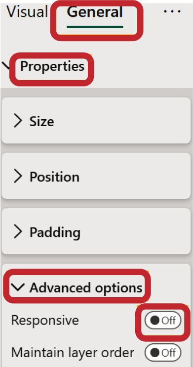
Figure 1-14. Enable/disable responsive mode
Get Data Visualization with Microsoft Power BI now with the O’Reilly learning platform.
O’Reilly members experience books, live events, courses curated by job role, and more from O’Reilly and nearly 200 top publishers.

