9
Working with color to achieve intended
results can be a challenge, but it can also
be fun! An effective color scheme can make
a room feel warm and inviting, a graphic
design able to attract attention, or a poster
to recall days gone by. Before learning what
colors to use in order to achieve the best
results, one must fi rst understand some
basic color terms.
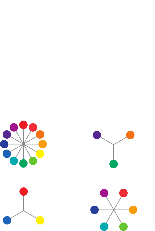
Each primary, secondary, and tertiary
hue is at a level of full saturation, or bright-
ness, which means that there is no black,
white, or gray added. Color is described in
terms of value, which is the lightness or
darkness of a color, or the relative amount
of white or black in a hue. White added in
increments to any of the twelve colors
results in lighter values of the hue called
tints. For example, pink is a tint of the pri-
mary color red. The incremental addition
of black or gray to a hue results in darker
values of the hue known as shades. A shade
of red is burgundy or maroon. These shades
and tints are illustrated by the color chart
on the following pages.
How to Use Color
SECONDARY
TERTIARY
PRIMARY
Get Color Harmony Compendium now with the O’Reilly learning platform.
O’Reilly members experience books, live events, courses curated by job role, and more from O’Reilly and nearly 200 top publishers.

