Chapter #7. Make Your Buttons Look Like Buttons
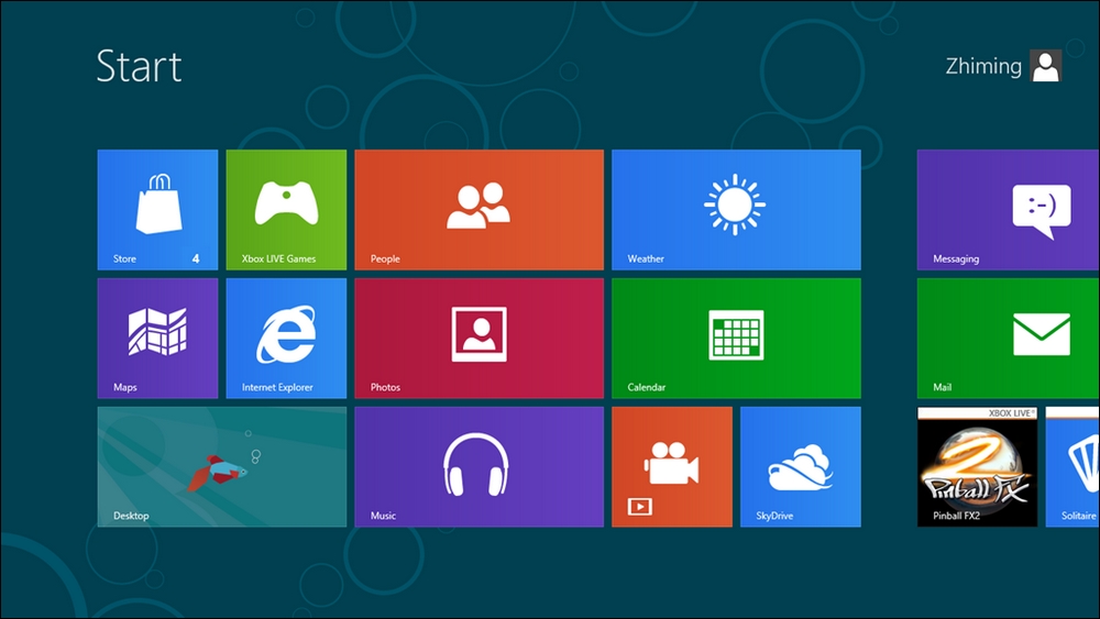
The flat design aesthetic, born out of Microsoft's Metro user interface, rose to near ubiquity in the late 2000s. In iOS 7 and Android's material design, these extremely minimal visuals are still the go-to look for modern web applications.
Flat design is bad. It's really terrible for usability. It's style over substance and it forces your users to think more about every interaction they make with your product. Stop making it hard for your customers to find the button:

The Metro user interface in all its "what is clickable?" splendor
There are parts of your UI that can be interacted with, but your user ...
Get 101 UX Principles now with the O’Reilly learning platform.
O’Reilly members experience books, live events, courses curated by job role, and more from O’Reilly and nearly 200 top publishers.

