Visual design principles
Learn the basic principles of good design and how to deal with color, shape, lines, and more.
 Image from page 61 of "X-ray observations for foreign bodies and their localisation" (1920). (source: Internet Archive on Flickr)
Lesson 51: Visual Weight (Contrast and Size)
This lesson is the first of five visual principles that will help you direct the user’s attention. Some parts of your design are more important than others, so we have to help users notice the important stuff.
The idea of visual weight is fairly intuitive. Some things look “heavier” than others in a layout. They draw your attention more easily. And that idea is valuable to a UX designer. Your job is to help users notice the things that matter. And it is equally important not to distract the users from their goals.
By adding visual “weight” to certain parts of your design, you increase the chance that a user will see them and you change where their eyes will go next. Remember: visual weight is relative. All visual principles are about comparing a design element to whatever is around it.
So, without further ado, I would like to introduce you to the stars of the UX Crash Course: The Rubber Ducks! *applause here*

Contrast
The difference between light things and dark things is called contrast. The more distinguishable a light thing is compared to a dark thing, the “higher” the contrast.
In UX, you want to give important things higher contrast, like the duck in the center. In this case, most of the image is light, so a dark duck is more noticeable. If the image were mostly dark, the lighter duck would be more noticeable.
If these were buttons, more people would click the dark one than if all the buttons were the same color.
Depth and Size
In the real world, we notice things that are close to us more than things that are far away.
In the digital world, bigger things are perceived to be closer, like the middle duck in the second illustration, and something that is smaller is perceived to be farther away (like the blurry duck in the back.) If the ducks were all the same size, you would probably look at them from left to right (assuming you read that way). If you use blur effects or shadows it just makes the perception of depth more realistic. Size has this effect even if your design looks “flat.”
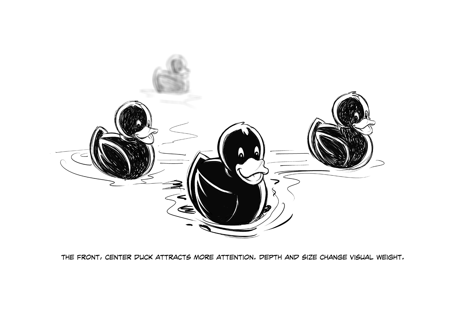
As a general rule, you want more important things to be bigger than less important things. This creates a visual “hierarchy” on the page and makes it easier to scan, but it also allows you to choose what the user notices first. That’s why it’s wrong to “make the logo bigger,” unless you want users to stare at your logo instead of buying something.
Lesson 52: Color
Real life is full of sunlight, artificial light, heat, cold, clothing, brands, fashion, and a million other things that affect the way we perceive colors. As a UX designer, we might not care about Pantones and brand guidelines, but we definitely have to learn about color.
There are a few things we can learn about color from the Technicolor rubber duckies on the preceding page. As UX designers, we usually rock the wireframes in black and white. And that’s a good thing! We focus on the function, while the UI designers can focus on the look, feel, and style. However, sometimes color is function. Like traffic lights, or making the color of a popsicle match the flavor. You know, important shit.
Meaning
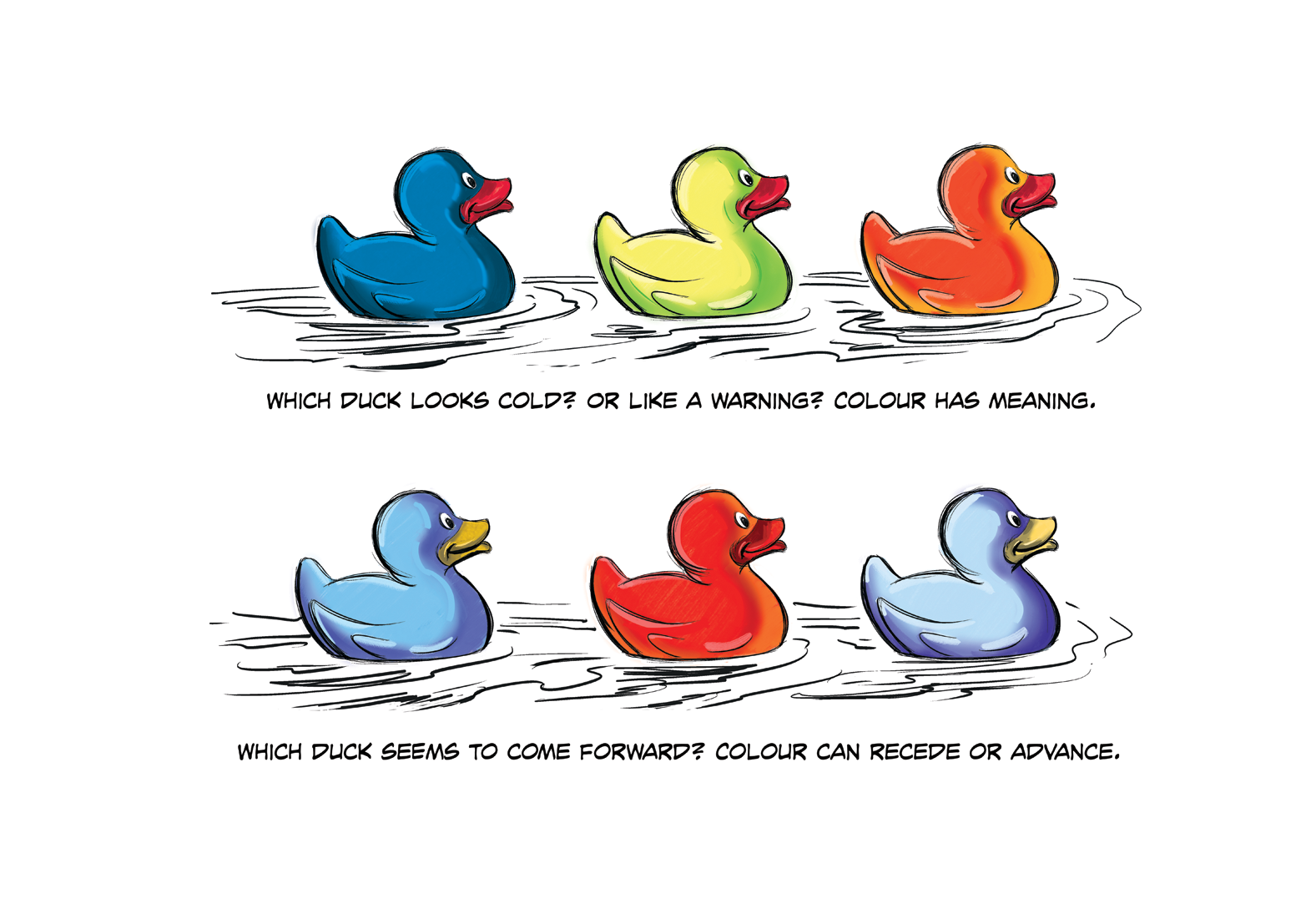
In the first illustration in this lesson, we see three ducks in different colors: blue, yellow, and red. They’re so handsome. Immediately, these ducks seem to have different tonality, and it is easy to imagine how the colors can change what each duck “means.”
If the ducks were buttons, they might be “confirm,” “cancel,” and “delete.” If they were indicators on a fuel tank, they might represent “full,” “half,” and “empty.” Or if they were on a stove: “cold,” “warm,” and “hot.”
You get the idea: the ducks are identical, but colors change the meaning. If you don’t need to indicate something like that, let the UI designer choose colors. But if you do, let your wireframes do the talking.
Recede or Advance
The other thing to keep in mind is that colors can be “loud” or “quiet.” The second image in Lesson 52 shows a red duck and two blueish ones. The red duck almost looks a little closer, doesn’t it? It’s not. Something like a “buy” button should have a color that makes it jump off the screen. More people will click a color that “advances” (comes forward).
On the other hand, sometimes we want things to step back so they are visible, but not too distracting, like the two blueish ducks. They “recede” (sink backward). This is good for something like a menu that is always on the screen. If it is always yelling at you, that’s unnecessary and it steals focus from more important things.
Keep Wireframes Simple
Colorful wireframes just get in the way of the functional details. Use colors where they matter, but don’t make your wireframes blue like blueprints, or dress them up for clients. It makes all discussions about color confusing: “No, the website won’t be blue…”
Combine Visual Principles
Color can work really well with the previous lesson about Visual Weight. Something big is noticeable, but you can’t miss something big and red! Make your errors and warning labels red and high contrast. Or, if you’re just confirming what the user did, something a little smaller in a receding green might be perfect.
Lesson 53: Repetition and Pattern-Breaking
One important visual design principles involves the creation of patterns to move the user’s eyes to important things. And like all good rules, patterns are made to be broken.
Who knew we could learn so much from rubber ducks?!
Human brains have a particular talent for patterns and sequences. Whenever something in nature happens over and over, we will quickly notice. In fact, we don’t just notice, we think about those things differently.
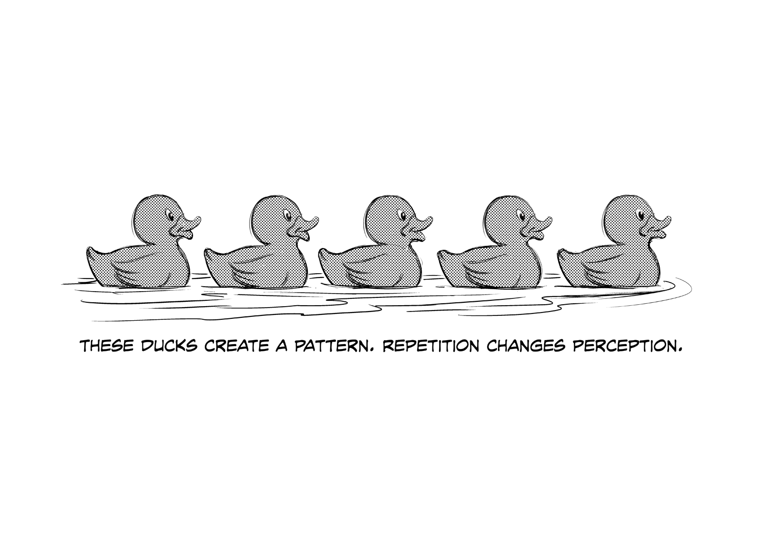
The first image shows five identical rubber ducks in a row. We don’t see five individual ducks though, we see a row of ducks. We treat them as a group or a sequence, and if you live in the Western world, you will probably look at them from left to right because that’s how we read. If that row of ducks were a menu or a list, we would do the same thing. Therefore, you could expect more people to click the options on the left, and fewer people to click the options on the right.
Breaking a Pattern
The second image shows the same five rubber ducks (still lookin’ good, aren’t they?) but this time one of them has gone solo. We’ll call her Beyoncé.
That changes everything. Now we see a row of four (jealous) ducks, and Beyoncé is alone, in the spotlight. She woke up like that! It is hard not to focus on Beyoncé, even though all five ducks are equally majestic creatures.
Now, if that were a menu, the middle option would get far more clicks than before because our eyes fixate on it. Also, those clicks would be stolen from the left options, so the left options would be less popular than before (although probably still more popular than the far-right option).
That’s a powerful thing to know.

This might seem simple and obvious, but when you apply that principle to your designs—or your dance routines—it can make people notice the important buttons, options, or pop stars.
Be careful: pattern-breaking can also lead the user’s eyes away from other important things. Before you can break a pattern, you have to make one.
Combine Your Principles
To make a pattern or a sequence, keep visual weight and color consistent. The user’s eye will start at one end and follow the pattern to the other end. To break the pattern, just switch it up in the place where you want to add focus. Make the “Register Now” button an unexpected color, size, shape, or style, and watch your clicks go up overnight!
Lesson 54: Line Tension and Edge Tension
Repetition, as we learned in the last lesson, creates a pattern. However, certain types of repetition can also create the perception of shapes that affect where the user’s eyes will go.
Are you tired of the ducks yet? I didn’t think so.
Visual “tension” is a concept that seems very elementary, but you’d be amazed how useful it can be. Our brains are a little too good at seeing patterns where they don’t exist. As a designer you can use that.
Line Tension
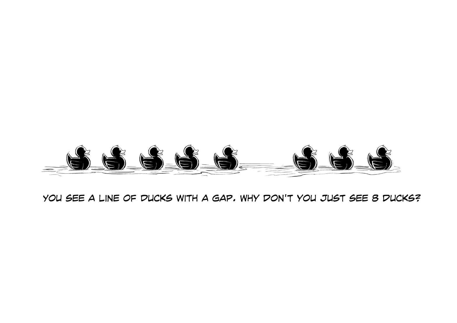
The first image shows eight ducks in a row. We don’t see eight individual ducks; we see a line. That’s line tension. The perception of a line or a “path” when there isn’t one. Our eyes will follow the path to see where it goes. Super useful.
If we break that path—like any broken pattern—the gap steals more focus.
Edge Tension
So far, we have assumed there is only one line. But what if we create line tension using more than one line?
The result can be “shapes.”
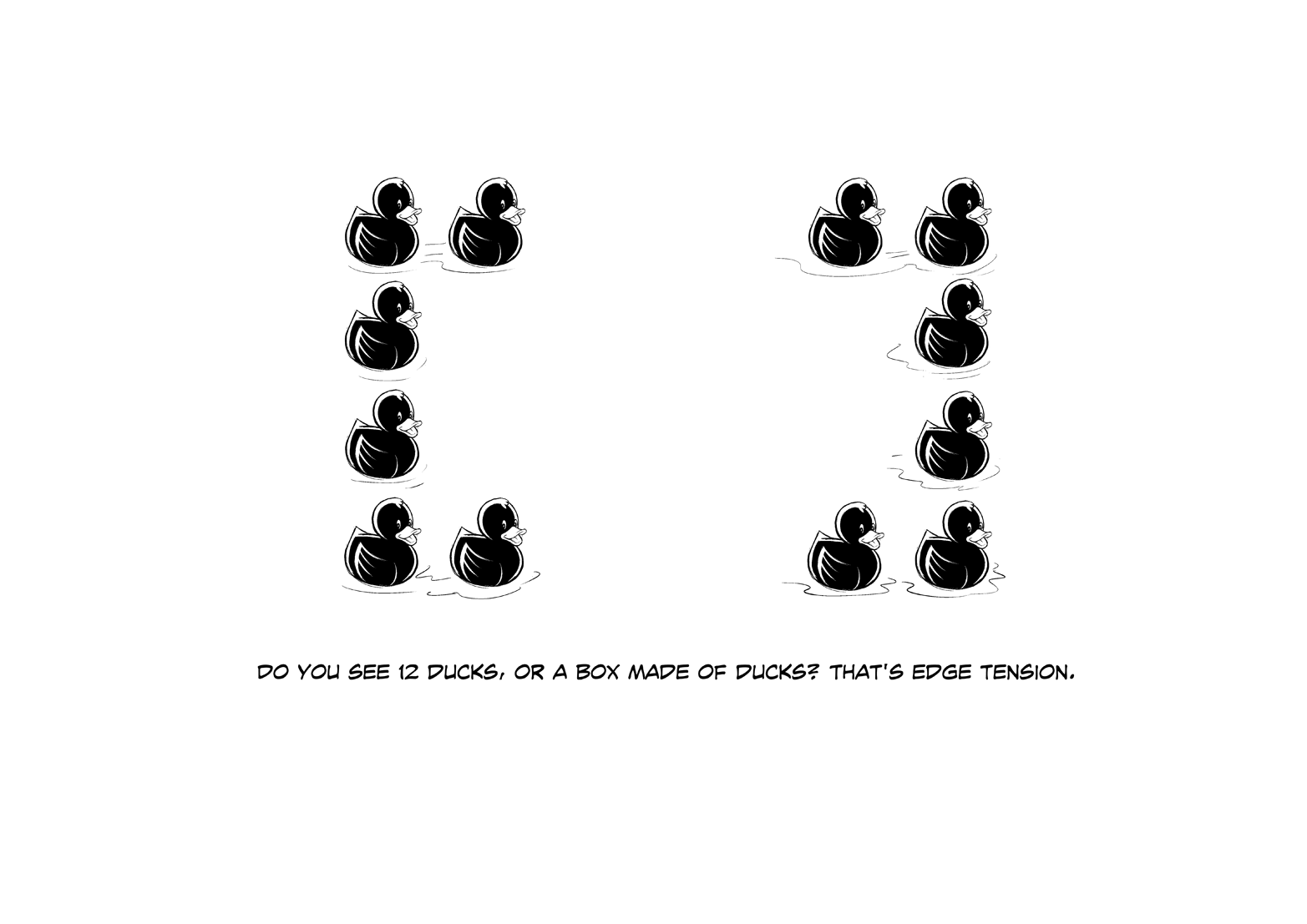
In the second image, I have arranged the ducks so they appear to form the corners of a box. You could see 12 ducks, or four groups of 3 ducks, but your mind really wants to see the box, so it does. Furthermore, now we can put things “inside” the box (like more ducks!), or in the spaces between the corners. Similar to line tension, edge tension brings focus to the gaps.
Layout-wise, this can be an excellent way to put more focus on something small, like a label. Or you can create visual paths leading to the button you want people to click. Vintage ads use this technique often to put a small logo in focus. And conveniently, it makes a layout feel simpler and more cohesive because a path or a box is only one mental thing, but 12 separate ducks is too much awesome to handle.
Combine Your Principles
In this lesson I have left the “tension” gaps blank, but you don’t have to. You can also use color to create a path like a gradient on a list of items. Or you can add visual weight to a group of elements by treating them like one shape instead of separate pieces. It’s a great way to direct the user’s eyes without adding any more things to a layout!
Lesson 55: Alignment and Proximity
The last design principle you will learn about is how to add order and meaning to elements of your design without adding any more elements. It might sound subtle, but it affects everything you see, every day.
Alignment
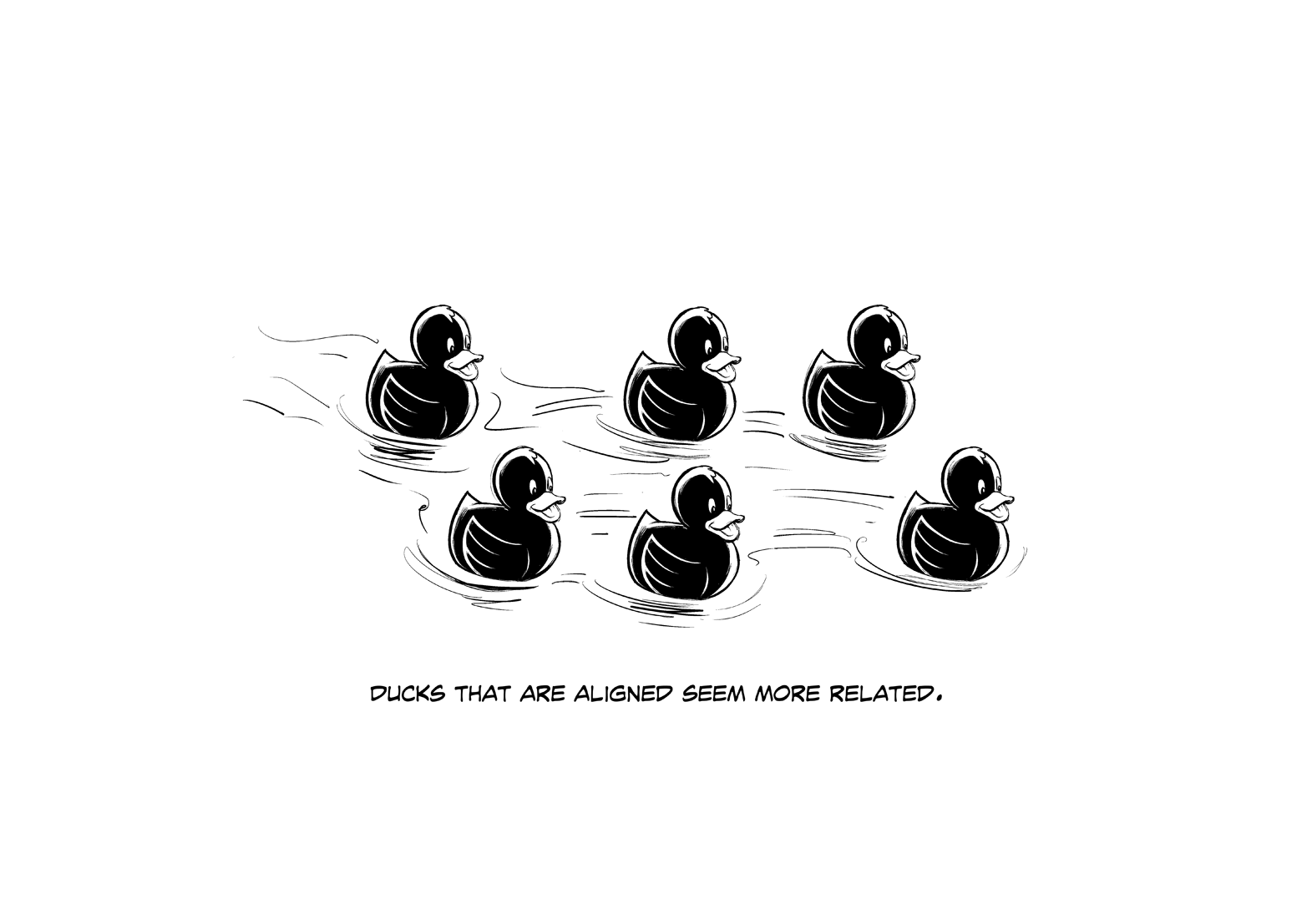
In the first image you see a group of six stunningly beautiful ducks, but you also see a lot of relationships, because of the way they are aligned:
- We see two rows.
- The far-left and farright ducks seem to be separated.
- The two center ducks seem the most organized.
- All ducks seem to be going in the same direction.
- If you see motion, the far-left duck might be falling behind.
- If you see motion, the far-right duck might be leading.
Those six ducks are identical. Only the alignment creates these perceptions. Buttons with similar functions can be aligned.
Different levels of content can be aligned. Information can be in a grid of rows and columns like a spreadsheet to create complex meaning.
Proximity
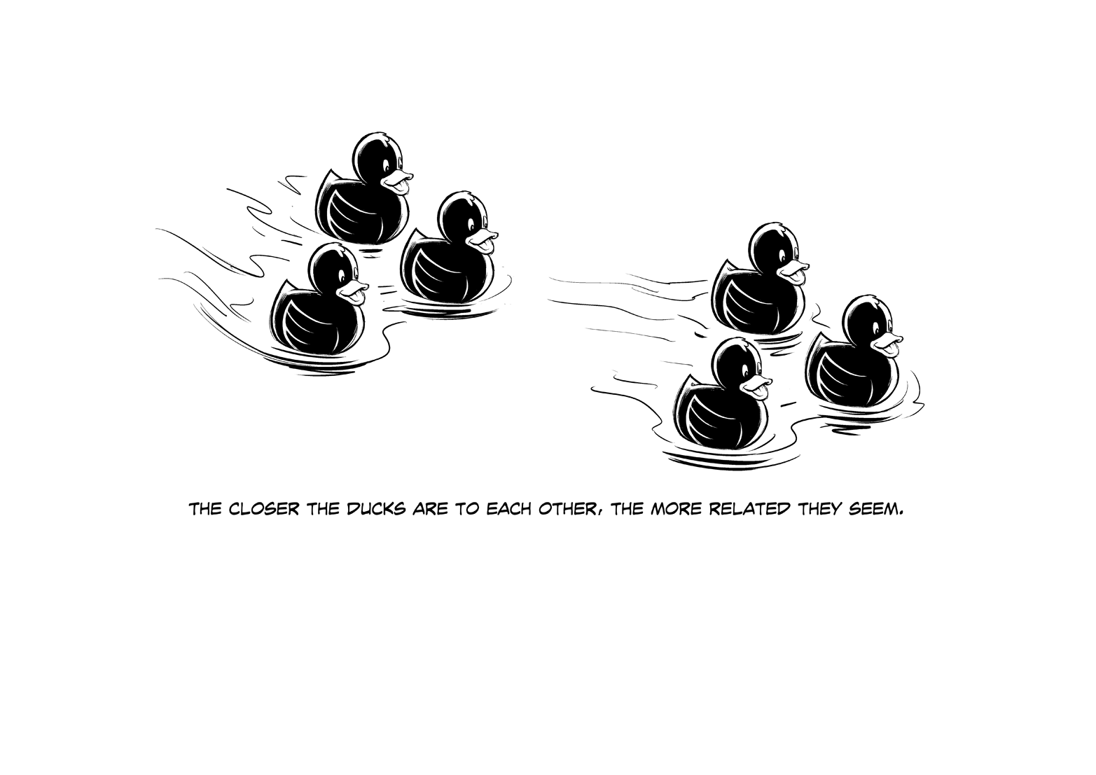
The closeness or distance between two objects creates a feeling of those objects being related or unrelated. That distance is called proximity.
In the second image, you see six identical ducks that are not aligned horizontally or vertically, but you definitely see two groups. The ducks in each group seem together, like a team or a family. The only thing creating that perception is their proximity.
In your designs, put related elements closer together and unrelated elements farther apart. For example: a headline, a block of text, and a button that are all related to one action— like a purchase or an app download—are usually designed like a “package.” That allows the user to understand that they go together without reading anything.
Lesson 56: Using Motion for UX
In digital design, it is becoming more and more common to include animation or motion design as part of the UX. It’s a stylish detail, but in UX, you care about more than style. Motion is a tool.
If Motion Makes People Wait, It’s Bad
Before you start designing amazing transitions between screens, and smooth animated buttons, and parallax gravity in your scrolling, think about the user. If the user is trying to navigate, or if they know what is coming, or if they have to see this animation a hundred times every time they use your site or app, you might be doing more harm than good.
Animations take time to show, and making users wait quickly gets frustrating. Even worse than waiting, sometimes animations make things hard to read, or they distract users from the content and buttons you want them to read and click.
Motion Is Noticed First
If you have ever been disturbed by a vibrating banner or a jumping button, then you understand how motion can draw your attention. If you made a list of the things your brain notices, in order of priority, motion would be first. But, a little goes a long way. If you make a vibrating banner or a jumping button (which are really annoying to click, by the way) I will hunt you down and… well… let’s just say it won’t be pretty.
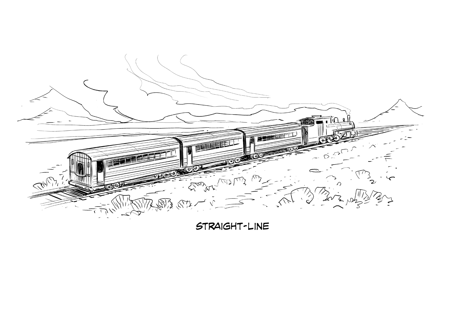
Straight lines point in a direction
Different types of motion will do different things to the user’s eyes. If you make something move in a straight line, the user’s brain will anticipate where it’s going and the user will look at the “end of the line.” If you are using motion to highlight key features or tell users where to go, straight lines are a good choice.
Curved lines make people follow the curve
However, if you want to lead users around the screen—like when you’re explaining your app for the first time—curved motion will make their eyes stick to the path and stop where the animation stops.
