Prototyping for physical and digital products
Become comfortable creating and testing both physical and digital prototypes, and learn how to user test to get the best insights.
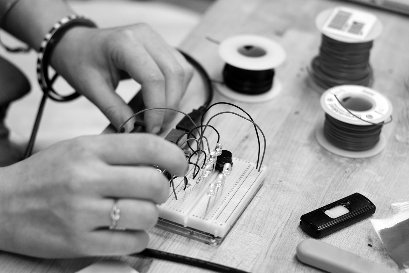 (source: Courtesy of Kathryn McElroy)
There seem to be hundreds of new smart objects and apps reaching the market every day. With all of this competition, how do you know that your idea will be influential and that people will buy it? You’ve done the market research and found a viable sector, or you’re working with a team that has an idea and is rushing toward a minimum viable product (MVP). But how can you truly know that your ideal customer will benefit from your new product or app?
Prototyping and user testing is the best way to make viable products that are impactful for your users. By creating incrementally better prototypes throughout your process, you can get valuable feedback to improve your product. By using real people, instead of merely trusting your gut, and observing how they interact with your prototypes, you’ll see exactly where they get stuck, what they don’t understand, and their visceral reaction to the entire experience. Prototyping is a key to developing a good experience and good user experience design.
In this report, I’ll begin with the basics of what prototypes are, with examples from different industries. Then I’ll explain why prototyping is important, including the many reasons for and value of prototyping. I’ll dig into current approaches and more specifics for prototyping for physical and digital products. Finally, I’ll explain how to set up and run user tests with these prototypes.
Physical products in the context of this report means physical-computing, electronics-based products, including smart objects, wearable technology, and Internet-connected devices, whereas digital products are software and apps that we use on devices that are usually screen-based. This report focuses on the abundant opportunities that we have designing for the Internet of Things and how to get started in electronics. It does not cover how to prototype for industrial design or product manufacturing.
By the end of this report, you’ll understand how to create cheap, fast prototypes at a variety of different fidelity levels and how to user test them to get the best insights to improve your product. You’ll feel empowered to take the next step in prototyping for your current project, and I hope that you do!
What Is a Prototype?
Prototypes are created every day for all sorts of situations. Even if you haven’t consciously been making prototypes, they have most likely intuitively been part of your process or even your daily life. A prototype is “a first, typical or preliminary model of something, especially a machine, from which other forms are developed or copied.”1 This “preliminary model” can be anything that takes an idea that’s in your head and gives it a form to test. As long as your goal is to always improve your idea, everything is a prototype. They can be sketches, sculptures, or intricate drawings. Or they can be coded, soldered, and fully functional products.
All sorts of industries create prototypes of their work to test and try out different ideas, as you’ll read in the following sections.
Architecture
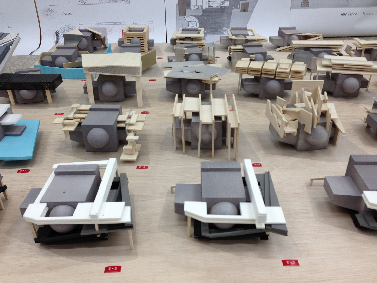
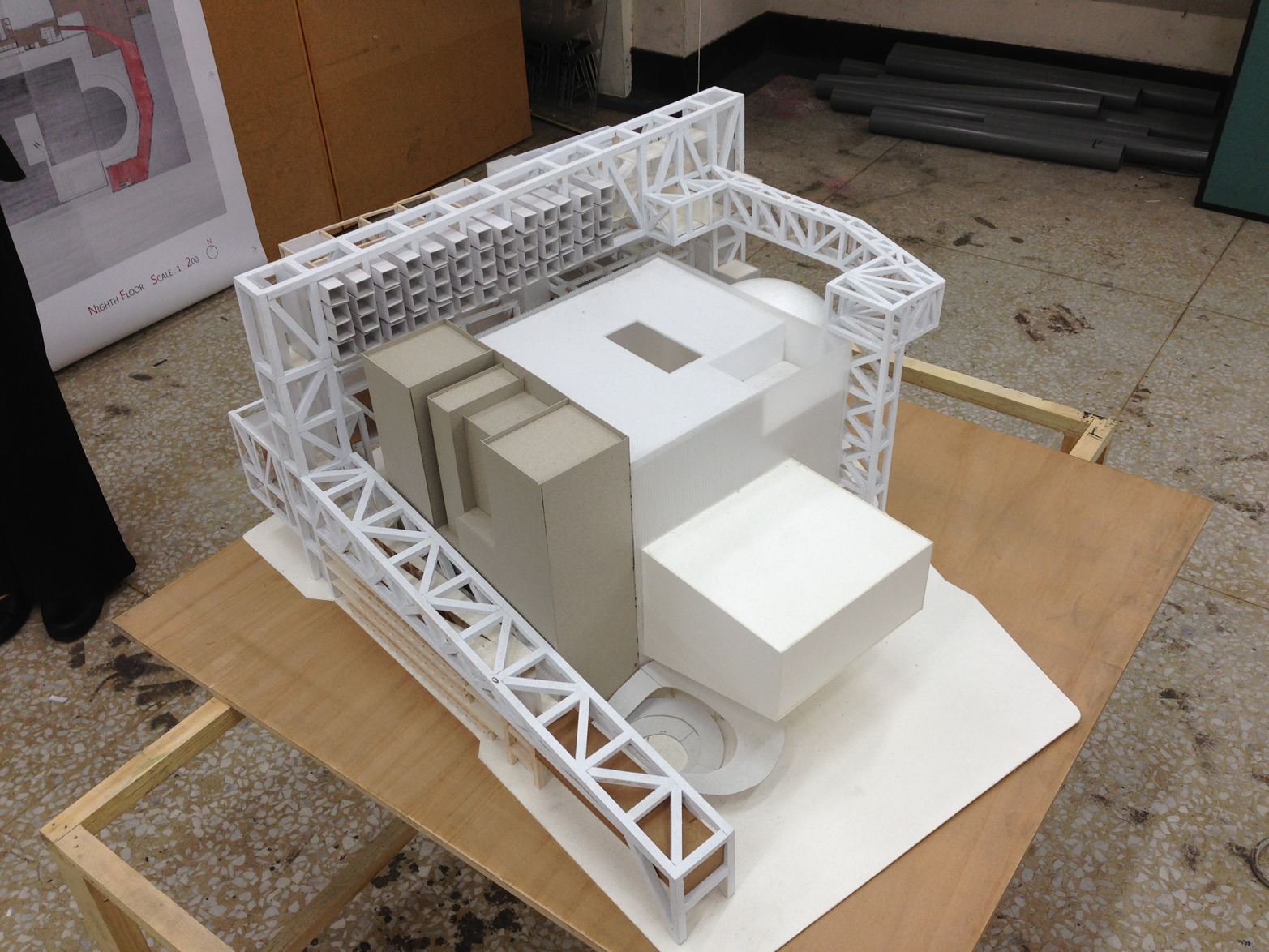
In architecture, prototypes include floor plans (which are drawn and redrawn based on user input and needs), form studies, aesthetic models (Figure 1-1), air-flow models (testing ventilation throughout a space by showing how air will move through the rooms), and daylight models (improving window design by testing how much light they let in at any point in the day or year—see Figure 1-2). Each of these prototypes has a specific use and improves the building based on the testing of the models.
Industrial Design
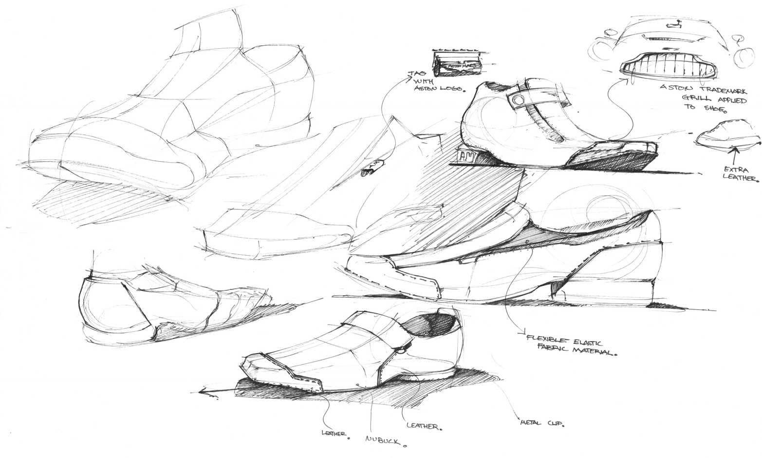
In industrial design, prototypes include hundreds of sketches, foam models, material studies, ergonomic studies, and final forms (Figure 1-3). These short-listed forms are created in the proper materials and tested for material longevity and feel before the final form is chosen and prepared for manufacturing. Industrial designers spend most of their time prototyping their ideas before settling on the proper form for production.
Personal Electronics
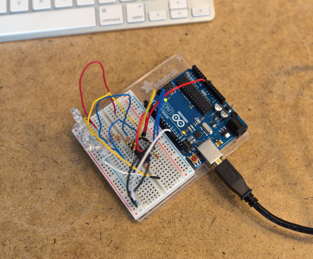
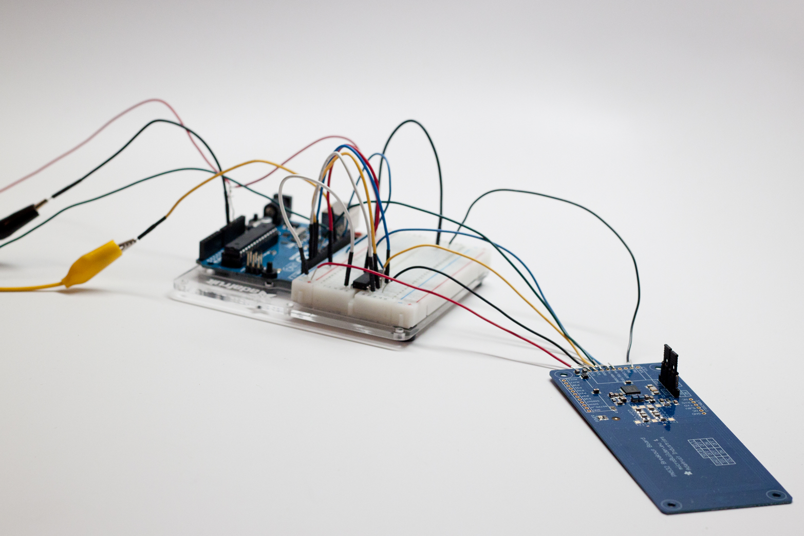
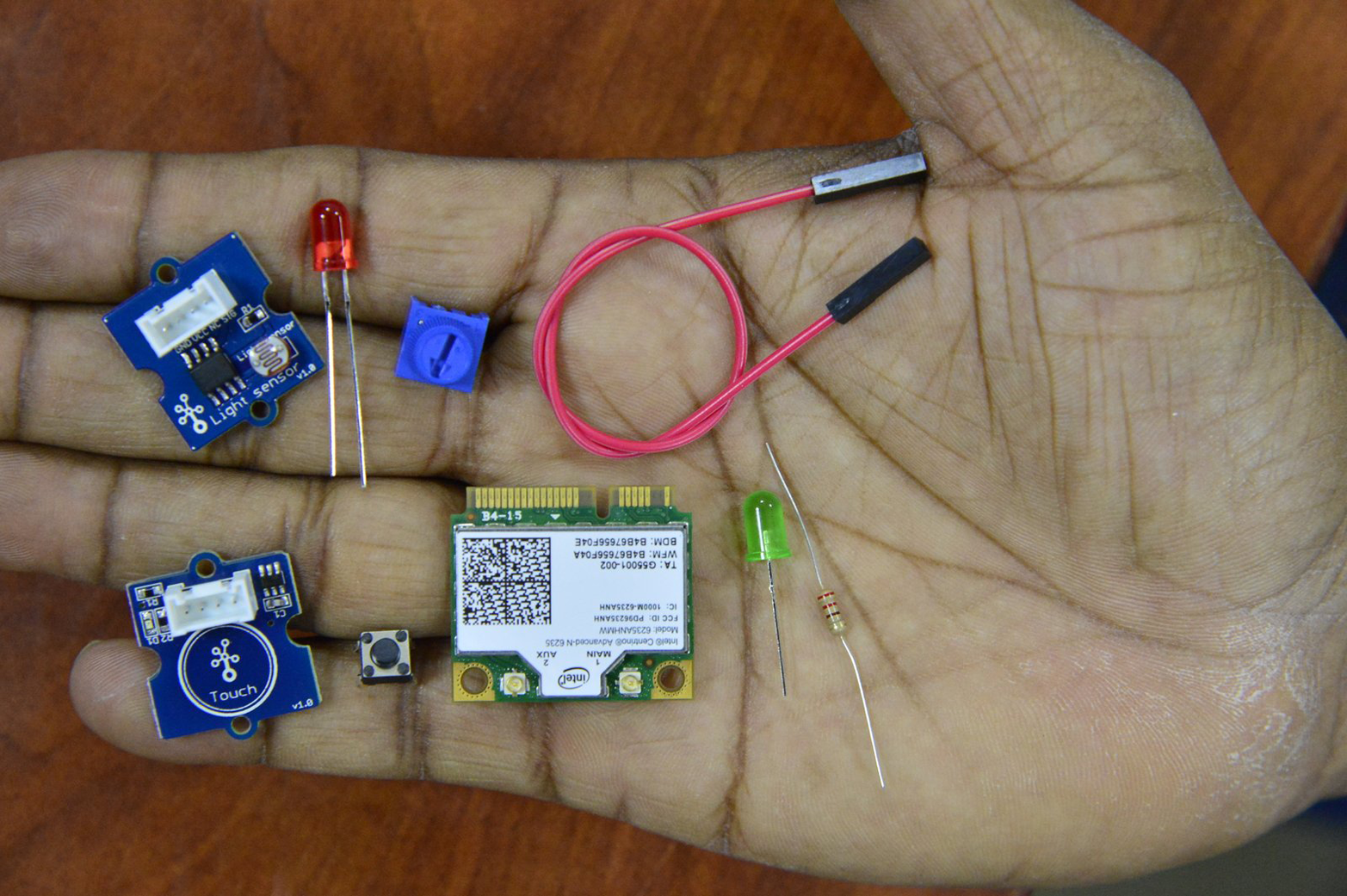
For developing personal electronics, a subset of industrial design, prototypes also begin with sketches and studies of form. Additional layers of complexity for electronics include figuring out the necessary electrical components and needing to test the different component functions. For that purpose, other prototypes include larger electronics to test each individual component (Figure 1-4), then slowly combining them together to get the code to work properly and incorporate the functions. Only after the components are all added together, with each section tested along the way, do these designers start soldering smaller versions of those components together and user testing them in the actual final setting (Figure 1-5). This type of project also needs material testing and potentially a parallel process of prototyping an accompanying app that will control the personal electronic.

Software and Apps
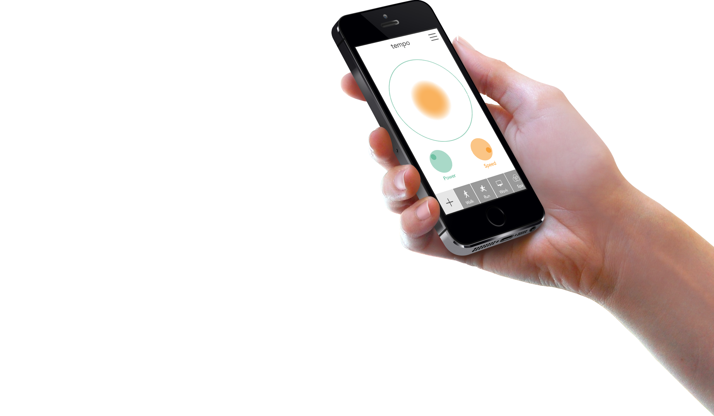
When developing software, the prototypes include sketches or a user flow showing the ideal path and functionality that the user will need, wireframes in a testable form (either paper or clickable; see Figure 1-6), clickable or coded prototypes, and visually designed, high-fidelity prototypes (Figure 1-7). Each of these prototypes can be improved throughout the process, and can be altered by testing.
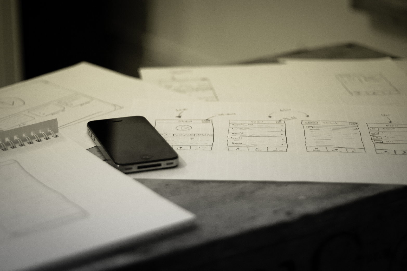
Each software prototype has a specific use and assumption that it manifests. Earlier in a process, prototypes target big-picture questions like information architecture, overall user flow, and format of the product. Later on in the process, prototypes are more refined to test specific elements such as styles, interaction patterns, and UI text.
Before making an initial prototype for any industry, you must have a basic understanding of who your user is in order to design an experience for the specific situation that user is in. User research allows you to interview potential end users and map out their personas (a representation of their goals and behavior) to help guide you along your design process.
You’ve probably been using prototypes throughout your own life and projects already, like sketching a furniture layout or landscape idea to communicate with a roommate or spouse, but now your goal is to consciously create prototypes to test specific assumptions as part of your product design process.
Why Do We Prototype?
There are many great reasons to make prototypes and to include them early and often in your process. The four reasons I’ll cover are as follows: to understand, to test and improve, to communicate, and to advocate. Each of these is similar, but has a unique twist to why prototypes are valuable.
To Understand
It’s easy to get stuck in your head when you’re trying to tackle a new idea. A great way to understand the problem you’re taking on, and to discover the best way to approach it, is to explore the problem through prototypes. By sketching many different variations of an interface, wearable, or other product, you can quickly understand the direction the work is taking you, and also begin discussing your ideas with the rest of your team. Prototypes at this stage allow you the freedom to think through all the different ways you could solve the problem, discover new problems that need to be addressed, and help you to refine your ideas with the feedback you receive. As long as you intend to improve your ideas, these sketches are both ideation and prototype.
To Test and Improve
Testing and improving products is the main reason to prototype. Now that you have a better hold on the problem you’re addressing, you can dig into specific parts of your product design through iterative prototyping. Each prototype you build will address a specific assumption or design element, that you then test with users to either support or disprove your assumption. It should be the cheapest means to an answer, so these prototypes are fast and disposable. After you’ve gained insights from testing a prototype, you should feel comfortable using only part of the prototype moving forward, or even tossing out the prototype and making a new one for the next assumption. This process is similar to the scientific method in that you’re building small experiments to test your hypotheses along the way, each test is unique for the hypothesis it’s testing, but different because user testing has a qualitative emphasis as opposed to being based purely on empirical data.
To Communicate
Another use for prototypes is to communicate to your team, investors, stakeholders, or end users. It’s more valuable to show an idea through an artifact than to merely talk about it. By having a prototype, no matter what fidelity level, you can actually point to what you’re talking about instead of asking your audience to imagine your idea themselves. If you only talk, each person will create their own different mental picture of your idea, and it will be difficult to align all those hidden expectations. Prototypes allow you to get everyone on the same page for the direction you’re going, without as much opportunity for miscommunication during your process.
To Advocate
Finally, you can use prototypes to advocate for a design or direction. The process of prototyping and user testing delivers valuable insights and user quotes that support a specific direction for the product. By sharing these results with management and product owners, you can advocate for a better user experience, and therefore a more sellable product. At the end of the day, the better the user experience is overall, the more marketable and useful your end product will be to your user.
Benefits of Prototyping
These are the main reasons why you should prototype, and there are many benefits that support them. By prototyping and user testing, you’re putting your end user at the center of your process. You’ll get to know what their pain points are, and create a product that solves that specific user’s problem. Although you may end up using your product, you are not your only user, so you need to test your assumptions in order to make sure your idea is serving the whole ideal audience. And as you continue to deliver user-centered design with your product team, or with your coworkers, the more they will come to value design in return.
Keeping the user at the center of your process through prototyping also improves your product immensely as you apply insights you gain from user testing. You’ll find major problems faster, and be able to fix them early on. Each iteration of a prototype tests something new, and incorporates it into the next, better model.
Finally, it’s an inexpensive and easy way to validate your product. Instead of waiting to get feedback from users only when they purchase the final version, you’ll get incremental feedback along the way. It’s cheaper to make changes earlier in the process rather than later. This saves time and money for your entire process, even if it feels like you’re wasting time while making a prototype.
It’s similar to the idea of a minimum viable product (MVP) and Lean Startup;2 however, the difference is that you can prototype along the way before you finalize an MVP to ship to customers. You may have a dozen prototypes before you have a full MVP to ship and measure. The more often you can prototype, test, and improve, the better.
How Is Prototyping for Physical and Digital Products Similar?
Prototypes for physical and digital products have a few similarities and a few differences. We’ll go over what’s similar first, then dig into both types individually to learn the different tools and processes for developing them.
Goals
The first similarity is the goal of prototypes. As I’ve mentioned before, the goal and benefit of prototypes is to make the best product possible by focusing on a specific user and their problem. By focusing on the user, and having a user-centered design approach, your product will be addressing a direct need of that user and will be much more viable and sellable. When you have a user as your guiding star, you will naturally design iteratively and user test each step of the way.
Fidelity Levels
The other similarity is the use of different fidelity levels for prototypes to test different aspects of the design. Fidelity means how closely the prototype looks to the finished product. Both types of prototypes benefit from starting with low fidelity and slowly increasing the fidelity level until most of your assumptions are tested and either proved or fixed. But the designer must be flexible and able to decide which fidelity is right for the assumptions they’re testing. If a prototype’s fidelity level is too high, the user will subconsciously believe that the design is “finished” and will only give feedback on polishing areas instead of the broad concepts. If a prototype’s fidelity level is too low, the user might not understand the context and get lost in the generalities.
Low Fidelity
Low-fidelity prototypes are best for testing your core concepts, getting over initial fears, and catching potential problems before they get too big to fix. This type of prototype doesn’t look like your final product at all: it’s in a different medium, at a different size, and is usually not visually designed (although you should be thinking about visual design during this whole process).
It’s the easiest and cheapest prototype to make, and doesn’t require as much time or skill to complete. Some examples include paper prototypes (Figure 1-8), storyboards, wireframes, mood boards, sketches, and component prototypes (Figure 1-9). The goal of a low-fidelity prototype is to test basic and big assumptions, including user flows, information architecture, labeling, navigation layout, basic organization, and user mental models. With this rough prototype, your user won’t waste time giving feedback on the execution and appearance of the interface or device.
Mid Fidelity
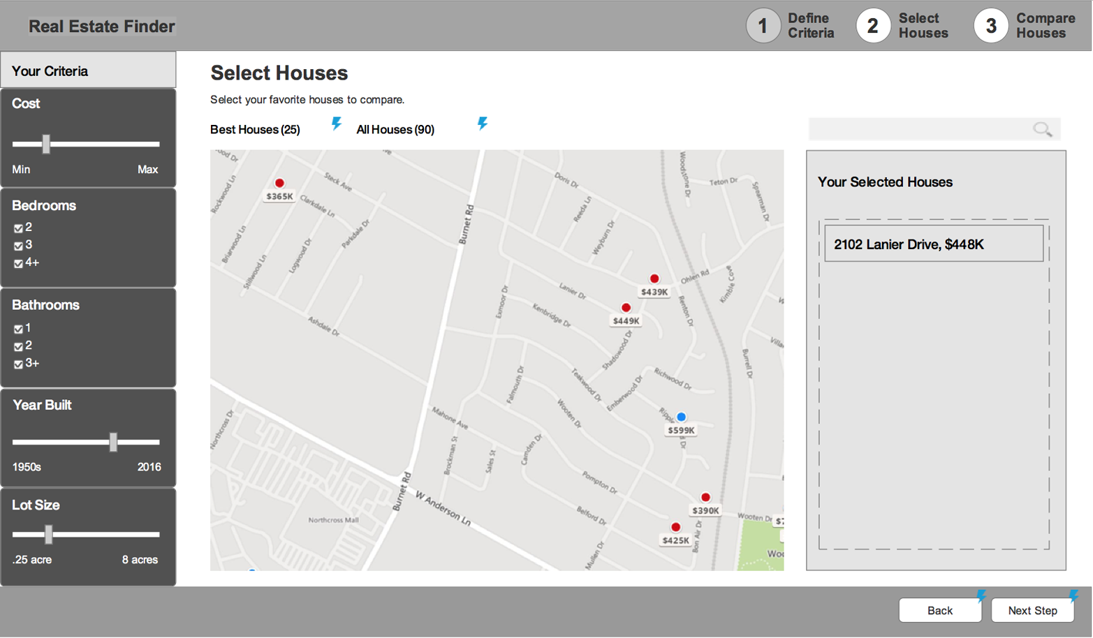
Mid-fidelity prototypes start to look like your final product. They are a good balance between cost (time or otherwise) and value, and have either been more visually designed or are in the final medium (on screen, in browser, or physically designed). Examples include clickable prototypes, Axure prototypes (Figure 1-10), coded prototypes, and initial electronic prototypes (Figure 1-11). The goal of a mid-fidelity prototype is to test more specific assumptions, such as whether the user found a specific function, if it was easy to navigate through the whole product, or if the wearable’s vibration was disruptive. They don’t take as long to make as high-fidelity prototypes, but you can begin testing more detailed parts of the interactions.
High Fidelity
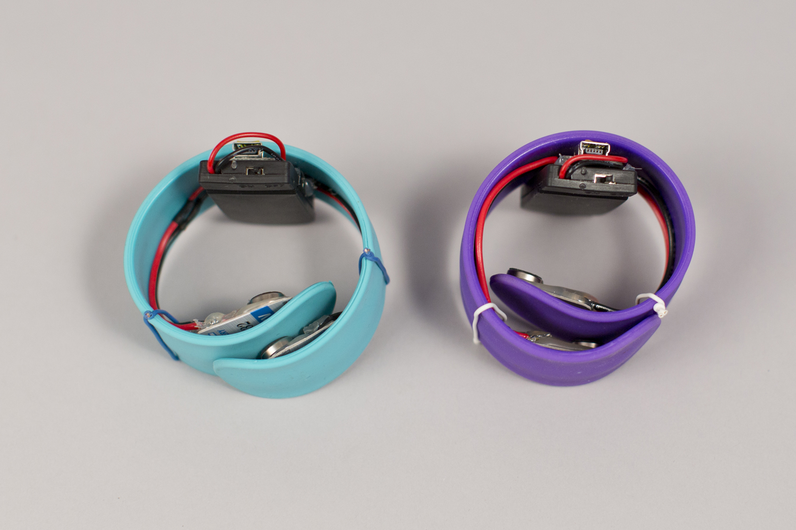
High-fidelity prototypes are the real deal. They’ve been visually designed and are in the final medium of either physical materials or in browser and coded. Some examples include fully coded and designed digital experiences (Figure 1-12) and high-quality industrial design models (Figure 1-13). At this point, most of your assumptions should have been tested in earlier prototypes. It’s best to use this type of prototype to test small details like overall user reactions to the experience, legibility of the font sizes, and long-term wearability.
These three fidelity levels, and the gradients in between, can be applied to design (like the preceding examples), content, and interactions with the physical or digital product.
Design is the overall experience, the specific UI (user interface), the functionality of the product, and the visual design.
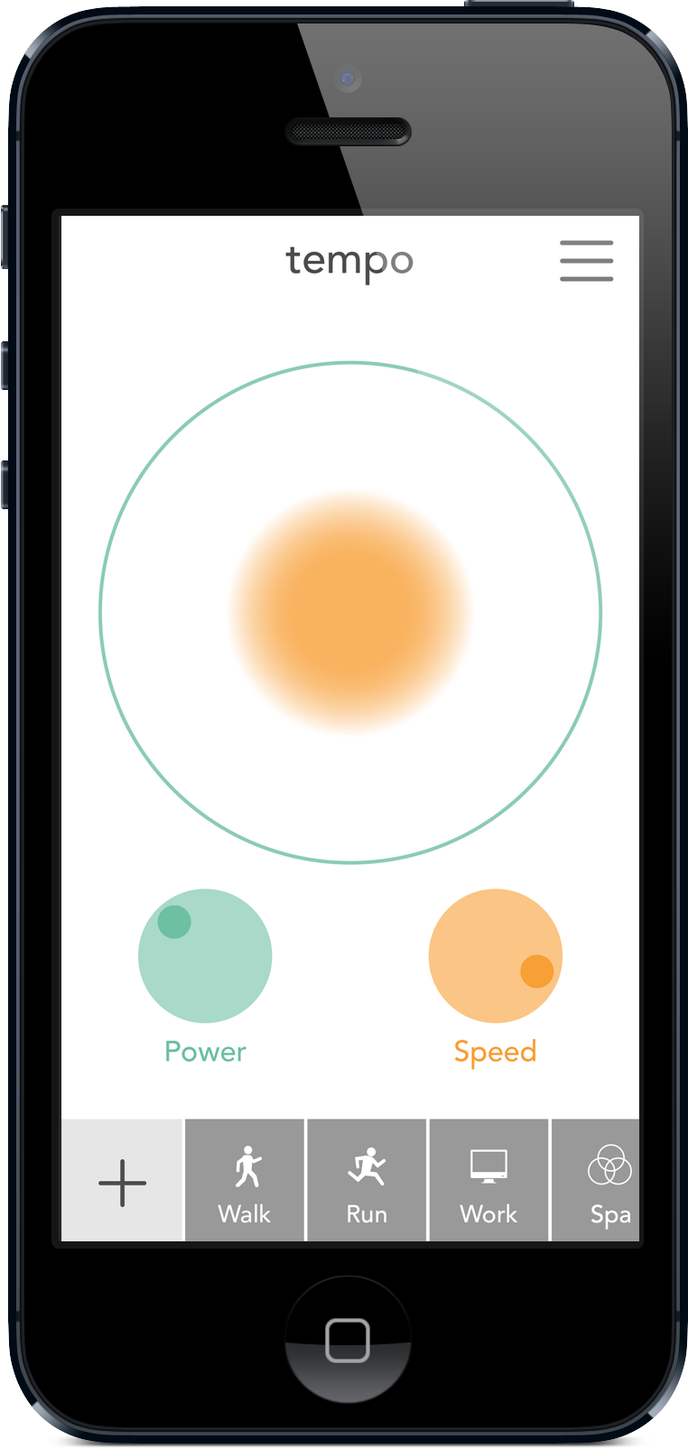
Content is the text or visuals used throughout an interface, including helper text, explanations, images, and the actual written matter of a site. You should try not to use lorem ipsum (dummy text); instead, create basic content that’s similar to what your final content will be, that can be updated as the real content is written. Products should be designed around the real, final content, but sometimes you’ll need to design quick, low-fidelity prototypes before the final content is ready.

Finally, interaction includes aspects such as how the page loads, animations in interfaces, and types of physical, visible, and audio outputs on electronics, which are all difficult to prototype and test until the product is in a higher fidelity and the final medium. Both content and interactions provide important context for the user, so make sure you’re testing this throughout your process.
As mentioned previously, the fidelity level you choose for a prototype will affect the type of feedback that you receive from users in testing (Table 1-1). The higher the fidelity, the more the user assumes it is a finished product, so they give feedback on execution aspects such as color choices and appearance instead of overall reactions to the flow through the product, or confusion about the navigation’s organization.
| Low fidelity | Mid-fidelity | High fidelity | |
|---|---|---|---|
| Pros | Fast, low-skill, cheap, made with materials available around you |
More interactive, easier to test, good balance of time and quality | Complete design, including visuals, content, and interactions; can test very detailed interactions |
| Cons | Limited interactions, harder to test details and full flows, little context for users | More time-intensive, but not fully functional | Very time-intensive, requires skills with software or coding, hard to test large concepts |
| Use | Exploring and testing high-level concepts like user flows and information architecture; best for making lots of different versions and testing them against each other | User testing specific interactions and guided flows; also better for stakeholder presentations, as these prototypes have more context | User testing very specific interactions and details, final testing of user flows, and presenting final design work to stakeholders |
Prototypes for Physical Products
Prototyping for physical products has a few essential features and processes that are not the same for digital products. The main aspects you must take into account are the materials and tactility of the physical product and the electronics involved in its functionality. I won’t dig too much into the industrial design side of physical products, but I will address some ways to prototype the outer materials and the inner functionality.
Materials and Tactility
Materials are a very important part of physical products. Keep in mind that any wearable that touches human skin needs to be thoughtfully designed to interact with a nerve-filled surface (Figure 1-14). Different materials are better or worse for this application. As you’re designing the functionality in the electronics, you also need to decide need to decide how the user interacts with the product (touch, voice, or through their smartphone), or if it’s a wearable, where it will reside on the body (wrist, neck, upper arm, etc.), and how it will communicate with the user (vibration motors, LED light, sound, etc.). Think through how the surface will be cleaned, and make sure the materials will not cause allergic reactions. For example, if you’re designing for a sports-related wearable, consider silicon or neoprene as materials that can stand up to a sweat and motion. Throughout your process, make sure to test your prototypes as close to possible to the final position on the body, so that you can get proper feedback on the form and material concerns. You should use prototyping to test different types of materials, forms, and placements during your process to help you decide which direction to go.
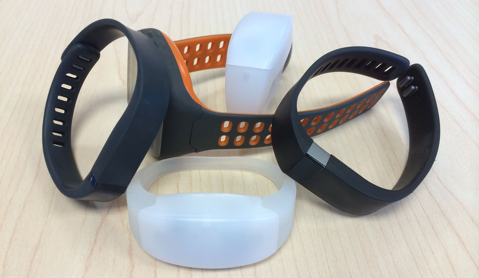
When designing for non-wearable smart objects, keep in mind the environment in which those objects will live. How can you best prototype and test your idea in its ideal environment? Not only will you be choosing build materials (such as injection-molded plastic), you might also choose finishing materials such as wood veneers or silicon covers. For more information about material design, check out these books:
-
Materials for Design by Chris Lefteri (Laurence King Publishing)
-
Making It: Manufacturing Techniques for Product Design by Chris Lefteri (Laurence King Publishing)
-
Materials and Design by Mike Ashby and Kara Johnson (Butterworth-Heinemann)
The material choice also contributes to the tactility of the product. What are the literal touch points on your product? You might have screens, buttons, haptics, or even an accelerometer to track motion (Figure 1-15). The decisions you make about the tactile components will help you develop the prototypes you need to test these components, separately and then together as a product.

Electronics
That leads us to the electronics. It may seem overwhelming to begin working with electronics, but it’s such a fun and engaging way to prototype! In this section, I’ll share my favorite resources for electronics components, tutorials, and support, and my basic process for writing code. With these tools, you will be well on your way to developing your next physical prototype.
When you have an idea for a new physical, electronics-based product, and a specific user that you’re solving a problem for, it’s time to begin prototyping. Determine what components you’ll need and how they should work together based on your full use case (Figure 1-16). Components can include how you collect information with sensors, including temperature, light, sound, motion, and pressure sensors or analog dials; how the device will interact with a phone or computer (Bluetooth, WiFi, or cord), and different outputs such as lights, sound, or haptics.
Low-Fidelity Prototypes
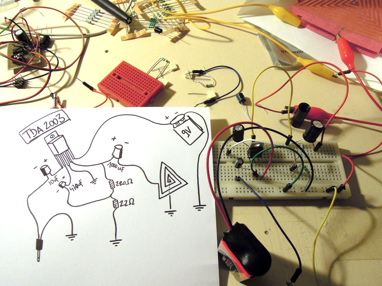
The first low-fidelity prototype you can make is sketches of potential circuits and how your different components should interact (Figure 1-17). Or if you haven’t made circuits before, write out in a story how the different sensors and outputs will work together and draw how they interact. Either of these directions is a prototype to test with your electrically minded friends. If you’re new to electronics, this is a great time to read up on some of the basics, so that you understand what you’ll need and basic safety. My favorite resources for foundational understanding include this Basic Electronics Instructable and the Adafruit website. The safety concerns are real when you’re working with electricity, so please be safe and make sure you understand enough to not get shocked or set your prototype on fire!
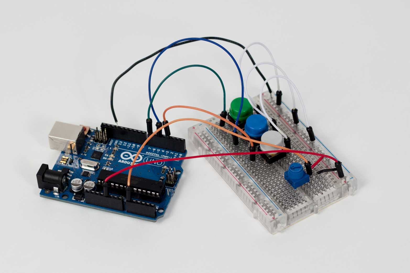
Another low-fidelity prototype you can start with, and my favorite way to prototype circuits, is an Arduino Uno. Arduino is an open source electronics platform that sells a variety of different microcontrollers and has a very supportive community. The Uno is great for low-fidelity prototypes because you can make circuits without soldering by plugging wires into the Uno directly and using a breadboard (a solder-less construction base for electronic circuits) to build out the rest of the circuit (Figure 1-18). You can get a starter kit from the Adafruit website, and learn more about the basics of Arduino in Arduino in a Nutshell (O’Reilly). In addition to the circuit, you’ll need to write code for the microcontroller, but don’t worry! There is already so much written here and online to help you figure out how to code, and to get you most of the way there by using open source examples.
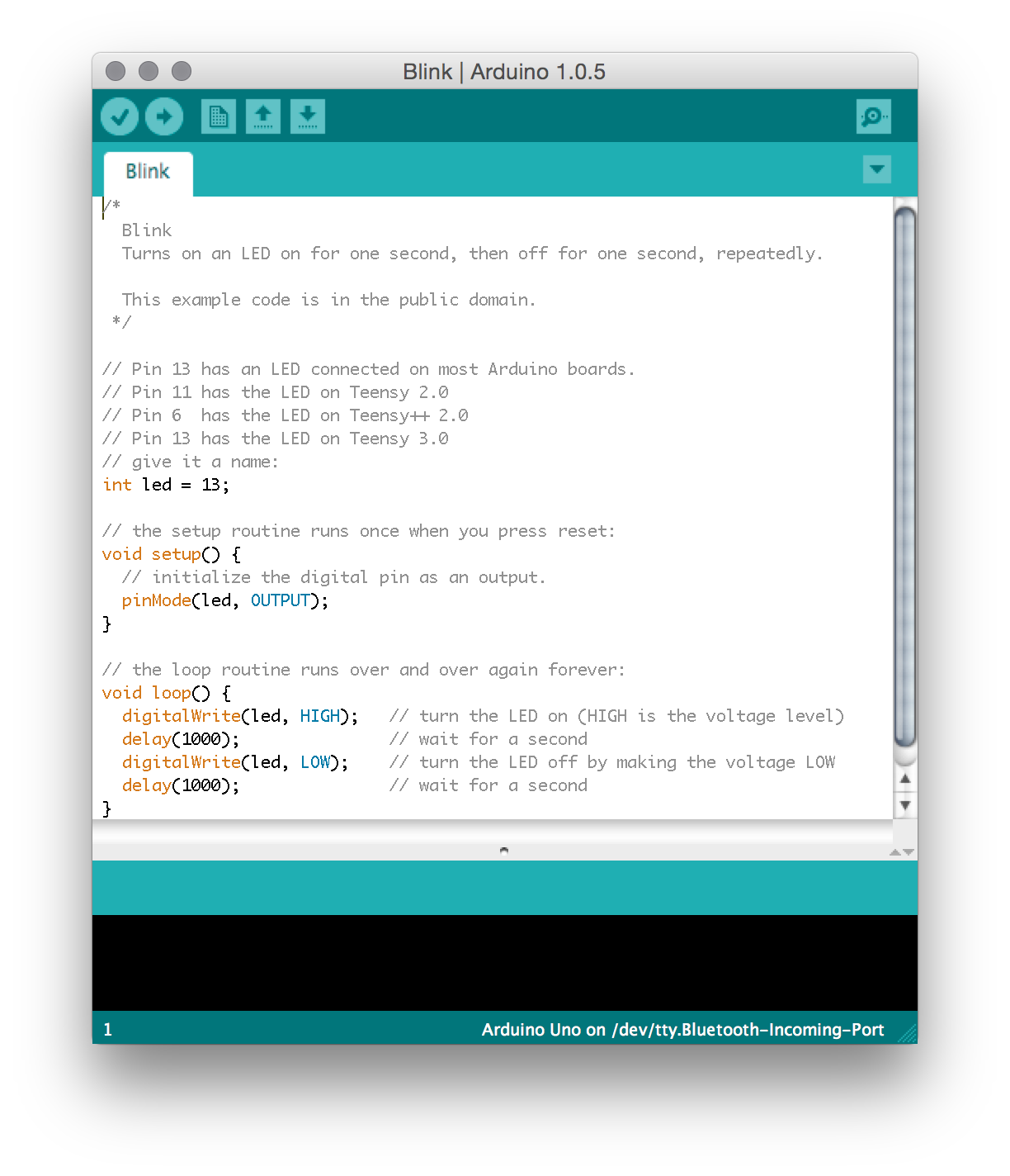
Code for Arduino microcontrollers is written in a very specific way using the C programming language and saved in files called “sketches” (other microcontrollers can be a little different, so I’ll focus on Arduino primarily for this report; see Figure 1-19).
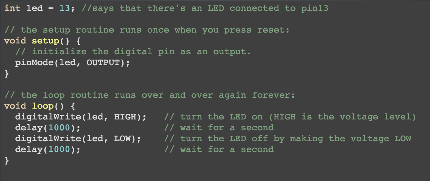
The three main parts of a sketch are the variables, the setup, and the loop (Figure 1-20). See Figure 1-21 for an example sketch that turns an LED on and off. For a detailed walk-through of a sketch, read through this tutorial from Lady Ada.
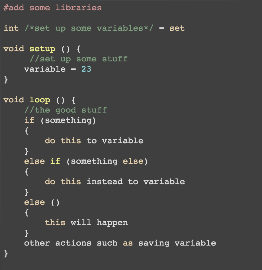
One helpful trick I use when working on prototype code is to write out what I want to happen in pseudocode first. Pseudocode is a storytelling approach to coding. For example, if I were making a light-up email notifier, the pseudocode story I write might look like this:
-
Check how many new emails I have.
-
Take that number and see if it’s more or less than the previous email count.
-
Take action depending on the result:
-
If it’s more, I have new emails, so turn on the light.
-
If it’s less, I must have read some emails, so turn the light off.
-
Otherwise, if it’s the same, then nothing has happened, so don’t do anything.
-
-
Save the new email number to use next time.
Now that I have the story written out, I can see that I need to save the email number as a variable so that I can reuse it in the next loop, I will need to do some math, and I will need an if/else statement to determine the output. Now I can do a bit of Googling to help find the chunks of code that will fill in these blanks. There is a huge online, open source community for Arduino microcontroller code and projects. You can find almost any type of project and at least some code to start with, and you’re encouraged to use it! It’s also helpful for the community if you share back your work to help continuously improve the available projects online. For my email notifier example, I used the ardumail project to help me with my base code.
Some of my favorite code and tutorial resources include:
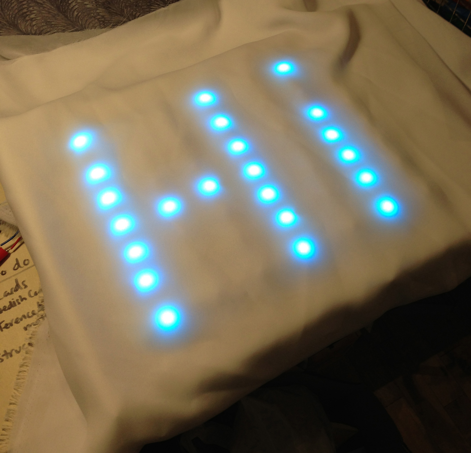
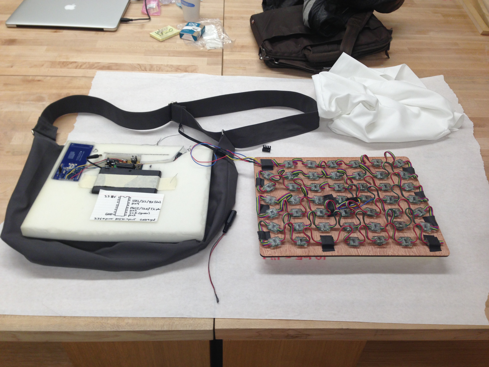
Once you get the hang of building small circuits, you’ll want to prototype and test each of your main components individually before combining them together. For example, I built the Chameleon Bag, a smart messenger bag, by combining an RFID sensor input (the same used for security badges) with a panel of RGB LEDs (that can change color) for output (Figure 1-22).
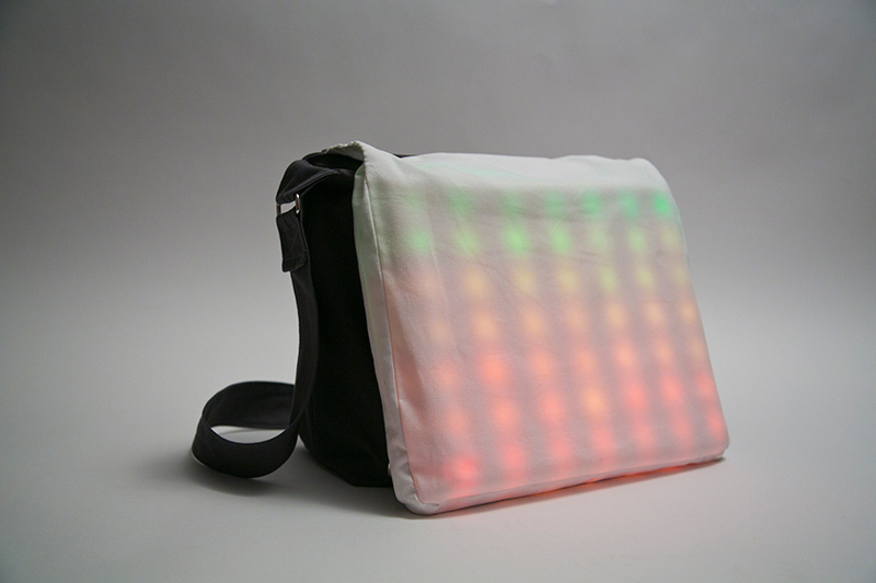
These components can tell what’s in your bag, and remind you if you’ve forgotten something. I first wrote the code for my Arduino to take the sensor input from the RFID sensor and tested it to make sure it was working. Then I separately coded the Arduino to create different patterns, colors, and animations with the LEDs (Figure 1-23). Only after I had the two components working without bugs did I put them together and write the final code (Figure 1-24).
Mid to High Fidelity
Now that you have the hang of testing individual pieces, you can increase the fidelity level and begin testing the whole experience as part of a series of prototypes. To explain, I’ll use one of my past projects, Tempo, a haptic pacing armband. During development, I created six levels of prototypes, each one testing a unique part of the product. The original goal of the armband was to increase productivity by helping the user focus on the task at hand through a haptic rhythm. I had many assumptions to test to prove the viability of this goal.
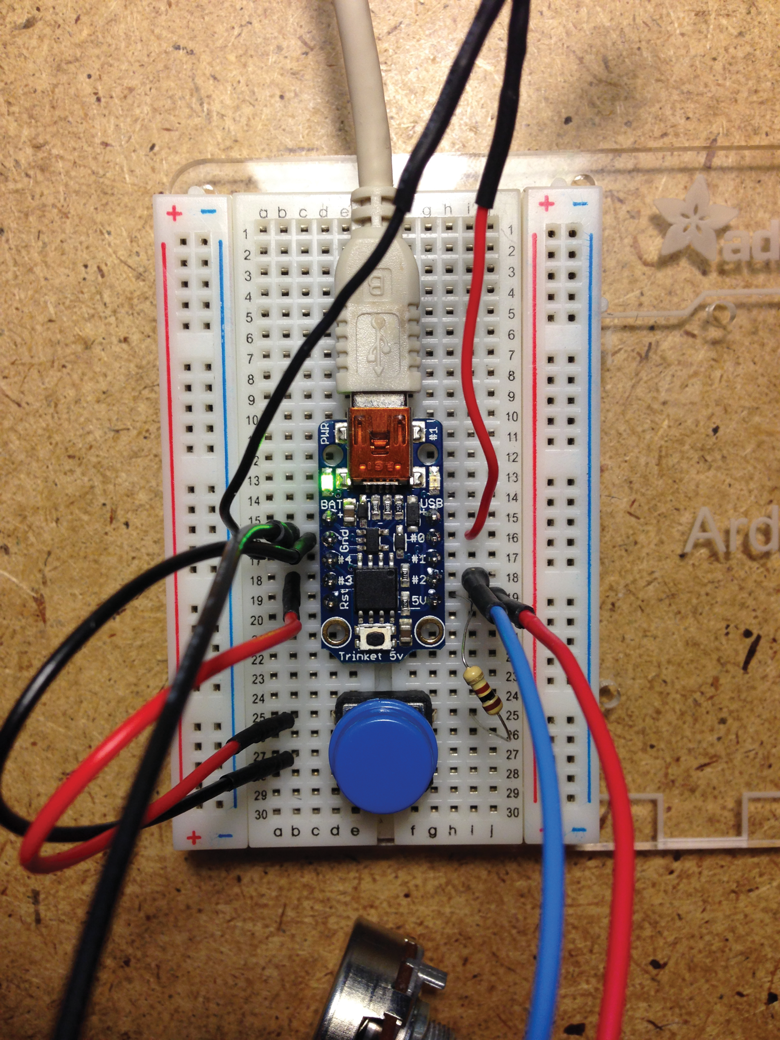
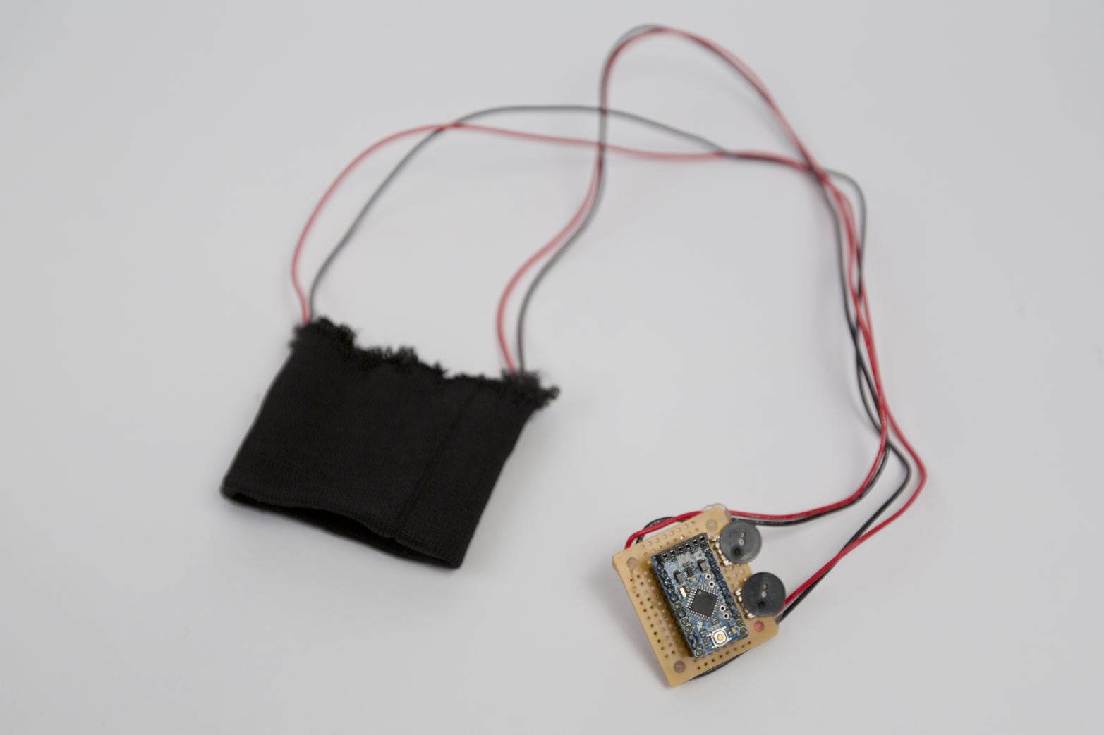
The first prototype uses a Trinket microcontroller and breadboard to try out the circuit and to see how strong the haptic output is (Figure 1-25). I tested a few different haptic motors to help me decide which one to use going forward.
The second prototype is quick and cheap and allowed me to test if the haptic sensation was viable or not (Figure 1-26). This one took 15 minutes to make and cost less than $15. I tested this with users to see if they had initial positive or negative reactions to having a pulsed pattern of vibrations. By using this prototyping, I could have learned that users completely hated the sensation; and then I could have pivoted the project with little loss of time or money. But I learned that they were open to the haptic output, so I moved on to the next prototype.
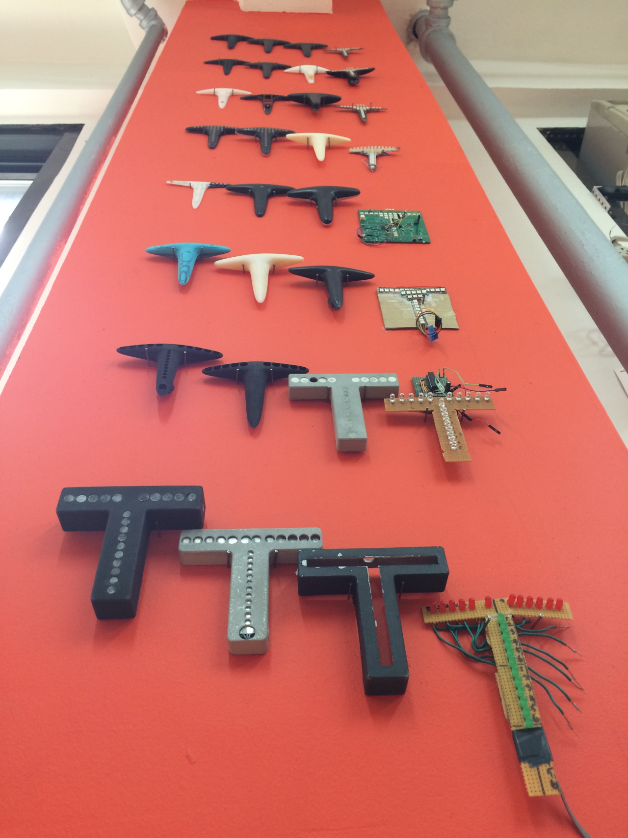
The third prototype is a little more refined (Figure 1-27), allowing me to carry it around with me and get feedback from many people about the specific pacing rate (Figure 1-28). I also had a few users wear it for a longer period of time to see how it affected their working rate and other activities. I learned that at a specific rate, the pulsing matched a cell phone ringing and was unnerving, so I was able to change the cadence of the vibrations moving forward. Another insight was how users put these armbands in surprising places. Most put it on their wrist, lower, or upper arm, but a few put it on their ankle and forehead. These interactions prompted me to consider designing a more flexibly sized band that could accommodate different placements on the body.

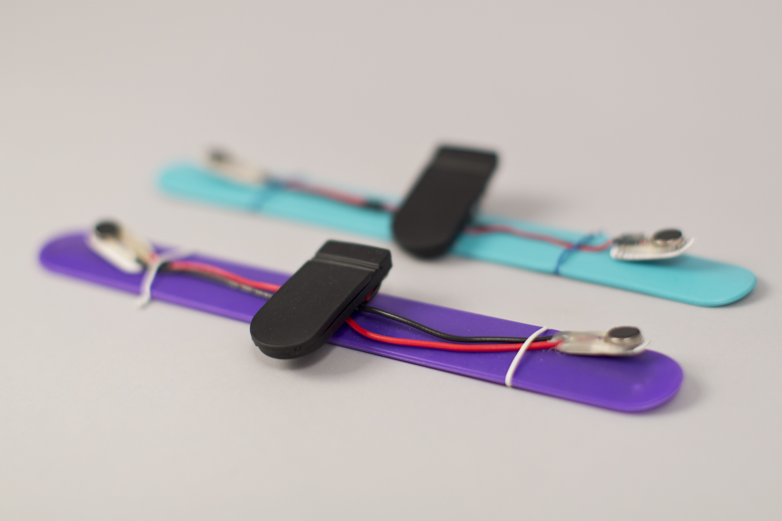
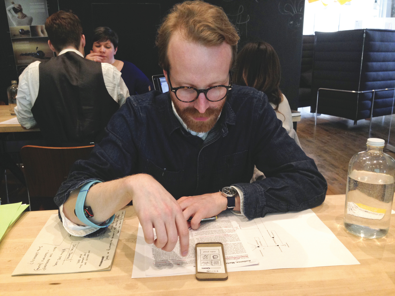
The fourth prototype includes input dials, so that the user can control the length of the pulse, and the length of the pauses between the pulses (Figure 1-29). I gave this prototype to users to incorporate into their work process, and let them control the pulsing. The added control was a huge hit with my users. They played around with the dials until it was a perfect rate and gave feedback that they wanted to save their favorite patterns so that they could go back to them depending on the activity they were doing (Figure 1-30). I was able to incorporate that feedback into the app design. They also gave a variety of different activities they’d like to use the armband for, including meditation, yoga, run pacing, silent metronome, and as a therapeutic device for carpal tunnel. Because of this feedback, I was able to widen the scope of my use cases to include productivity, sports, music, and therapy. Now I had more, new assumptions to test.

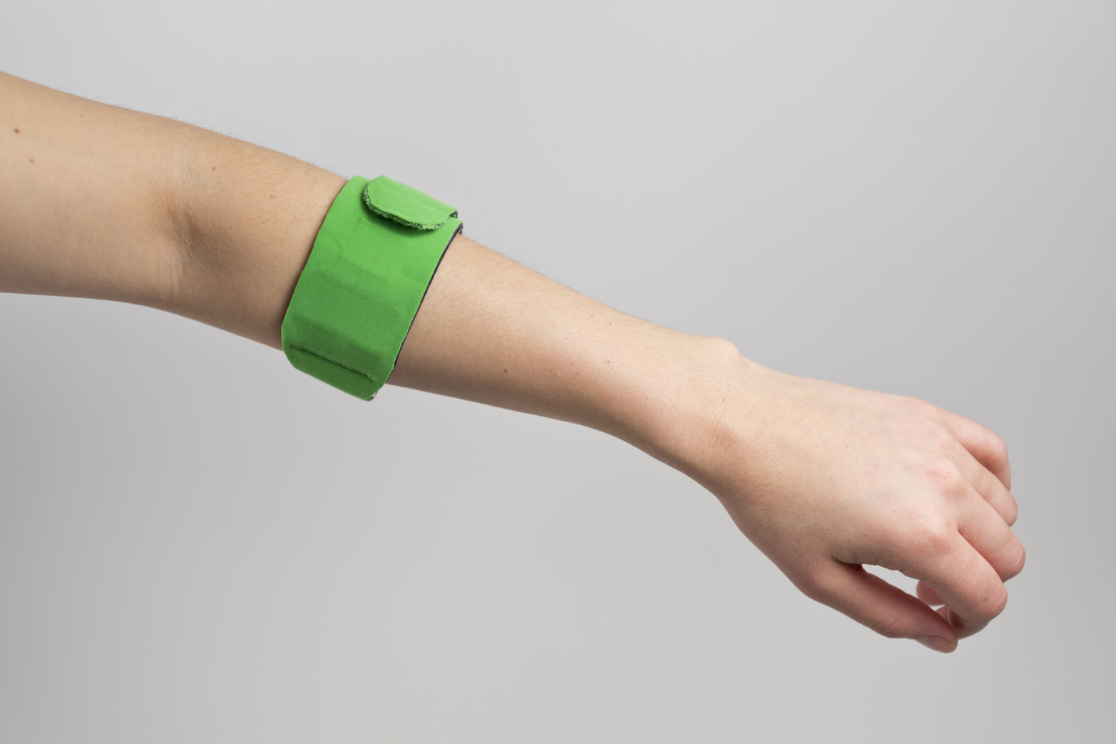
The fifth prototype is a material study for a sports use case (Figure 1-31). I tried using silicon bands and neoprene fabric before settling on the latter. I had users wear this model and rate the comfort level of the material on their skin, and even use it during runs and yoga to test the viability of the use case (Figure 1-32). I got feedback that the interaction of pulling the band through and folding it was not ideal. It was also a bit bulky, so for the next iteration, I tried to source thinner components and think through alternative ways to make a flexibly sized, comfortable band.

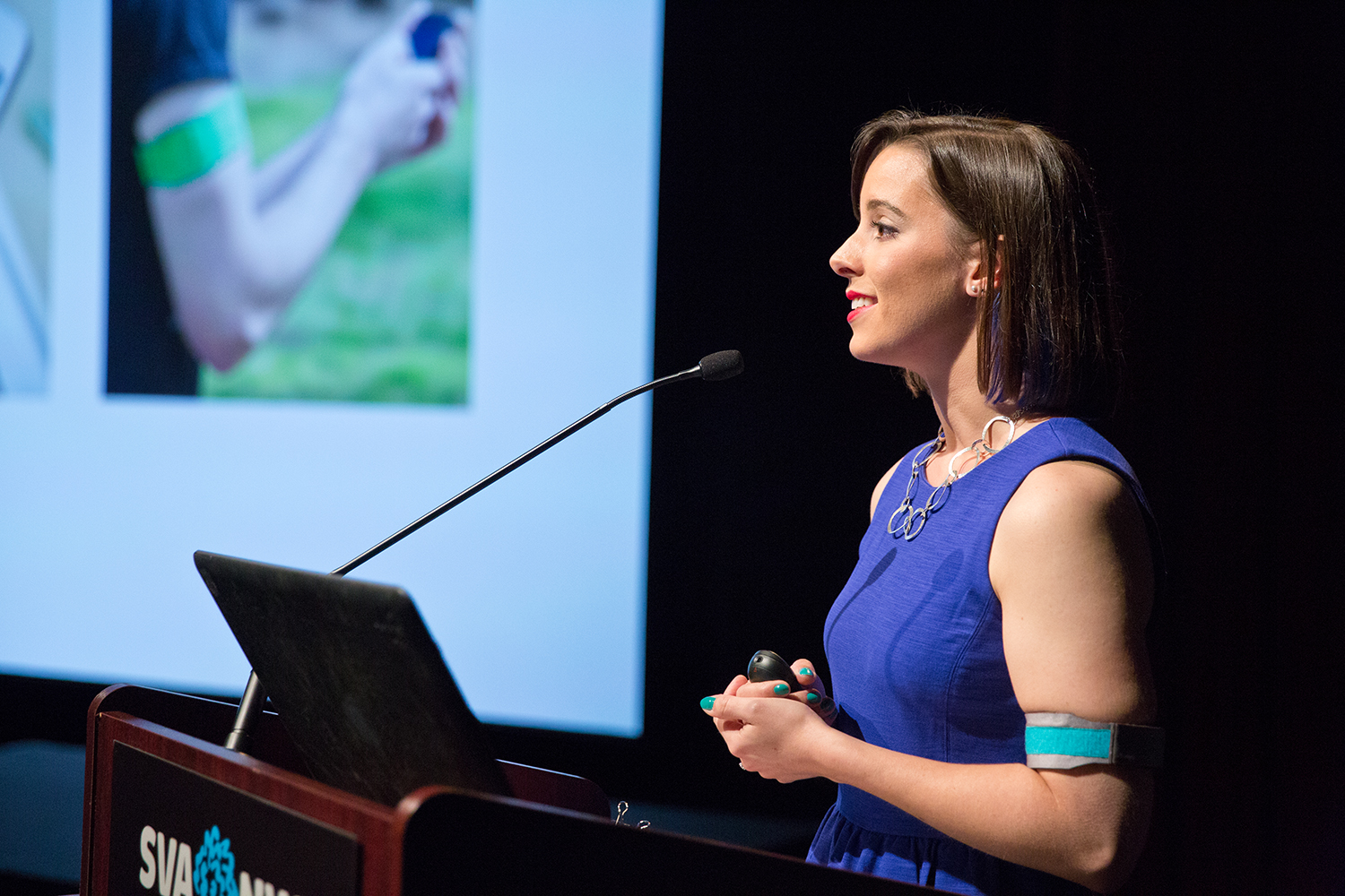
The sixth prototype puts the insights gathered from the previous five together with the final materials and full capability (Figure 1-33). With this prototype, I tested long-term use. I regularly wear this during my own presentations to help me talk at a slow pace, as directed by the pace of the band, and it helps me remember to breathe while speaking to large groups of people.
Each of these prototypes improved my product in a unique way, and built upon each other in order to create new use cases, validate original use cases, and be fully functional and ergonomic. The next steps to develop this prototype into a product are to develop manufacturing-ready specs and work with companies to source the parts and labor to make an initial run of the product.
A similar process of prototyping through many versions can be applied to all sorts of smart objects and Internet of Things products. One example is the Hammerhead smart bike navigator (Figure 1-34).3 This team went through countless iterations before deciding on the functions, form, and app for their product. Another example is IDEO’s work on the Diego medical device. They worked directly with surgeons to understand their existing tools, their current problems (including clogging and cord tangling), and even co-creating ergonomic handle designs. Their final product not only reduces the duration of procedures, it also increased revenues by 300% and market share by 16%.4
With the guidance and resources in this section, I hope you feel empowered to try your hand at making electronic prototypes for your product ideas.
Prototypes for Digital Products
Prototyping for digital products has its own set of essential characteristics, which includes creating a unified experience across multiple devices. Software and apps are accessed not only on computers, but also on smartphones, smart watches, tablets, and other interfaces. The unique aspects of designing for the screen are thinking through the different user flows that might occur, responsive design, and designing for screen, touch, and voice interactions.
User Flow
User flow is how someone navigates and uses your software or app design. After you understand what pain point you’re solving for the user, and the user’s goal within the software, you design the route that will be the easiest and fastest way for a user to complete his or her task, or the “happy path.” These flows must be prototyped and tested to make sure that they are clear, and that users actually follow them. Oftentimes, a user will find a new way to move through your app, and might miss the main functions because of that. By testing prototypes, you’ll be able to improve the overall design to help the user easily flow from task to task.
Responsive Design
If you’re designing a web-based digital experience, you must design it to be responsive and mobile-first. Smartphone browsing has exponentially increased in the last few years, and surpassed desktop browsing in 2014.5 With this in mind, it’s important to create prototypes for a variety of screen sizes, and even better to create responsive prototypes that can be used to test both desktop and mobile experiences.
Designing for All Interaction Types
With mobile interaction comes designing for touch, and additional sets of constraints to design within. Your navigation and menus must be accessible, and your content must be legible in a smaller screen size. This type of interface can include voice input and audio output depending on your functions. These aspects are a little more difficult to prototype, but creating proxy interactions and play-testing can allow you to test the interface at a lower fidelity before you commit to extensive implementations.
Low-Fidelity Prototypes
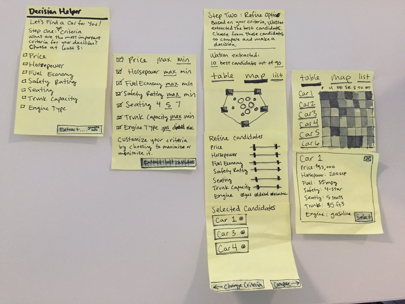
The lowest fidelity prototype that you can start with is writing out the user flow, as this will determine the type of interactions you need to prototype later (Figure 1-35). Start with how the user finds your app and write out the flow until they are finished using it. Write out each step that the user will take to complete their task in your app. If you write this out on Post-its, you can think through alternative flows by reordering them. This exercise helps you be flexible with the interface you design.
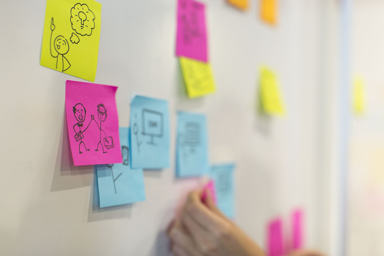
Now that you have a core idea for the function of your app, you can begin to test some of your basic assumptions with low-fidelity prototypes. If you’re designing a website or software that has navigation, you can develop the information architecture through a card sort or through paper prototypes.
Paper Prototype
Paper prototypes are low fidelity, low cost, and low skill (Figure 1-36). They’re fast to make and test, and enable you to try out many different ways to solve the same problem in a short amount of time. To make a paper prototype, think through the specific assumption you want to test (navigation, completing a partial task, etc.) and decide which parts of the design will be needed. Draw out your wireframes on separate pieces of paper or Post-its, with each interaction having an additional piece of paper. Make sure to include real content so that your test doesn’t give you false feedback due to the lack of context in your design.
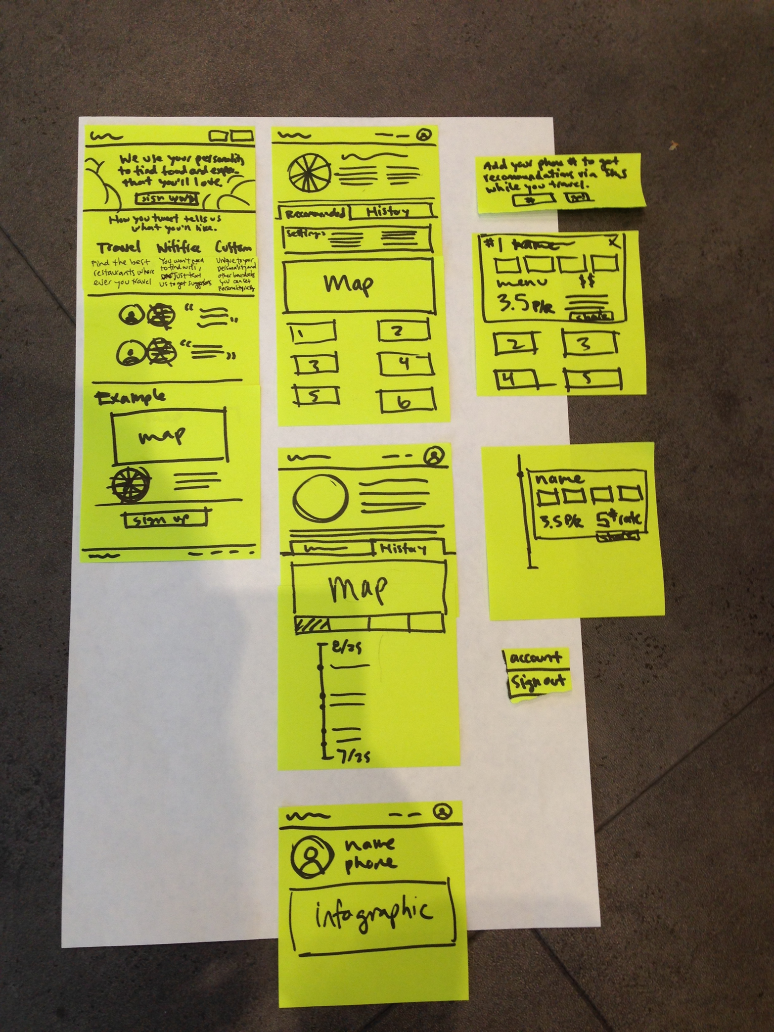
You can also make different fidelities of paper prototypes. By adding more content, more detailed buttons, and illustrations, you can get feedback on all parts of your design. Try out alternative wordings for your calls to action, different sizes of buttons, and even completely different layouts for the same content. This step is where you want to establish your core assumptions, and experiment while you still have the opportunity.
Clickable Prototype
Another way to make a low- or mid-fidelity prototype is by turning your analog paper prototypes into clickable prototypes (Figure 1-37). This automates the interactions a bit, and makes it easier to test. There are many apps that make this easy including Prototyping on Paper, Axure, and InVision. You can take pictures of each of the screens you drew, put hot spots on interactive areas such as buttons and text fields, and select what happens when they’re clicked. Then you can test these clickable prototypes similar to how you did the paper prototypes, but with less work on your behalf to move the paper pieces around during the session.
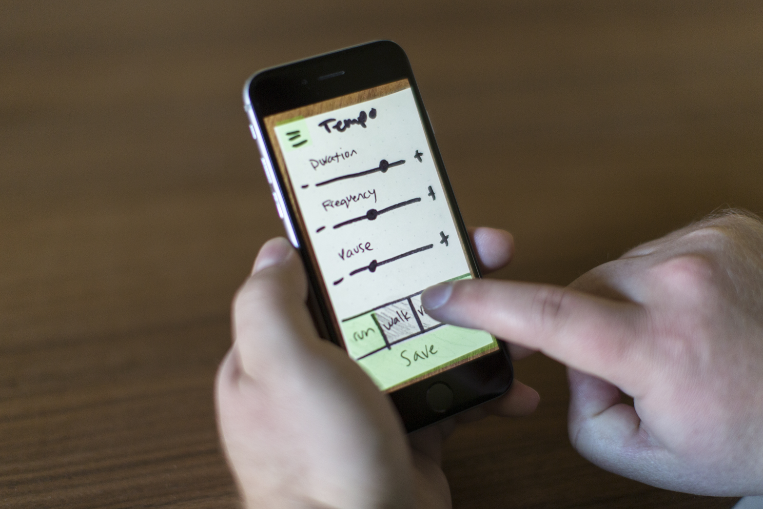
A mid-fidelity prototype can also be created using more powerful software like Sketch, InVision, or Axure, and built from scratch (Figure 1-38). See Table 1-2 for details on each current tool. The learning curve is a bit higher and it takes more time, but you can build a dynamic prototype, adding real data and content, more functionality, and different interactions as needed, and then save it out to access online through the browser. Some of these tools include basic animation capability, which is important to test during this phase to determine loading order, UI help text, and even error states. Mid-fidelity clickable prototypes are good for testing general interaction patterns on the actual device and using real input such as finger, mouse, or keyboard.

| Name of program | Fidelity | User testing | Dynamic elements | Pros | Cons |
|---|---|---|---|---|---|
| Axure | Medium–High | Average | Good | Create complex interactions, works with any digital format, extensive library of widgets to build out screens | High learning curve, difficult to use existing mocks |
| Balsamiq | Low | Low | Low | Quick, low-fidelity prototypes | Limited functionality and motion options |
| Framer | High | Average | High | High-fidelity animation and interactions, can import Sketch or Illustrator files | Code-based, steep learning curve |
| HotGloo | Low | Low | Average | Good library of UI elements | No import options, no animation support |
| Indigo Studio | Medium | Average | High | Gesture-based interactions, can prototype any digital format | Doesn’t import mock-ups, just images, moderate learning curve |
| InVision | Medium–High | Good | Average | Easy to learn, great feedback and sharing system, easy to import from Sketch or Illustrator | No features for creating elements, must have file from other program, hotspots only |
| Justinmind | Medium | Good | Good | Good animation and gesture tools, simulates final device for testing | Moderate learning curve |
| Keynote | Medium | Medium | Average | Low-skill animation prototyping | Limited functionality, not built specifically for prototyping |
| Marvel | Medium | Good | Average | Easy to learn, fast to build with existing mocks, basic animations | No features for creating elements, limited interactions, hotspots only |
| PoP | Low | Medium | Average | Very fast, easy to use, includes some gestures and animations | Limited functionality, must have own mocks or sketches, hotspots only |
| Proto.io | Medium | Average | Average | Can add animations to individual elements, good simulation of complex interactions | Learning curve, difficult to use existing mocks |
| Solidify | Good | High | Average | Good for click-through prototypes, great for user testing, collects qualitative and quantitative data, some animation options | No animation for individual elements, no features for creating elements in-tool |
| UXPin | Medium | Good | Average | Large library of UI elements, can add animation to individual elements, some import options | Learning curve, limited interactions, no animated transitions or gesture-based interaction |
Coded Prototype
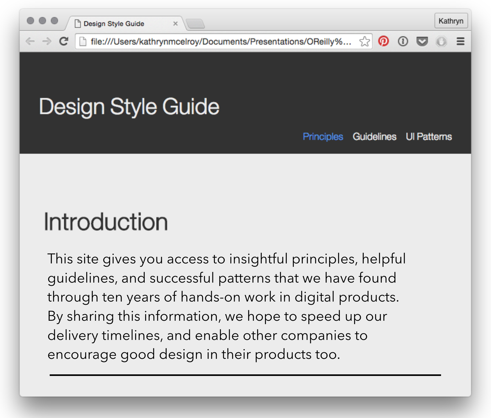
Coded prototypes are also mid-fidelity, because they are in the same medium that the final product will be (Figure 1-39). Coding a basic prototype with HTML/CSS is relatively straightforward for mid-fidelity, and allows you to create a responsive design that can be tested across different browsers and devices. You can also use pattern libraries such as Bootstrap or Foundation to help you build faster. However, when you need more complex interactions and higher fidelity levels, you’ll need to use JavaScript, jQuery, or other more powerful programming languages.
I believe that all designers should understand the basics of code and should be empowered to create HTML/CSS prototypes, but as you move forward, it is best to partner closely with a front end developer or engineer to co-build useful prototypes for more in-depth testing. As they program intricate interactions, you can test more detailed tasks, including full user flows, purchasing an item, or signing up for a new service.
These prototypes should also include visual design, even in its initial stages. Visual design should never be left until the end of the process; it should be developed alongside the functionality and fidelity levels of the prototypes. Visual cues help users interact more intuitively with the system, and include spacing, color, font choices and sizes, and iconography. Keep an eye out for users that don’t notice important calls to action, interactive fields, or links. Visual design greatly helps these areas and may need to be tweaked depending on your testing.
High-Fidelity Prototype
Now that you’ve worked out most of your assumptions through prototyping and user testing, and fixed any big problems along the way, you can create high-fidelity prototypes to bring all of your learning and design together (Figure 1-40). The best approach is a high-fidelity coded prototype, but if you don’t have the capability, some of the best tools for creating these prototypes are Sketch and Illustrator in combination with prototyping tools like Axure and InVision. The specific tool doesn’t matter as much as the execution of prototype. It should include high-fidelity visual design (this is the time for pixel-perfect), your exact data, content, and written material, and animations and interactions (Figure 1-41). It’s still a prototype, so the entire system might not be present, but the parts that are should look exactly like the expected final product.
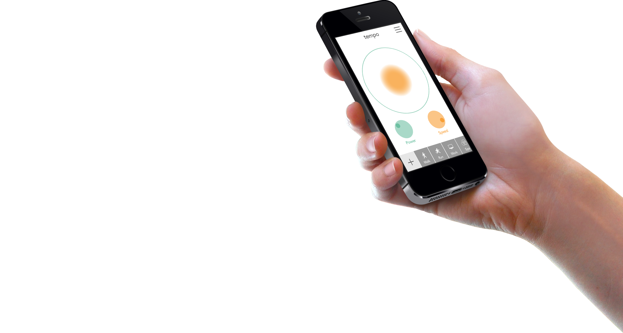
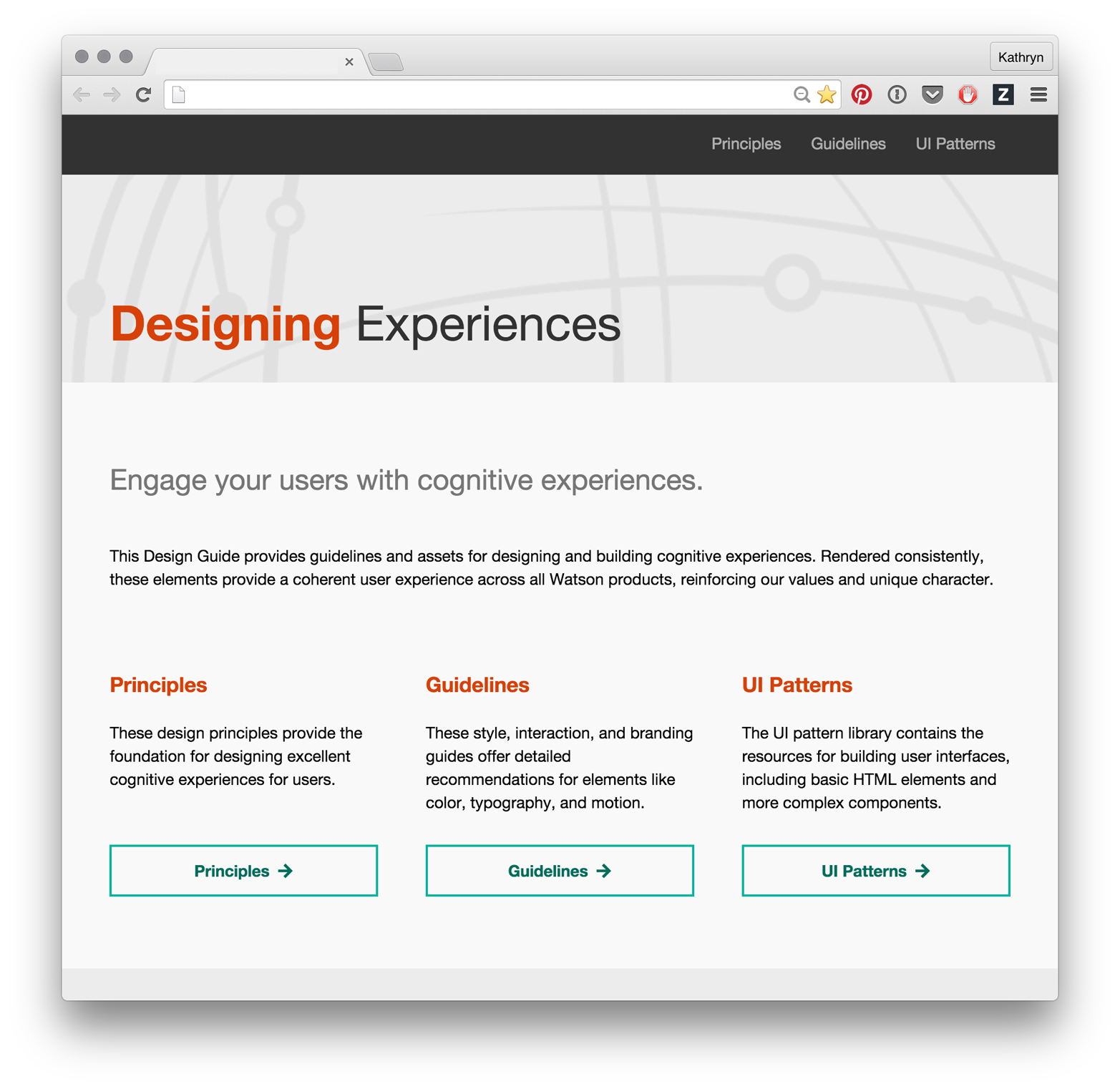
At this point in your process, you’re testing minute details and interactions. Is the font size appropriate for the different media sizes? Are the animations adding to the experience and not distracting the user? Is the content easy to read, and are the calls to action clear and accessible? You can conduct longer, more detailed tests, and users can tackle complex interactions.
Use these prototyping types as a toolkit from which you can pull what you need, when you need to. Remember to write out the assumptions you’re testing, and then choose the proper fidelity level and type of prototype you need to prove or disprove that assumption. The best user experience designers and prototypers don’t depend on just one tool; they have a whole arsenal of options that they’re comfortable with, and choose which one to use for each specific engagement.
User Testing with Prototypes
After you’ve created your first, or hundredth, prototype, you’re ready to user test it. User testing is the process of getting someone who is as close to your ideal user as possible, and who is not you, to interact with your prototype and find any pain points, problems, or confusion within your proposed idea. Observing a user directly interacting with your prototype will give you a wealth of information beyond just “did the task get finished?” By being in person, or including a video feed of your remote user’s face, you can look for micro-expressions of frustration, delight, and confusion, and then ask follow up questions to why the user felt that way. It’s qualitative data that lets you examine the emotional response to an experience, rather than just the quantitative analytics once it’s delivered.
The first step for successful user testing is to create a research plan that includes exactly what assumptions you want to test, the goal of the research, a few basic questions to establish who the test subject is, and the questions you need to ask or the tasks the user needs to accomplish to test the assumptions. This document can be formal, including a list of your stakeholders and business objectives that the test will affect, or it can be more casual, acting as a guide to help you during your testing. For a more formal version, look at Usability.gov’s template.
The Assumptions and Goals
You should already know the assumptions you’re testing because you designed the prototype to address those concerns directly. If you don’t, though, start by writing out exactly how you expect your user to use the prototype and point out the most important interactions that the user needs in order to understand and use your product. Look back to your user flow, and see where there might be deviation points from your happy path. If you’re later in the process, your assumptions will be more specific interactions and patterns.
Once you’ve written out your assumptions, write your goal for the test. If I’m making a meditation app, and my assumption is “users will be able to find the additional meditations in the menu,” an example goal is “determine if a user can discover and choose a new meditation.”
The Questions
There are two types of questions you should ask your user: establishing questions and feedback questions. Establishing questions allow you to get to know this specific user, to understand their work background, and to find any hidden biases that may affect your testing. Here are some examples of the information you may want to gather:
-
Name
-
Job Description
-
Team profile (if it’s a work-based software)
-
Home life (if it’s a lifestyle product)
-
What software/apps/smart objects do you use on a regular basis?
-
What is your favorite app/smart object to use recently and why?
Feedback questions are the meat of the interview, and should be written to accomplish your goals. When you write these questions for your user testing, there are a few guidelines you should follow. The objective of these questions is to get your user to interact with your prototype in either an open or closed way (exploratory versus guided, depending on the research goal), and talk about what they are doing, what they expect, and what issues they’re having. The biggest rule for writing research questions is to create open-ended, non-leading questions that do not result in “yes” or “no” answers. As the following table illustrates, you should frame your questions in an open-ended manner to keep the conversation—and insights—flowing:
| Don’t ask this | Ask this instead |
|---|---|
| Would you use this product? | How might this product integrate into your daily life? |
| Did you like feature “A”? | Observe how they interact with the feature; ask, “what did you expect to happen?” |
| Do you like this product? | What’s your impression of this product? |
| What was your favorite thing about this product? | What were the top two things you liked and the top two things you disliked about this experience? |
The more you can get the user to talk about the experience with your software or physical product, the more likely you’ll find nuggets of insight and wisdom in what they’re saying. More often than naught, the most insightful conversations I have are usually right after the “testing” is done, and we’re just talking about what the user thought of the whole experience. So keep recording your conversation until the entire session is over!
The Tasks
Tasks are another way to guide the research so that you’re testing your specific assumptions instead of letting a user go randomly through your product. Tasks should give the user a goal that aligns with the research goal, and then see if the user takes the assumed path to complete that goal. For the meditation app example, a task would be “sign into the service and choose a new meditation to listen to.” It does not directly tell the user how to complete the task, just what they should accomplish. Now you can see if your user’s actions match your assumptions.
A Sample Research Plan
Here’s a sample research plan for the meditation app example:
- Goals and Assumptions
-
- Determine if a user can discover and choose a new meditation
- Assumed that they will find the catalog of meditations and will be able to choose one based on the provided information
- User Profile
-
- Beginner or intermediate experience with meditation
- Has meditated at least once in the past week
- Questions
-
- Name
- Job description
- What role does meditation play in your life?
- How often do you meditate?
- Do you use other existing meditation apps or products?
- Tasks
-
- You are a returning user to this meditation app, and you’d like to find a new meditation that fits your current mood.
- Once you’ve “listened” to the meditation, you want to come back and use it later. How do you accomplish this?
- Now that you’ve finished, what were the top two things you like about this app, and what were the two things you disliked about it?
Conducting the Research
With your research plan in hand, you’re ready to conduct your research. First thing you’ll need to do is find users to test with. It may seem daunting to reach out to people to test a prototype, but I have a few tricks that make it easier.
The first is to check with your friends and family to see if anyone fits your user persona. It’s helpful for you to interview them first to get an initial test done, but remember that because of the nature of your relationship, they might not give you the hard constructive feedback you need. Take their feedback with a grain of salt. It’s also better to use friends for lower-fidelity prototypes that need bigger-picture feedback.
The second, and best way I’ve found to engage specific users is to look for a meet-up that your ideal user would attend, reach out to the organizers, and see if you can attend the next event. For the meditation app, it would be easy to attend any sort of meditation meet up and after it’s done, ask the other attendees if they’d be interested in helping you with a project. You’ll be surprised how many people love trying new products before they come out. You can also put ads out on Craigslist or Facebook, go to locations your users hang out and intercept people for short interviews, or even place prototypes in the environment to get people to interact with them (more so for outdoor smart objects).
Set up your research session for success by gathering the necessary materials before you start. You’ll need a consent form for your user to sign, such as this one from Usability.gov, the prototype, a way to record at least the audio, if not a video or screencast of the session, and ideally a second person to take notes while you pose the questions and tasks.
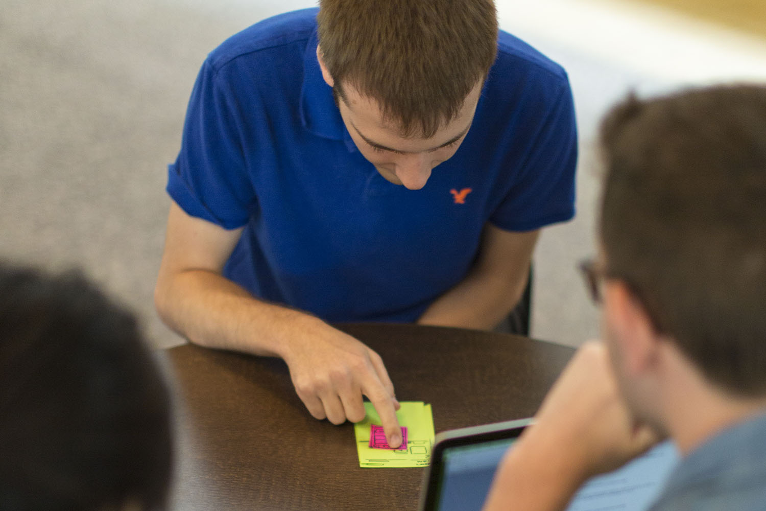
During the session, make sure to record from the beginning to end, and have your user think out loud as they go, so you can hear what they expected and what their initial reaction is to the content (Figure 1-42). Keep an eye out for micro expressions, where the user looks confused, excited, frustrated, or even scared for a split second. Dig deeper into those reactions and ask what they saw or thought just then. My favorite question to ask when I see microexpressions is “what did you expect to happen?” Take notes, and return to the recording to take additional notes about what the user enjoyed, disliked, and anywhere they got confused along the way.
Finding Insights
After the session, and preferably within a day, you’re ready to find insights in the interview. Remember that if a user went off your happy path, it’s a good thing! You’ve found a problem that a user would have had with your finished product, but you found it before your product shipped. Seeing where people get lost is the main goal of prototyping and testing; it means the prototype was valuable.
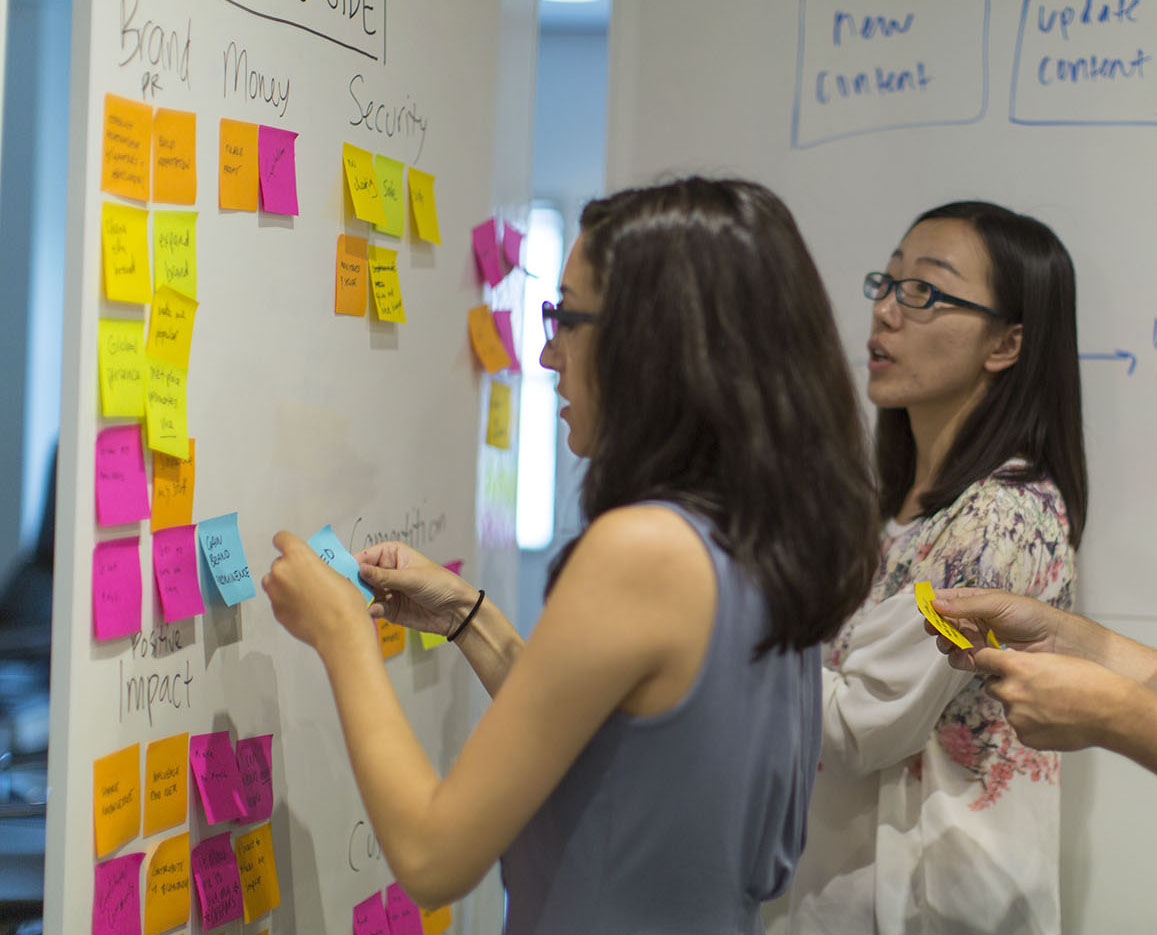
Start by going over your notes, and writing anything that is potential feedback onto individual Post-it notes or in a list. After you’ve gone through the entire interview and you have a ton of Post-its, look over all of them and start grouping similar ideas into categories (Figure 1-43). These categories will tell you what can be improved in your prototype, and what you should ideate on next.
Think of lots of different solutions for those problems, and decide which solutions to include in the next prototype you design. This user testing process will help you improve your product, communicate those improvements to your stakeholders, and keep the user central to your design. With a little bit of planning, you can conduct these experiments as part of your weekly sprint cycle or longer-term workflow.
Conclusion
Prototyping is a core skill for all designers, and it’s the best way to improve your product with user-centered design leading the way. By testing your ideas with your ideal users, you can create a more intuitive and useful product for them, whether it’s physical or digital. Your MVPs will have more punch, and your stakeholders will be impressed. I hope this report has given you a good basis for what prototyping is, why you should prototype more often, and the tools you need to begin building prototypes and testing them. I hope you feel empowered to prototype early and often. Don’t wait for perfection; test what you have now so that you can improve your product for your user.
1“Prototype,” Merriam-Webster, accessed January 10, 2016, http://www.merriam-webster.com/dictionary/prototype.
2“The Lean Startup,” The Lean Startup, accessed January 10, 2016, http://theleanstartup.com.
3“Hammerhead,” Hammerhead, accessed January 10, 2016, http://hammerhead.io/index.php.
4“Diego Powered Dissector System,” Diego Powered Dissector System, accessed January 10, 2016, https://www.ideo.com/work/diego-powered-dissector-system.
5Mary Meeker, “2015 Internet Trends Report,” 2015 Internet Trends—Kleiner Perkins Caufield Byers, May 27, 2015, accessed January 10, 2016, http://www.kpcb.com/internet-trends.
6Schwartzman, Emily. “Designer’s Toolkit:Prototyping Tools.” Cooper. Accessed February 20, 2016.
http://www.cooper.com/prototyping-tools.
