UX for beginners: Key ideas
So, you want to get started in UX design? Good. You came to the right place.
 Books and magazines. (source: Pexels)
Lesson 1: What Is UX?
Everything has a user experience. Your job is not to create the user experience. Your job is to make it good.
And what do I mean by “good” user experience? It is common to think that a good user experience is one that makes users happy.
Not true!
If happiness was your only goal, you could just throw in some Lolcats and random compliments and go home. But—although that’s not the worst universe I can imagine—your boss may not be satisfied with the results. The goal of a UX designer is to make users effective.
A user’s experience is just the tip of the iceberg:
Many people mistakenly think that “UX” means a user’s experience, but it is actually about “doing” the process of User Experience Design. A user’s individual experience is their conscious, subjective opinion of your app or site. User feedback is important—sometimes—but UX designers need to do a lot more than that.
“Doing” UX
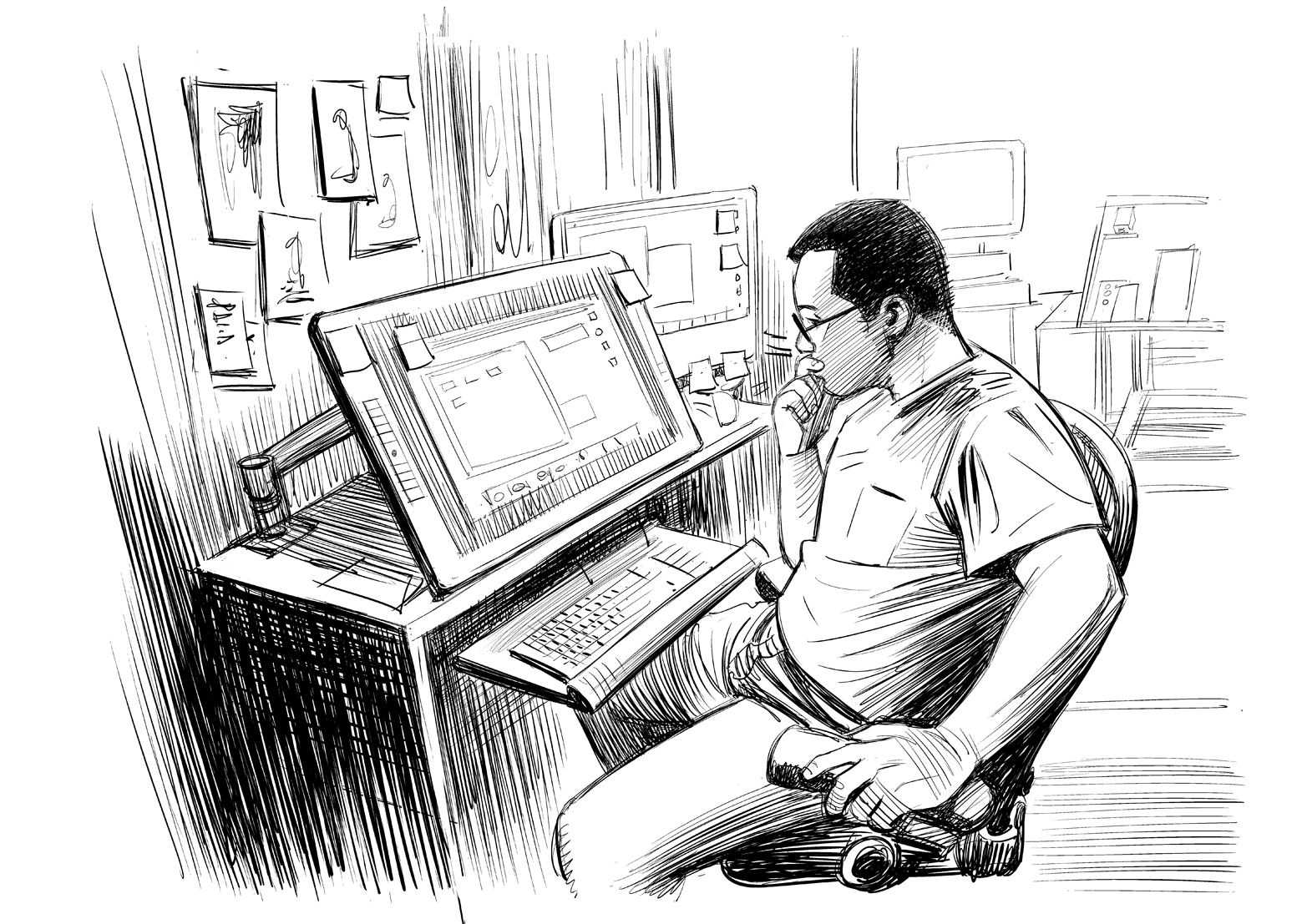
UX Design (also sometimes called UXD) involves a process very similar to doing science: you do research to understand the users, you develop ideas to solve the users’ needs—and the needs of the business—and you build and measure those solutions in the real world to see if they work.
You will learn about all of that in this book. Or if that’s not your deal, Lolcats are still an option.
Lesson 2: The Five Main Ingredients of UX
Any one of these five ingredients could be a book of its own,
so I will be oversimplifying a bit. This is supposed to be a crash
course, not Wikipedia.
Although, to be fair, I’m pretty sure Wikipedia’s UX page was
written by a guy who heard about UX once… at that thing…
that time…
1. Psychology
A user’s mind is complex. You should know; you have
one, (I assume). UXers work with subjective thoughts and
feelings a lot; they can make or break your results. And
the designer must ignore their own psychology sometimes,
too, and that’s hard!
Ask yourself:
- What is the user’s motivation to be here in the first
place? - How does this make them feel?
- How much work does the user have to do to get
what they want? - What habits are created if they do this over and over?
- What do they expect when they click this?
- Are you assuming they know something that they
haven’t learned yet? - Is this something they want to do again? Why? How
often? - Are you thinking of the user’s wants and needs, or
your own? - How are you rewarding good behavior?
2. Usability
If user psychology is mostly subconscious, usability is
mostly conscious. You know when something is confusing.
There are cases where it is more fun if something is
hard—like a game—but for everything else, we want it to
be so easy that even a (moron) could use it.
Ask yourself:
- Could you get the job done with less input from the
user? - Are there any user mistakes you could prevent? (Hint:
Yes, there are.) - Are you being clear and direct, or is this a little too
clever? - Is it easy to find (good), hard to miss (better), or subconsciously
expected (best)? - Are you working with the user’s assumptions or
against them? - Have you provided everything the user needs to
know? - Could you solve this just as well by doing something
more common? - Are you basing your decisions on your own logic
or categories, or the user’s intuition? How do you
know? - If the user doesn’t read the fine print, does it still
work/make sense?
3. Design
As the UX designer, your definition of “design” will be
much less artistic than a lot of designers. Whether you
“like it” is irrelevant. In UX, design is how it works, and
it’s something you can prove; it’s not a matter of style.
Ask yourself:
- Do users think it looks good? Do they trust it
immediately? - Does it communicate the purpose and function without
words? - Does it represent the brand? Does it all feel like the
same site? - Does the design lead the user’s eyes to the right
places? How do you know? - Do the colors, shapes, and typography help people
find what they want and improve usability of the
details? - Do clickable things look different than nonclickable
things?
4. Copywriting
There is a huge difference between writing brand copy
(text) and writing UX copy. Brand copy supports the
image and values of the company. UX copy gets shit done
as directly and simply as possible.
Ask yourself:
- Does it sound confident and tell the user what to do?
- Does it motivate the user to complete their goal? Is
that what we want? - Is the biggest text the most important text? Why not?
- Does it inform the user or does it assume that they
already understand? - Does it reduce anxiety?
- Is it clear, direct, simple, and functional?
5. Analysis
In my opinion, most designers’ weak spot is analysis.
But we can fix that! Analysis is the main thing that separates
UX from other types of design, and it makes you
extremely valuable. It literally pays to be good at it.
So, ask yourself:
- Are you using data to prove that you are right, or to
learn the truth? - Are you looking for subjective opinions or objective
facts? - Have you collected information that can give you
those types of answers? - Do you know why users do that, or are you interpreting
their behavior? - Are you looking at absolute numbers, or relative
improvements? - How will you measure this? Are you measuring the
right things? - Are you looking for bad results, too? Why not?
- How can you use this analysis to make
improvements?
Lesson 3: Your Perspective
Know Thyself
There are two things you need to be aware of, about yourself, before you can start understanding users well:
- You want things that don’t matter to users.
- You know things that don’t matter to users.
Meditate on that for a minute.
Namasté.
Empathy: Want What They Want
If there is one word that is over-sold in UX, it’s “empathy”. It is important though. It is. In general, and in UX.
But here’s a secret: unless you are a serial killer, you have empathy. If you are a serial killer, UX design might not be for you. What we want by nature might not be what the users want. And that’s a big deal. It means your intuition about the users might be wrong!
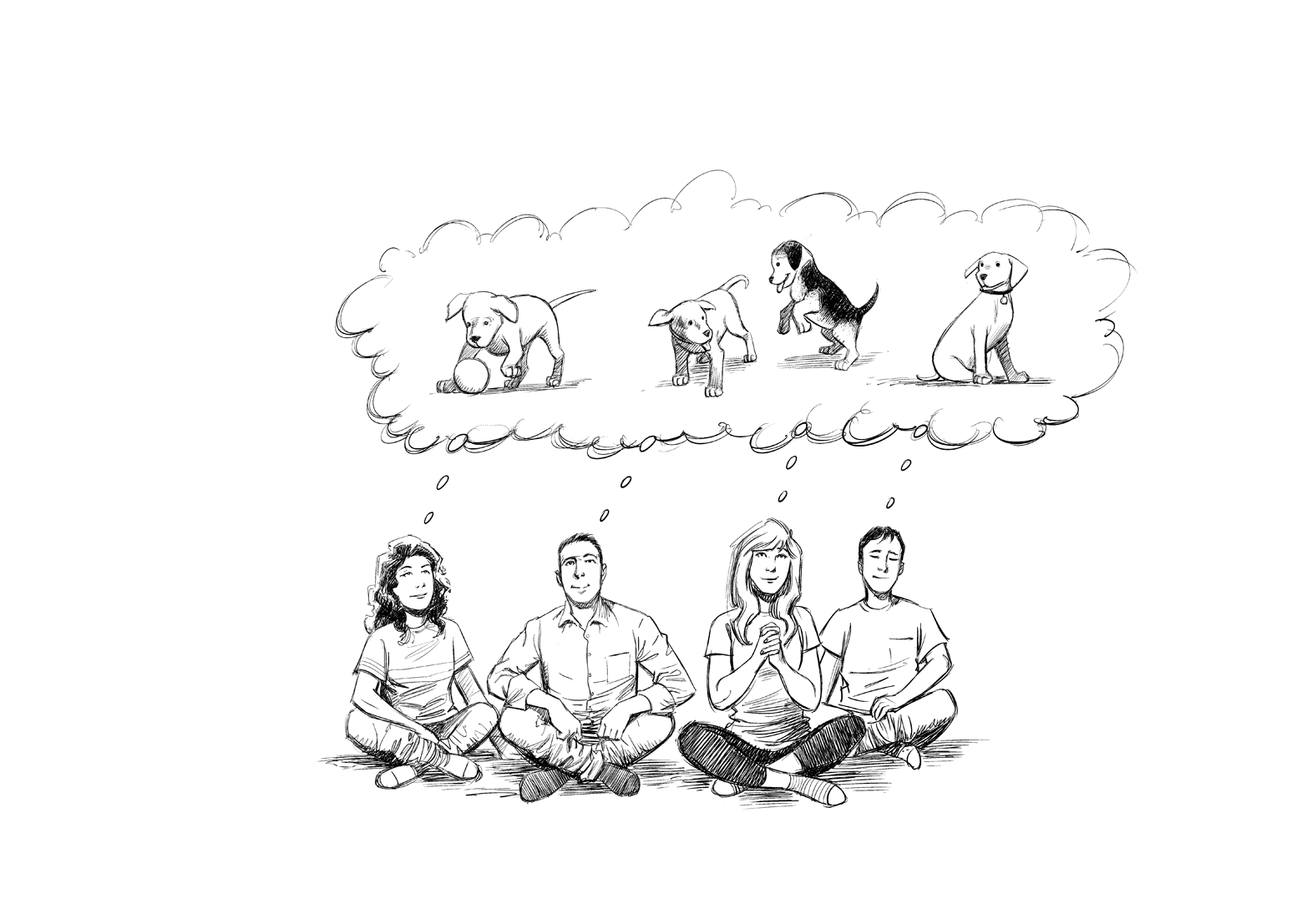
Do research. Talk to users. Study the data. Cuddle some puppies. When you truly understand a problem, it becomes your problem, emotionally. That’s empathy. You will feel it. A good solution will excite you. Not because you’re an emotional superhero, but because you relate to the users.
You’re one of them now.
*single tear*
Ask yourself:
- If you have to choose between a feature for your users or having this design in your portfolio, what will you choose?
- If users don’t like your design, what would probably be the reason?
- Have you actually tried the software, or are you just clicking “next” to get through it?
You Know Too Much
Designing for people who know less than you is a core part of UX.
Not people who are dumber than you. People who know less.
You know that your site gets more powerful if you customize it, but users don’t. You know that your menu categories match the teams in your company, but users don’t. And you know your prices are high because licensing fees make your content expensive to make, but users don’t.
If users don’t know, users don’t care. And sometimes even when they do know, they don’t care! Licensing fees? That’s your problem. They can get a pirated copy for free.
Ask yourself:
- If you didn’t read the text, would you understand?
- If a user only had a few clicks to find what they want, would this design be your best bet?
- Are you judging a feature based on the time it will take to build it or the value to the user?
- Are you assuming users will click it just because it exists? (They won’t.)
Lesson 4: The Three “Whats” of User Perspective
A good design communicates three things:
- What is this?
- What is the benefit for the user?
- What should they do next?
“What Is This?”
It is always a good idea to have a title or an image (or both) that answers the question: “what is this?” Seems pretty basic, right? But it’s amazing how many websites forget to do it. Why? Because we already know. But the user doesn’t. Is it an article? A registration form? A party for people who love lemons? A place to see goats? Your gerbil’s secret YouTube channel?
Just tell them. Directly. And use simple words. Nobody is excited when you pull out the dictionary at a party. Especially not a lemon party.
“What’s in It for Me?”
This is the “why” of user experience. What can the user gain?
It is better to show users what they will get, rather than tell them. You can use a video, demo, example images, free trial, sample content, testimonials, or several of those things!
The best answers to “what is it?” also tell you a little about what you get. For example, “A global network of megalomaniacs cooperating to conquer the world and share funny cat pics.” That tells you what it is, and what you get (assuming you’re a megalomaniac who loves cats).
Note
Remember
You’re saying what’s in it for them. Not why you want them to register/buy/click.
User motivation is a thousand times more valuable than beauty or usability—for the company—but how much time do you spend talking about it at work?
“What Do I Do?”
If the user understands what it is and they are motivated to know or see more, their next action should be obvious in your design.
It could be something small, like “What do I click now?” or “How do I register?”
It could be something bigger, like “How do I get started?” or “How do I buy?” or “Where do I get more training?”
There is always a “next” step. Sometimes there are a few possibilities. It’s up to you to figure out what the users might need, and tell them how to get it.
Lesson 5: Solutions versus Ideas
All types of designers work with ideas. And great ideas are great!
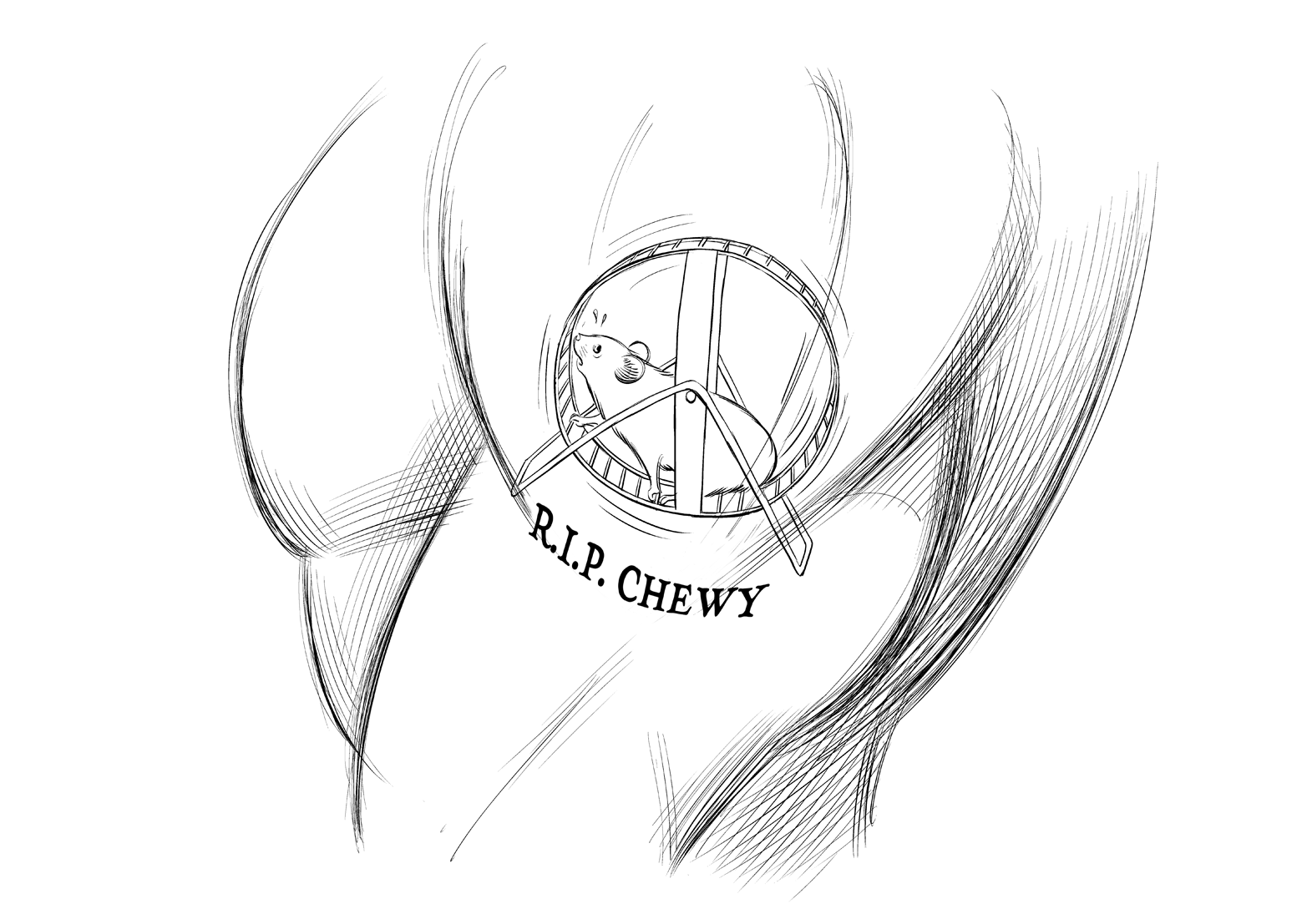
Ideas come in different flavors. Some ideas are things we would like to make, like, perhaps, a fish-and-chocolate soufflé. (“I love both of those things! They must be great together!”). Some ideas are meaningful to us in a personal way, like that tattoo that reminds you of your pet hamster, Chewy. God rest his soul. And some ideas are solutions to problems. That’s what UX is all about.
Solutions are ideas with meaning for other people.
Unlike most artists and designers, UX designers do not focus on the ideas that have meaning for themselves. You should care a lot about creativity, but if your ideas are not meaningful for other people—the users—then they are not meaningful for you.
That means you have to spend a lot of time trying to understand problems that mean nothing to you. And that might feel unnatural at first. That’s why UX is a unique, valuable job: it’s tricky.
Solutions are ideas that can be wrong.
In UX, we can test things. We can design more than one solution to the same problem and see which one is better. And we can ask users which solution they prefer.
This means that UX is a special kind of design: it can be wrong. And we can prove that it is wrong.
And the same solution can be right for one site, and wrong for another! Just because Twitter does it, doesn’t mean it’s right for you.
Lesson 6: The Pyramid of UX Impact
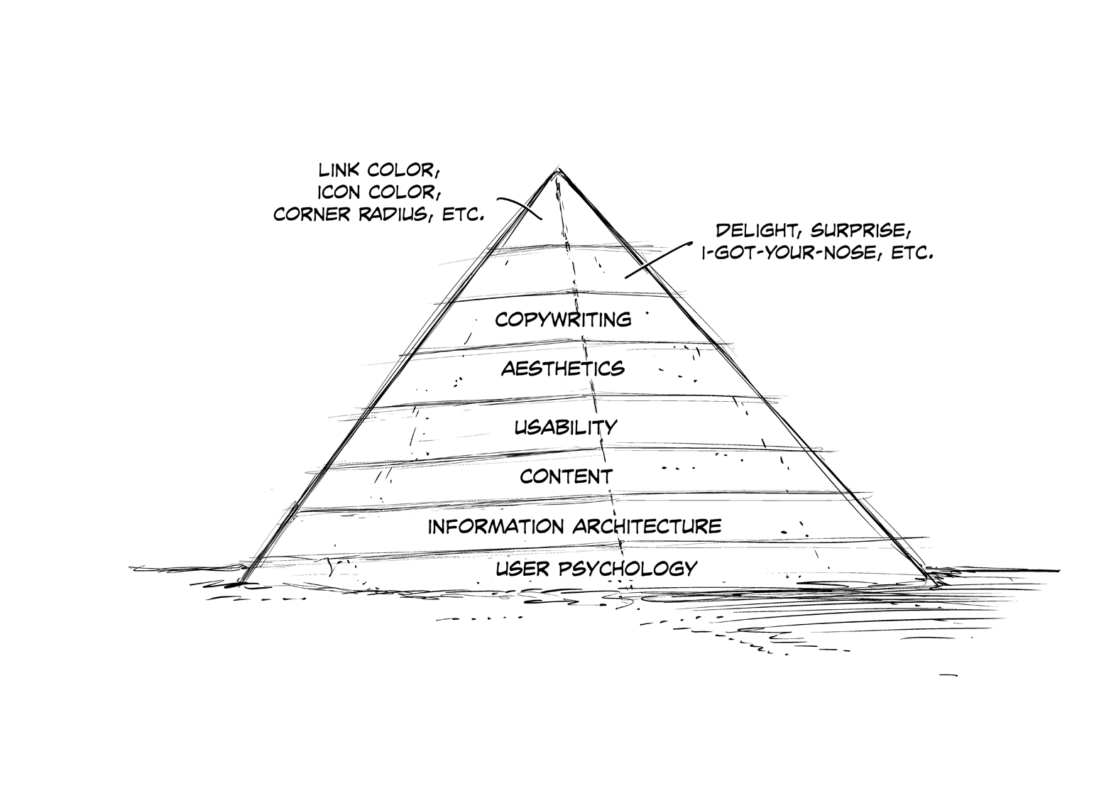
As a UX designer, your job is to create value—from the user’s perspective. Some parts of the UX process create more value than others. Spend your time wisely. You will learn about every part of the Pyramid throughout the rest of this book. For now, just understand that the bottom of the pyramid— the big layers—are the parts that can destroy a product if you ignore them. And they are often invisible. The top of the pyramid—the small layers—are the parts that might not add value to your product, no matter how much time you spend on them. And they are usually visible.
