Telling your data’s story
How storytelling can enhance the effectiveness of your visualizations.
Editor’s note: this post is part of our investigation into Big Data Design and Social Science. Michael Freeman covers the use of storytelling frameworks in visualizations in his new tutorial video “Using Storytelling to Effectively Communicate Data.”
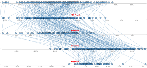
Visualizing complex relationships in big data often requires involved graphical displays that can be intimidating to users. As the volume and complexity of data collection and storage scale exponentially, creating clear, communicative, and approachable visual representations of that data is an increasing challenge. As a data visualization specialist, I frightened one of my first sets of collaborators when I suggested using this display:

What I had failed to communicate was that we would use a story structure to introduce audiences to the complex layout (you can see how I did it here).
This image captures three emerging limitations in big data visualization:
- Unclear visual encodings: People don’t know what each visual symbol represents
- Too much data: The volume of information displayed is overwhelming
- Too many variables: Simultaneous encodings of color, position, size, etc. precludes fully understanding each dimension
Leveraging a story structure can help introduce complex visualizations to various audiences. These simple steps provide an effective framework for sharing big data visualizations:
- Set the stage: Ensure your audience has sufficient background information to understand the dimensions of your data
- Introduce characters: Explicitly encode each variable (i.e., demonstrate what each point or line represents)
- Create tension: Gradually introduce your data, and independently encode each variable (i.e., first encode position, then color, then size)
- Provide resolution: Arrive at a conclusion, or provide a framework for your audience to explore your data
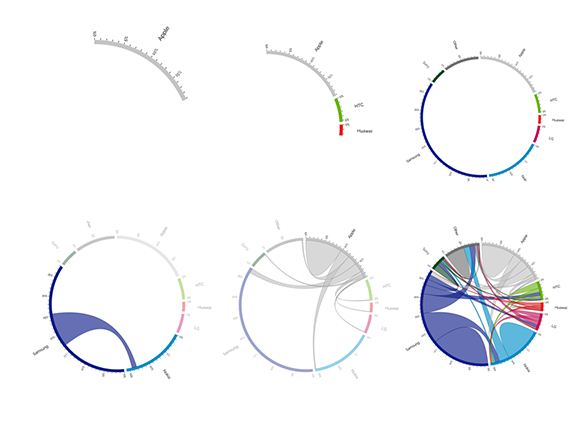
Using this structure, you can break down complex visualizations into digestible pieces, ensuring clarity and increasing engagement. For example, the image below shows how a chord diagram can be broken out into multiple stages. The interactive version, designed by Nadieh Bremmer, leverages a story structure to slowly introduce different pieces of data as well as different underlying variables. By exposing the components of the diagram independently, users are able to consider the aspects of the visualization more carefully.

Using storytelling approaches not only drives engagement, but also provides opportunity to create more memorable, emotionally impactful visualizations. Properly introducing your visual representations is a prerequisite to them being understood, and storytelling provides an effective structure to accomplish this.
