Jay Jacobs on data analytics and security
The O’Reilly Security Podcast: The prevalence of convenient data, first steps toward a security data analytics program, and effective data visualization.
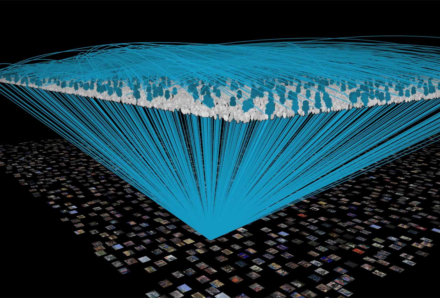
 TV genome visualization (source: bluefin on Wikimedia Commons)
In this episode of the Security Podcast, Courtney Nash, former chair of O’Reilly Security conference, talks with Jay Jacobs, senior data scientist at BitSight. We discuss the constraints of convenient data, the simple first steps toward building a basic security data analytics program, and effective data visualizations.
Here are some highlights:
The limitations of convenient data
In security, we often see the use of convenient data—essentially, the data we can get our hands on. You see that sometimes in medicine where people studying a specific disease will grab the patients with that disease in the hospital they work in. There’s some benefits to doing that. Obviously, the data collection is easy because you get the data that’s readily available. At the same time, there’s limitations. The data may not be representative of the larger population.
Using multiple studies combats the limitations of convenient data. For example, when I was working on the Verizon Data Breach Investigations Report, we tried to tackle that by diversifying the sources of data. Each individual contributor had their own convenient sample. They’re getting the data they can access. Each contributing organization had their own biases and limitations, problems, and areas of focus. There are biases and inherent problems with each data set, but when you combine them, that’s when you start to see the strength because now all of these biases start to level out and even off a little bit. There are still problems, including representativeness, but this is one of the ways to combat it.
The simple first steps to building a data analysis program
The first step is to just count and collect everything. As I work with organizations on their data, I see a challenge where people will try to collect only the right things, or the things that they think are going to be helpful. When they only collect things they originally think will be handy, they often miss some things that are ultimately really helpful to analysis. Just start out counting and collecting everything. Even things you don’t think are countable or collectible. At one point, a lot of people didn’t think that you could put a breach, which is a series of events, into a format that could be conducive to analysis. I think we’ve got some areas we could focus on like pen testing and red team activity. I think these are areas just right for a good data collection effort. If you’re collecting all this data, you can do some simple counting and comparison. ‘This month I saw X number and this month I saw Y.’ As you compare, you can see whether there’s change, and then discuss that change. Is it significant, and do we care? The other thing: a lot of people capture metrics and don’t actually ask the question do we care if it goes up or down? That’s a problem.
Considerations for effective data visualization
Data visualization is a very popular field right now. It’s not just concerned with why pie charts might be bad—there’s a lot more nuance and detail. One important factor to consider in data visualization, just like communicating in any other medium, is your audience. You have to be able to understand your audience, their motivations, and experience levels.
There are three things you should evaluate when building a data visualization. First, you start with your original research question. Then you figure out how the data collected answers that question. Then once you start to develop a data visualization, you try to ask yourself does that visualization match what the data says, and does it match and answer the original question being asked? Trying to think of those three parts of that equation, that they all have to line up and explain each other, I think that helps people communicate better.
