Is real CSS layout finally here?
Now, after two long decades, we have actual layout systems coming to fruition.
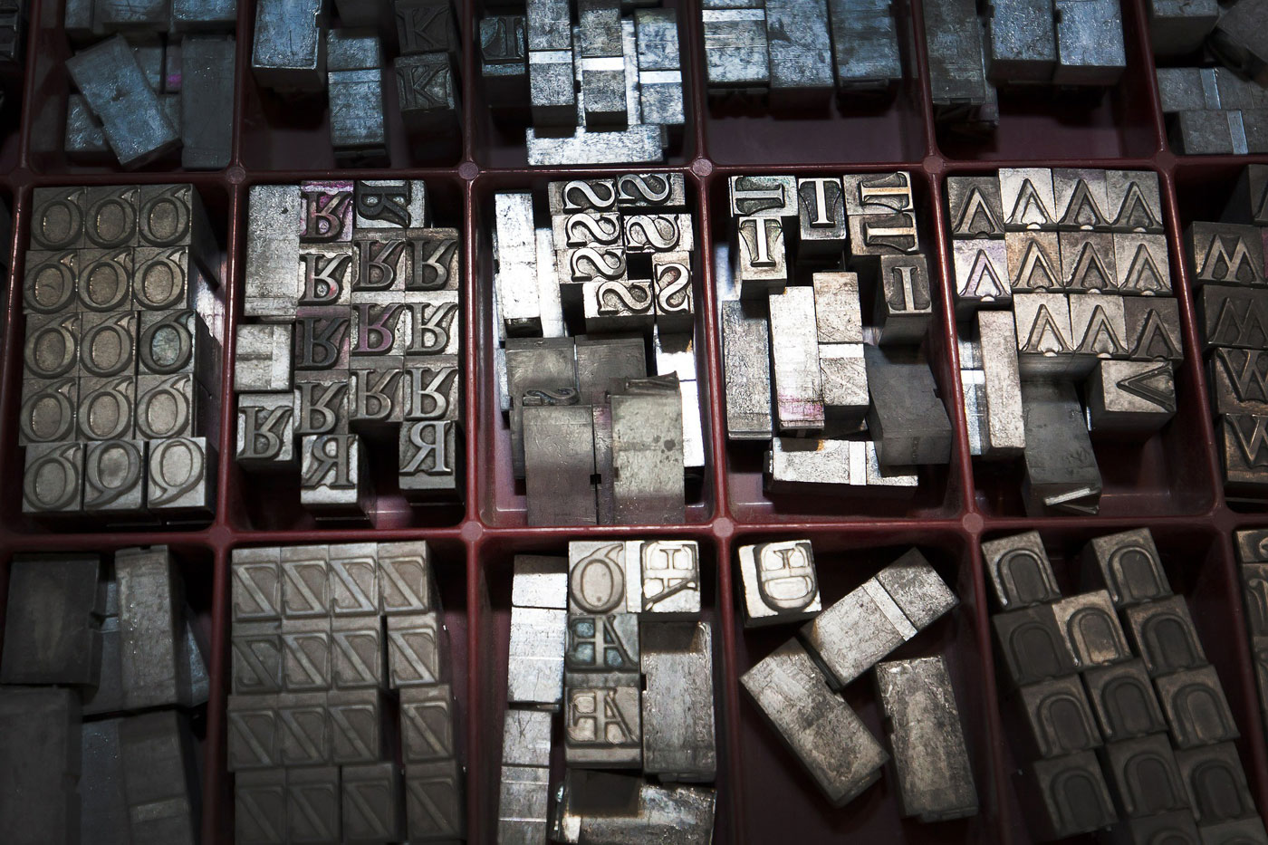
 Lead type (source: Pixabay)
This coming December, CSS will officially turn twenty years old. Think of it. Two decades of presentation, of capabilities expanded in massive fits and hesitant starts, of browser convergence and sweeping upgrades and subtle tweaks.
A full-score years of not having a layout system.
We’ve laid out billions (maybe trillions) of pages with CSS, but only by hacking the holy aitch-eee-double-hockey-sticks out of it. Even if you look past the initial phase of styling content inside table cells or pouring everything into a Flash container, the history of web layout is essentially a long, unbroken stretch of wildly innovative designers and developers wildly innovating their way around the great big gaping hole in the center of CSS.
We floated pieces together, devising wild innovations and brilliant techniques to take a simple little corner of the CSS specification and warp it into something that kind of resembled a layout device, if you squinted from just the right angle and resolved not to notice the warts and the unspeakable fragility of it all. We dreaded float drops and container-busting content changes, and for a while stopped trying to make side-by-side elements be the same height. Why would you even want to, man? Ragged design elements were so much more pleasing! And if you really needed a full-height column background, well, we’ve got a whole brace of clever tricks! You, too, can turn a bunch of divs into table cells and shove blocks into text runs!
Now, after two long decades, we have actual layout systems coming to fruition. I’m not talking about your favorite layout framework, but about actual systems baked directly into the language, and into browsers: flexbox and grids. Flexbox is better supported in browsers than rounded corners, and makes assembling pieces of a layout a breeze. Grid support is rapidly expanding, even as the specification is improved. Taken together, the two of them go a very long way toward filling the hole at the heart of CSS.
But I’m not sure they can fill the hole in my heart. I’ve heard “CSS will get real layout real soon!” too many times before, only to see the promises turn to ashes. I delivered public talks about the new layout powers that were right around the corner back in the 2000s. I wrote articles back in the late 1990s. After so long a wait and so many disappointments, I’m… well, I’m afraid to believe. I’ve been hurt too many times, okay?
It’s really hard not to believe, though. I’ve built grid layouts in a browser on my own computer, and had them respond to changes of content with nary a hiccup. I’ve seen what layout could be like with nary a float, and it’s wonderful. There are still some limitations, to be sure, and browser support isn’t everything we might want it to be. But the first time I set up a grid of images that autofilled each one into the first available spot in the grid, regardless of their document order, I felt something like butterflies in the pit of my stomach. The ability to not just set up a layouts grid, but to mix in flexbox and positioning for the contents of the elements that are hung on that grid, was enough for a tiny flutter of hope to stir, deep in my breast.
I get it if people are skeptical—wary, even. I was. In many ways, I still am. There’s still plenty that could go wrong… but from what I’ve already seen, there’s even more that could go so, so right.
Just don’t break my heart again, CSS. Okay?
