In defense of the pie chart
Common mistakes that thwart a simple data visualization technique.
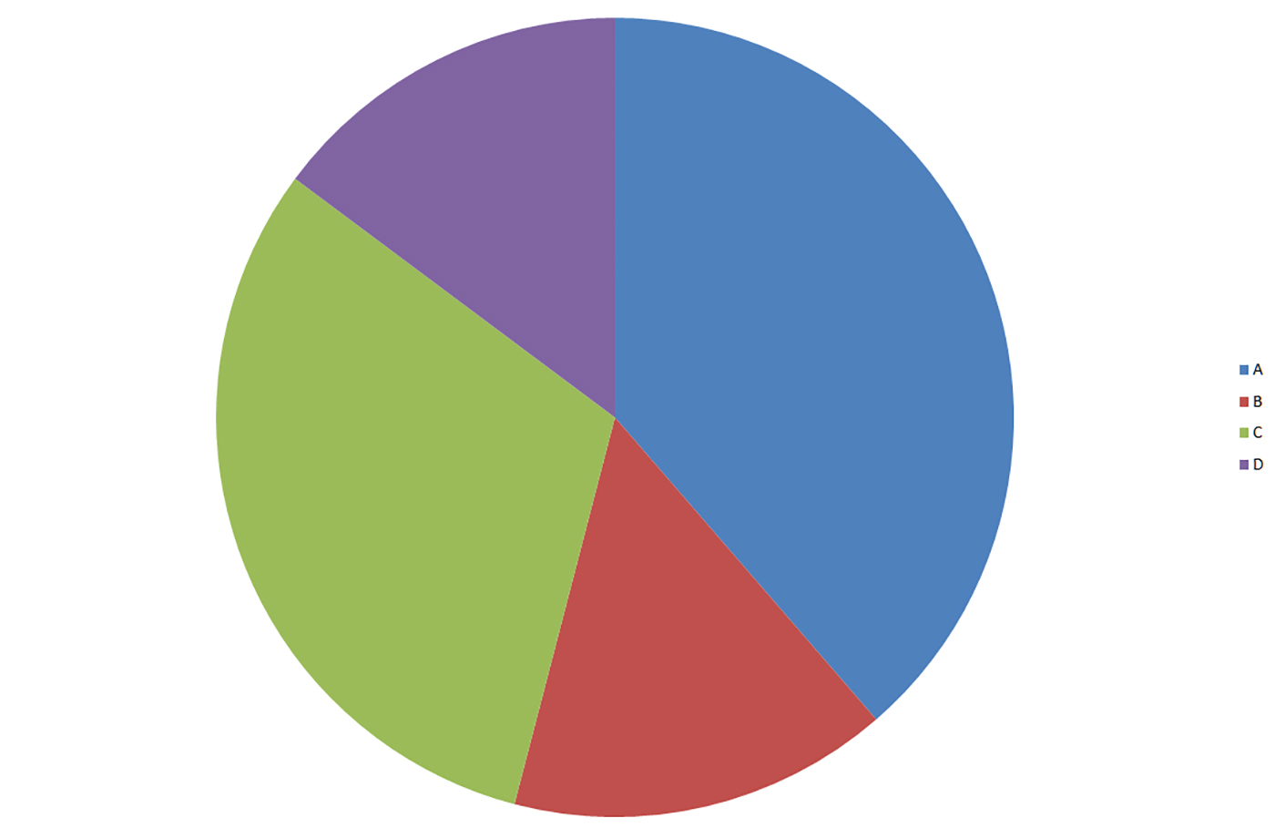 A pie chart. (source: By Carrotkit on Wikimedia Commons)
Pie charts are the most widely-berated chart in data visualization. Many articles have been written over the years describing why pie charts are bad, and why we should no longer use them. Even key members of the data visualization community consider using a pie chart equivalent to using incorrect grammar. In short, pie charts are the Comic Sans of data visualization: many would agree that if you use a pie chart, you immediately betray your lack of data visualization knowledge. I believe that the reason so many people dislike pie charts is because they’re so frequently misused by amateur practitioners. Furthermore, I believe that pie charts still play an important role in data visualization, and I’m going to make my case in favor of pie charts below. Along the way, I will explain the correct way to use pie charts; please take note and share this information with your colleagues so we can salvage the pie chart’s reputation.
The advantages of pie charts
From my point of view, pie charts have two major advantages over their alternatives:
- Pie charts are easy to understand. Even readers who have never taken a statistics course can look at a pie chart and immediately understand what it’s trying to show. This is a vital factor if you are making data visualizations for public consumption.
- Pie charts easily communicate a simple proportion. If all you need to communicate is that one category (or the sum of a few categories) represents a simple proportion of a whole, then pie charts will excel at this task.
I will demonstrate these points with a few examples below, though the lens of the three most common mistakes that designers make when using pie charts.
Make sure your parts sum to a meaningful whole
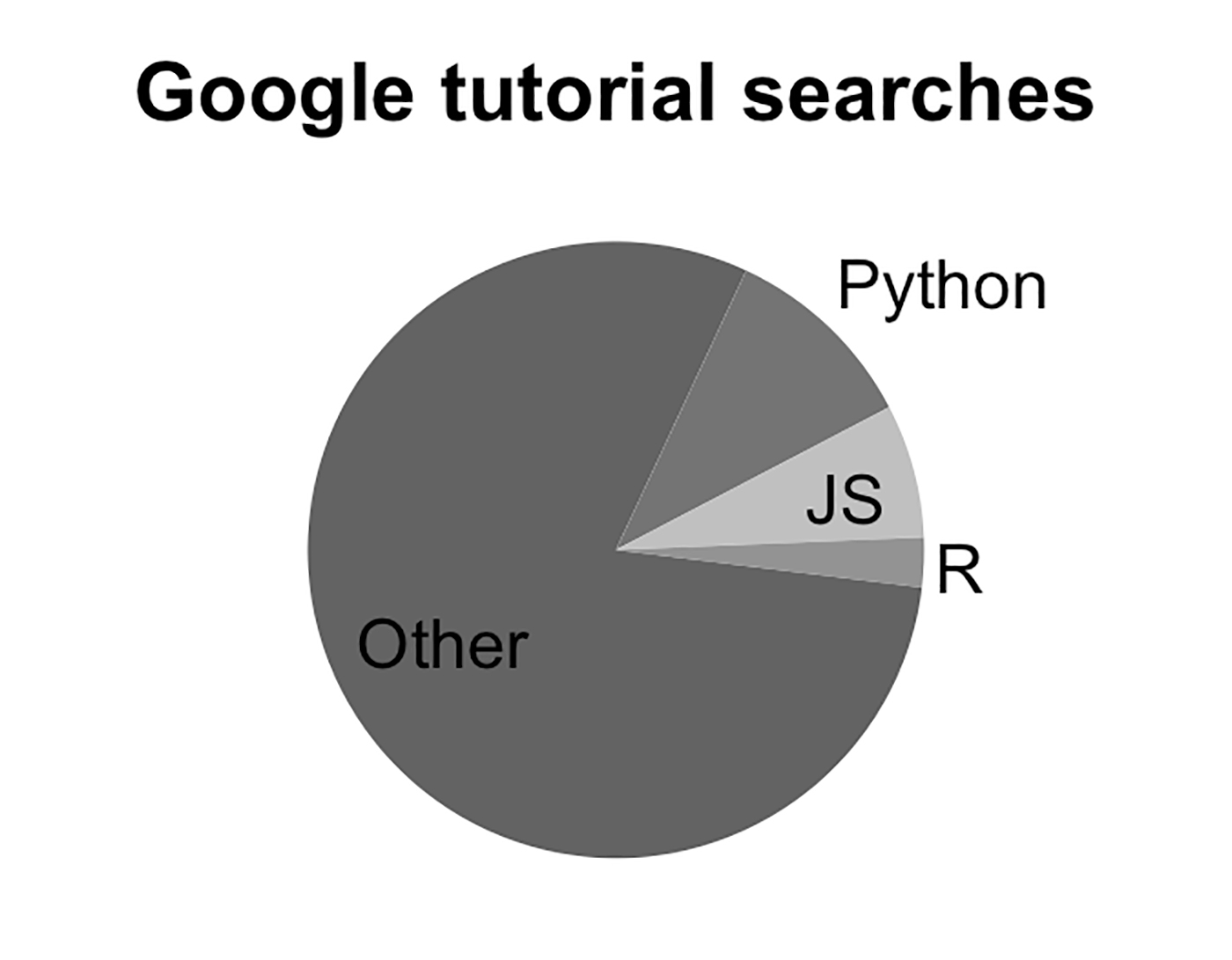
By far, the most common mistake with pie charts is representing parts that don’t sum to a meaningful whole. “What is a meaningful whole?,” you ask. Let’s make this concrete with an example. Say we’re putting together a presentation for our boss and want to demonstrate the popularity of three programming languages as indicated by their Google search frequency. We make the pie chart below (Figure 1) and move on with our slides. What’s wrong with this pie chart?
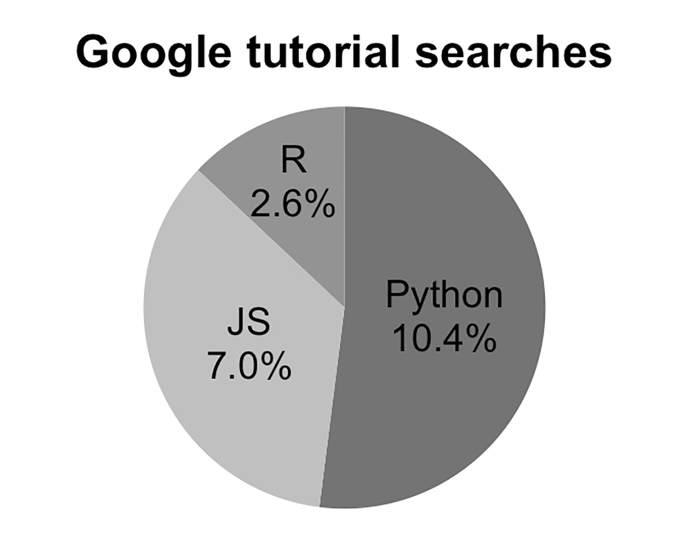
That’s right: R, JavaScript, and Python don’t represent every programming language out there, yet by making them the only “pieces of the pie,” that’s exactly what we’re claiming. In other words, our parts don’t sum to a meaningful whole that represents all Google searches for all programming languages. To fix this problem, we have to add an “Other programming languages” part to the pie chart, as we have in Figure 2. Now we’re properly visualizing the relative popularity of our three programming languages.

With the pie chart above, we can easily make the point that R, JavaScript, and Python together represent a little less than 1/4 of all Google searches for programming languages. Note that we’re using the pie chart to make statements about simple proportions of the whole: 1/4, 1/3, 1/2, and so on, are fine as simple proportions, but don’t use pie charts to communicate a specific percentage (for example, 32.3333%).
Collapse categories down to three or fewer categories that matter
Now let’s say we want to provide a broader picture of all the programming languages that people search for on Google. We make the pie chart below (Figure 3) to show the percentage breakdown for all of the programming languages that we’ve been tracking. What’s wrong with this pie chart?
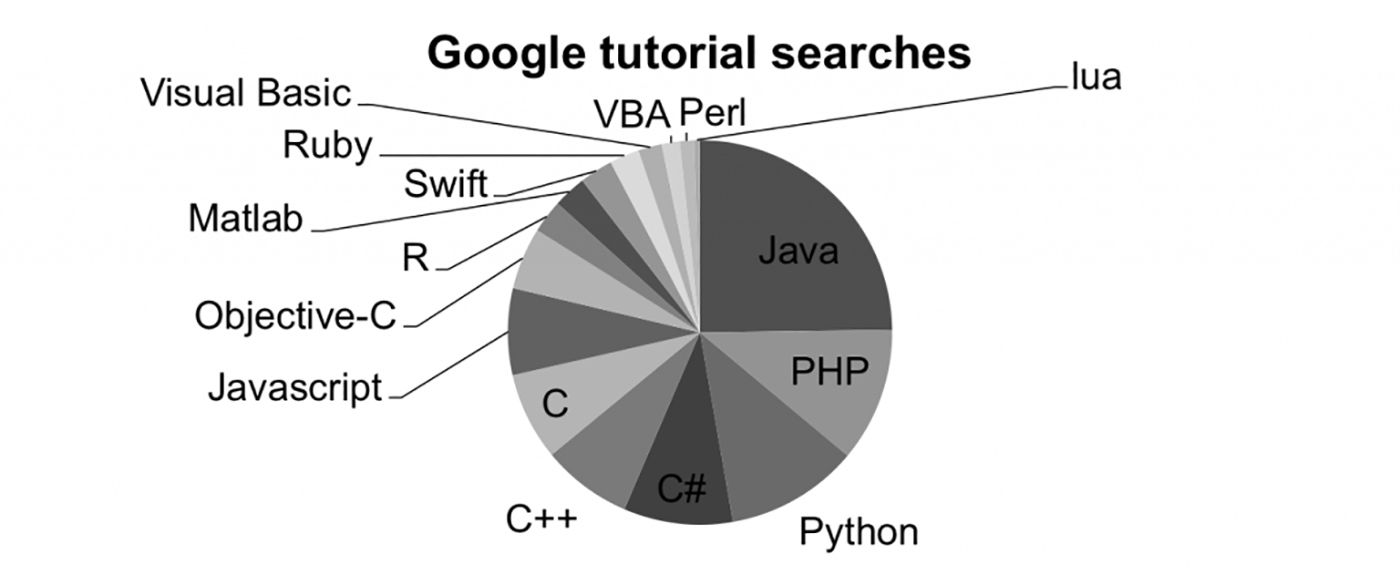
Right again! We went overboard and showed way too many categories at once. Pie charts are not designed to communicate multiple proportions, so we should collapse our categories down to only a handful that really matter—three categories or fewer is the general rule of thumb. This is where we really have to think about the message that we want to communicate with this pie chart. Do we really want to show all of the programming languages, or do we want to only focus on a few of them? In this case, we decide that we really only care about Java, PHP, and Python, and collapse the other categories into an “Other” column (see Figure 4).
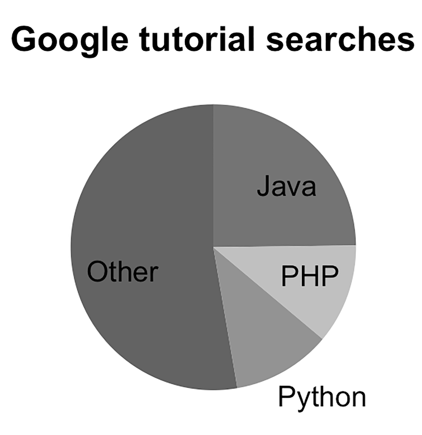
Now we have a very clear message with our pie chart: Java, PHP, and Python together represent nearly 1/2 of all Google searches for programming languages, and Java represents roughly 1/4 of all searches alone. Note that we shouldn’t try to use the pie chart to compare between Java, PHP, or Python: Pie slices are notoriously difficult to compare directly, especially if we ask our uncle who always takes the bigger slice of pumpkin pie during Thanksgiving dinner. If we want to compare the proportions, then we should use a bar chart instead.
Always start your pie charts at the top
One final note: Our readers will typically start reading our pie charts from the top of the circle—the 0° mark. We should never violate our readers’ expectations by starting the parts at any other section of the circle, even if it makes the pie chart look like Pac-Man. Figure 5 is an example of a pie chart that does not start at the 0° mark.
Fortunately, most data visualization software starts pie charts at the 0° mark. But in case you find software that doesn’t: you’ve been warned.
Recap
Now that we’ve walked through a couple visualization exercises, let’s recap what we’ve learned about pie charts.
- The parts must sum to a meaningful whole. Always ask yourself what the parts add up to, and if that makes sense for what you’re trying to convey.
- Collapse your categories down to three or fewer. Pie charts cannot communicate multiple proportions, so stick to their strengths and keep your pie charts simple.
- Always start your pie charts at the top. We naturally start reading pie charts at the top (the 0° mark). Don’t violate your readers’ expectations.
Pie charts are useful for representing a simple proportion of a whole, and can easily be interpreted by expert and novice alike. Keep these tips in mind the next time you need to communicate a simple proportion to a general audience.
To learn more about data visualization, take a look at my video course Data Visualization Basics with Python, which I created in collaboration with O’Reilly. In just one hour, I cover these topics and much more, which will provide you with a strong starting point for your career in data visualization.
