Ideas on interpreting machine learning
Mix-and-match approaches for visualizing data and interpreting machine learning models and results.
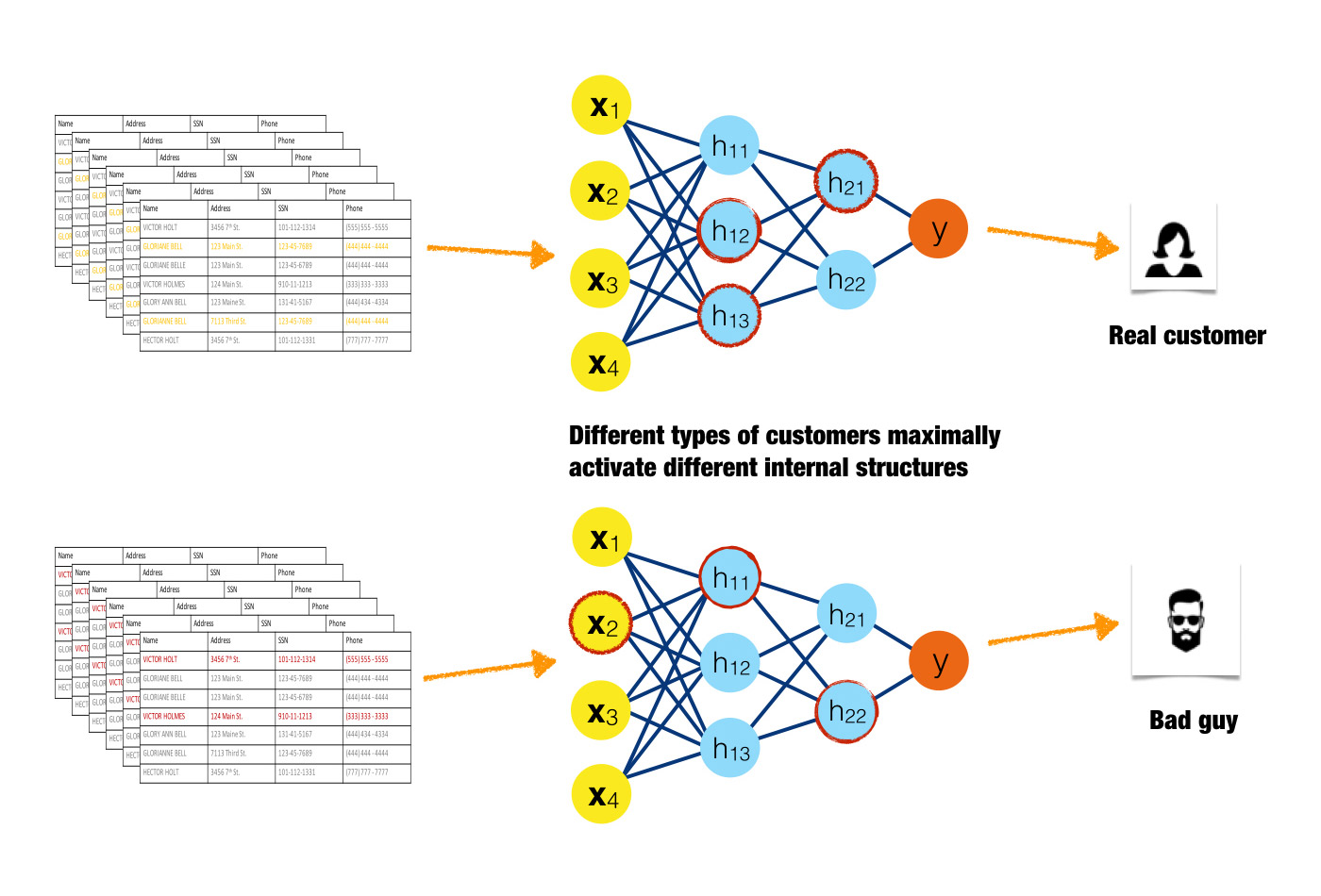 Inputs activating different neurons in a neural network. (source: Image courtesy of Patrick Hall and the h2o.ai team, used with permission)
You’ve probably heard by now that machine learning algorithms can use big data to predict whether a donor will give to a charity, whether an infant in a NICU will develop sepsis, whether a customer will respond to an ad, and on and on. Machine learning can even drive cars and predict elections. … Err, wait. Can it? I believe it can, but these recent high-profile hiccups should leave everyone who works with data (big or not) and machine learning algorithms asking themselves some very hard questions: do I understand my data? Do I understand the model and answers my machine learning algorithm is giving me? And do I trust these answers? Unfortunately, the complexity that bestows the extraordinary predictive abilities on machine learning algorithms also makes the answers the algorithms produce hard to understand, and maybe even hard to trust.
Although it is possible to enforce monotonicity constraints (a relationship that only changes in one direction) between independent variables and a machine-learned response function, machine learning algorithms tend to create nonlinear, non-monotonic, non-polynomial, and even non-continuous functions that approximate the relationship between independent and dependent variables in a data set. (This relationship might also be referred to as the conditional distribution of the dependent variables, given the values of the independent variables.) These functions can then make very specific predictions about the values of dependent variables for new data—whether a donor will give to a charity, an infant in a NICU will develop sepsis, a customer will respond to an ad, etc. Conversely, traditional linear models tend to create linear, monotonic, and continuous functions to approximate the very same relationships. Even though they’re not always the most accurate predictors, the elegant simplicity of linear models makes the results they generate easy to interpret.
While understanding and trusting models and results is a general requirement for good (data) science, model interpretability is a serious legal mandate in the regulated verticals of banking, insurance, and other industries. Business analysts, doctors, and industry researchers simply must understand and trust their models and modeling results. For this reason, linear models were the go-to applied predictive modeling tool for decades, even though it usually meant giving up a couple points on the accuracy scale. Today, many organizations and individuals are embracing machine learning algorithms for predictive modeling tasks, but difficulties in interpretation still present a barrier for the widespread, practical use of machine learning algorithms.
In this article, I present several approaches beyond the usual error measures and assessment plots for visualizing data and interpreting machine learning models and results. Users are encouraged to mix and match these techniques to best fit their own needs.
Wherever possible, “interpretability” of each technique in this article is deconstructed into more basic components—complexity, scope, understanding, and trust—which I will first outline below.
Complexity of response function to be explained
Linear, monotonic functions: Functions created by linear regression algorithms are probably the most interpretable class of models. These models will be referred to here as “linear and monotonic,” meaning that for a change in any given independent variable (or sometimes combination or function of an independent variable), the response function changes at a defined rate, in only one direction, and at a magnitude represented by a readily available coefficient. Monotonicity also enables intuitive and even automatic reasoning about predictions. For instance, if a lender rejects your credit card application, they can tell you why because their probability-of-default model often assumes your credit score, your account balances, and the length of your credit history are monotonically related to your ability to pay your credit card bill. When these explanations are created automatically, they are typically called “reason codes.” Of course, linear and monotonic response functions enable the calculation of relative variable importance measures, too. Linear and monotonic functions have several uses in machine learning interpretability. Part 1 and Part 2 below discuss the many ways linear, monotonic functions can be used to make machine learning interpretable.
Nonlinear, monotonic functions: Although most machine learned response functions are nonlinear, some can be constrained to be monotonic with respect to any given independent variable. While there is no single coefficient that represents the change in the response function induced by a change in a single independent variable, nonlinear and monotonic functions do always change in one direction as a single input variable changes. Nonlinear, monotonic response functions usually allow for the generation of both reason codes and relative variable importance measures. Nonlinear, monotonic response functions are highly interpretable and often suitable for use in regulated applications.
(Of course, there are linear, non-monotonic machine-learned response functions that can, for instance, be created by the multi-variate adaptive regression splines approach. These functions are not highlighted here because they tend to be less accurate predictors than purely nonlinear, non-monotonic functions, while also lacking the high interpretability of their monotonic counterparts.)
Nonlinear, non-monotonic functions: Most machine learning algorithms create nonlinear, non-monotonic response functions. This class of functions is the most difficult to interpret, as they can change in a positive and negative direction and at a varying rate for any change in an independent variable. Typically, the only standard interpretability measure these functions provide are relative variable importance measures. You may need to use a combination of additional techniques presented below to interpret these extremely complex models.
Scope of interpretability
Global interpretability: Some of the presented techniques facilitate global interpretations of machine learning algorithms, their results, or the machine-learned relationship between the inputs and the dependent variable(s) (e.g., the model of the conditional distribution). Global interpretations help us understand the entire conditional distribution modeled by the trained response function, but global interpretations can be approximate or based on average values.
Local interpretability: Local interpretations promote understanding of small regions of the conditional distribution, such as clusters of input records and their corresponding predictions, or deciles of predictions and their corresponding input rows. Because small sections of the conditional distribution are more likely to be linear, monotonic, or otherwise well-behaved, local explanations can be more accurate than global explanations.
Understanding and trust
Machine learning algorithms and the functions they create during training are sophisticated, intricate, and opaque. Humans who would like to use these models have basic, emotional needs to understand and trust them because we rely on them for our livelihoods or because we need them to make important decisions for us. For some users, technical descriptions of algorithms in textbooks and journals provide enough insight to fully understand machine learning models. For these users, cross-validation, error measures, and assessment plots probably also provide enough information to trust a model. Unfortunately, for many applied practitioners, the usual definitions and assessments don’t often inspire full trust and understanding in machine learning models and their results. The techniques presented here go beyond the standard practices to engender greater understanding and trust. These techniques enhance understanding by providing specific insights into the mechanisms of the algorithms and the functions they create, or by providing detailed information about the answers they provide. The techniques below enhance trust by enabling users to observe or ensure the stability and dependability of machine learning algorithms, the functions they create, or the answers they generate.
Another important way to classify model interpretability techniques is whether they are “model-agnostic,” meaning they can be applied to different types of machine learning algorithms, or “model-specific,” meaning techniques that are only applicable for a single type or class of algorithm. The techniques herein are described in an approachable, high-level manner that is generally model-agnostic. Model-specific techniques will be called out for the reader when appropriate.
The techniques are presented in three parts. Part 1 includes approaches for seeing and understanding your data in the context of training and interpreting machine learning algorithms, Part 2 introduces techniques for combining linear models and machine learning algorithms for situations where interpretability is of paramount importance, and Part 3 describes approaches for understanding and validating the most complex types of predictive models.
Part 1: Seeing your data
Most real data sets are hard to see because they have many variables and many rows. Like most sighted people, I rely on my visual sense quite heavily for understanding information. For me, seeing data is basically tantamount to understanding data. However, I can only understand two or three visual dimensions, preferably two. And, something called change blindness frustrates human attempts to reason analytically given information split across different pages or screens. So, if a data set has more than two or three variables or more rows than can fit on a single page or screen, it’s realistically going to be hard to understand what’s going on in it without resulting to more advanced techniques than scrolling through countless rows of data.
Of course, there are many, many ways to visualize data sets. Most of the techniques highlighted below help illustrate all of a data set in just two dimensions, not just univariate or bivariate slices of a data set (meaning one or two variables at a time). This is important in machine learning because most machine learning algorithms automatically model high-degree interactions between variables (meaning the effect of combining many—i.e., more than two or three—variables together). Traditional univariate and bivariate tables and plots are still important and you should use them, but they are more relevant in the context of traditional linear models and slightly less helpful in understanding nonlinear models that can pick up on arbitrarily high-degree interactions between independent variables.
Glyphs
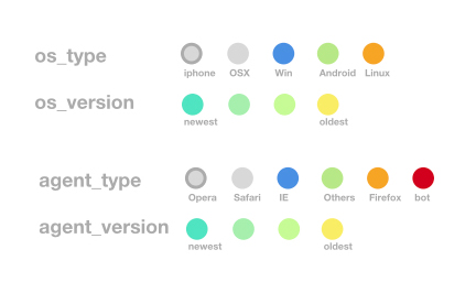
Glyphs are visual symbols used to represent data. The color, texture, or alignment of a glyph can be used to represent different values or attributes of data. In Figure 1, colored circles are defined to represent different types of operating systems and web browsers. When arranged in a certain way, these glyphs can be used to represent rows of a data set.
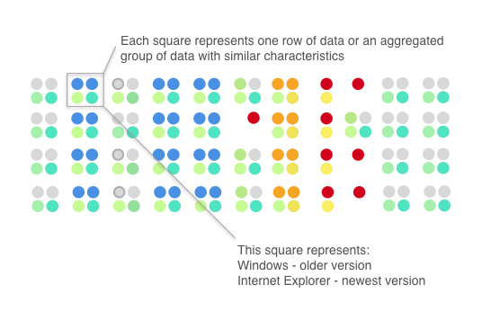
Figure 2 gives an example of how glyphs can be used to represent rows of a data set. Each grouping of four glyphs can be either a row of data or an aggregated group of rows in a data set. The highlighted Windows/Internet Explorer combination is very common in the data set (represented by blue, teal, and green circles) and so is the OS X and Safari combination (represented by two grey circles). It’s quite possible these two combinations are two compact and disjoint clusters of data. We can also see that, in general, operating system versions tend to be older than browser versions and that using Windows and Safari is correlated with using newer operating system and browser versions, whereas Linux users and bots are correlated with older operating system and browser versions. The red dots that represent queries from bots standout visually (unless you are red-green colorblind). Using bright colors or unique alignments for events of interest or outliers is a good method for making important or unusual data attributes clear in a glyph representation.
Correlation Graphs
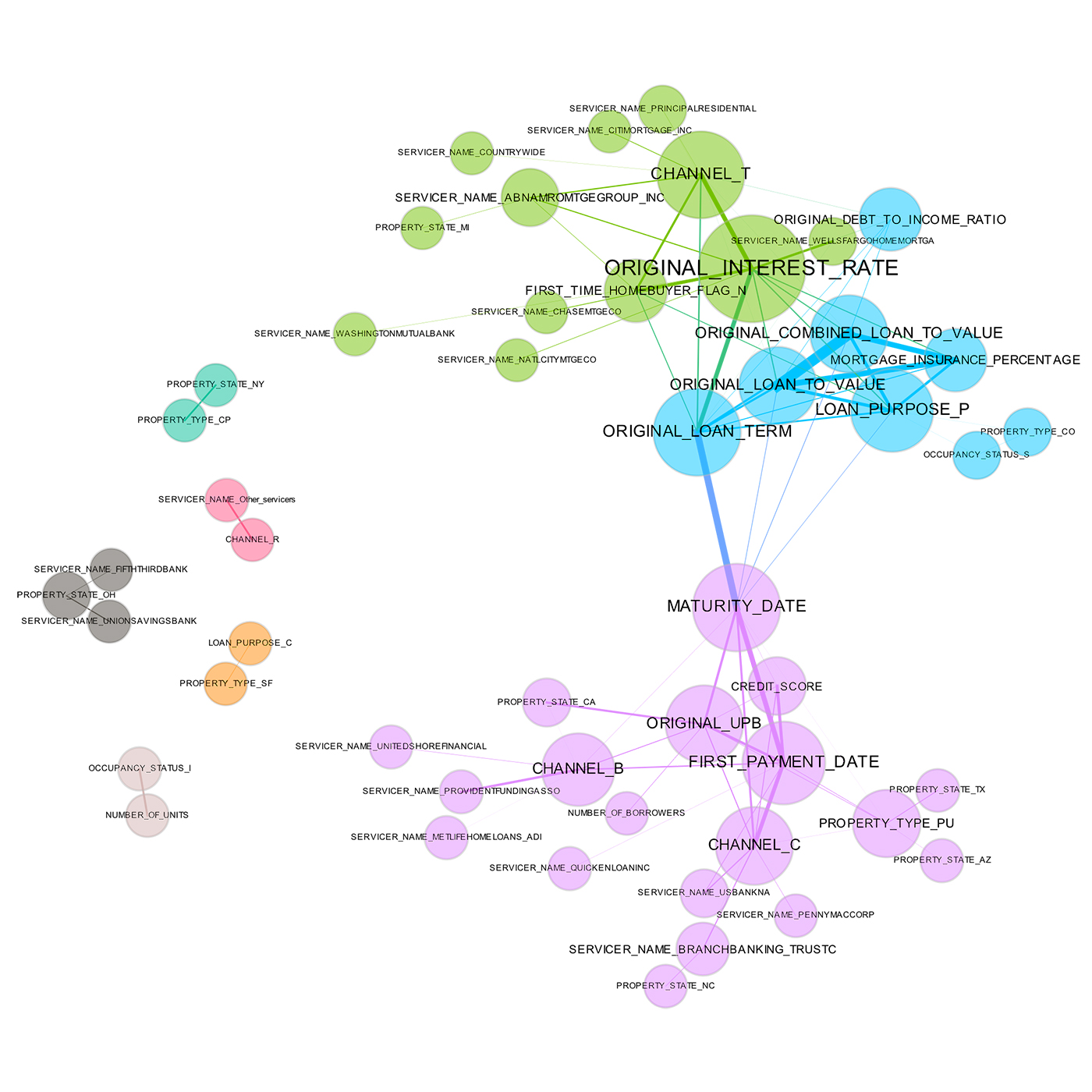
A correlation graph is a two-dimensional representation of the relationships (correlation) in a data set. While many details regarding the display of a correlation graph are optional and could be improved beyond those chosen for Figure 3, correlation graphs are a very powerful tool for seeing and understanding relationships (correlation) between variables in a data set. Even data sets with tens of thousands of variables can be displayed in two dimensions using this technique.
In Figure 3, the nodes of the graph are the variables in a loan data set and the edge weights (thickness) between the nodes are defined by the absolute values of their pairwise Pearson correlation. For visual simplicity, absolute weights below a certain threshold are not displayed. The node size is determined by a node’s number of connections (node degree), node color is determined by a graph community calculation, and node position is defined by a graph force field algorithm. The correlation graph allows us to see groups of correlated variables, identify irrelevant variables, and discover or verify important relationships that machine learning models should incorporate, all in two dimensions.
In a supervised model built for the data represented in Figure 3, assuming one of the represented variables was an appropriate target, we would expect variable selection techniques to pick one or two variables from the light green, blue, and purple groups, we would expect variables with thick connections to the target to be important variables in the model, and we would expect a model to learn that unconnected variables like CHANNEL_R are not very important. Figure 3 also illustrates common sense relationships such as that between FIRST_TIME_HOMEBUYER_FLAG_N and ORIGINAL_INTEREST_RATE that should be reflected in a trustworthy model.
2-D projections
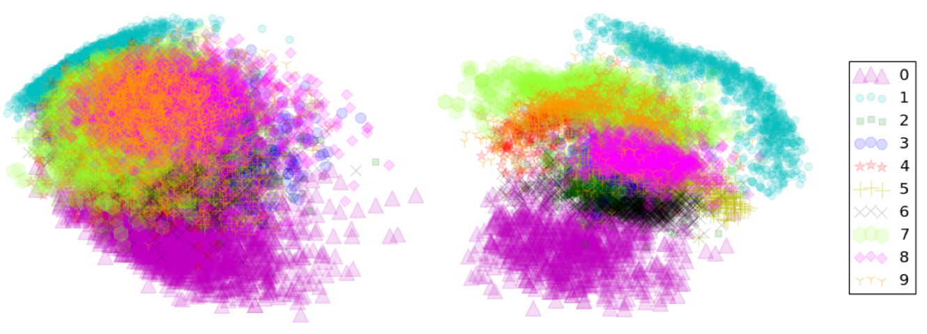
There are many techniques for projecting the rows of a data set from a usually high-dimensional original space into a more visually understandable lower-dimensional space, ideally two or three dimensions. Popular techniques include:
- Principal Component Analysis (PCA)
- Multidimensional Scaling (MDS)
- t-distributed Stochastic Neighbor Embedding (t-SNE)
- Autoencoder networks
Each of these techniques has strengths and weaknesses, but the key idea they all share is to represent the rows of a data set in a meaningful low-dimensional space. Data sets containing images, text, or even business data with many variables can be difficult to visualize as a whole. These projection techniques enable high-dimensional data sets to be projected into a representative low-dimensional space and visualized using the trusty old scatter plot technique. A high-quality projection visualized in a scatter plot should exhibit key structural elements of a data set, such as clusters, hierarchy, sparsity, and outliers.
In Figure 4, the famous MNIST data set is projected from its original 784 dimensions onto two dimensions using two different techniques: PCA and autoencoder networks. The quick and dirty PCA projection can separate digits labeled as 0 from digits labeled as 1 very well. These two-digit classes are projected into fairly compact clusters, but the other digit classes are generally overlapping. In the more sophisticated (but also more computationally expensive) autoencoder projection, all the digit classes appear as clusters, with visually similar digits appearing close to one another in the reduced two-dimensional space. The autoencoder projection is capturing the presumed clustered structure of the original high-dimensional space and the relative locations of those clusters. Interestingly, both plots can pick up on a few outlying digits.
Projections can add an extra and specific degree of trust if they are used to confirm machine learning modeling results. For instance, if known hierarchies, classes, or clusters exist in training or test data sets and these structures are visible in 2-D projections, it is possible to confirm that a machine learning model is labeling these structures correctly. A secondary check is to confirm that similar attributes of structures are projected relatively near one another and different attributes of structures are projected relatively far from one another. Consider a model used to classify or cluster marketing segments. It is reasonable to expect a machine learning model to label older, richer customers differently than younger, less affluent customers—and moreover, to expect that these different groups should be relatively disjointed and compact in a projection, and relatively far from one another. Such results should also be stable under minor perturbations of the training or test data, and projections from perturbed versus non-perturbed samples can be used to check for stability or for potential patterns of change over time.
Partial dependence plots
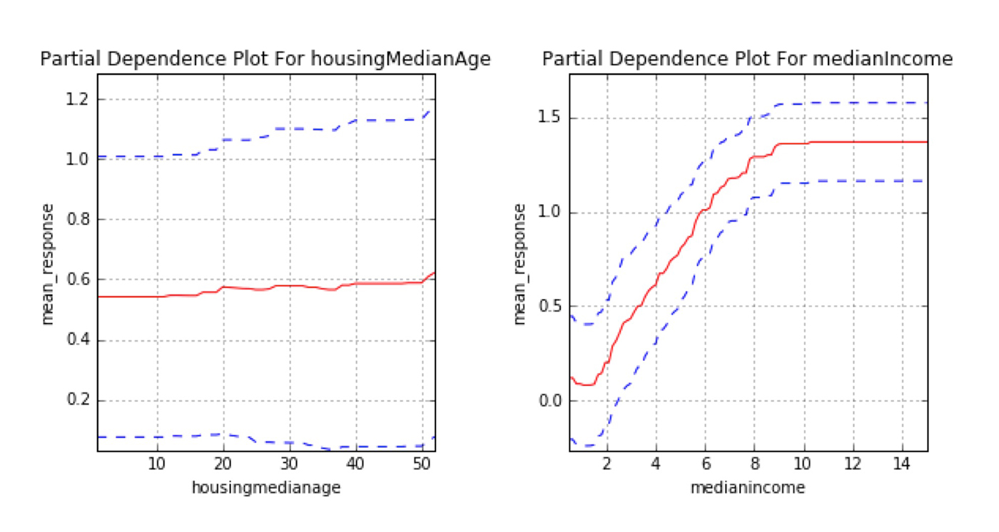
Partial dependence plots show us the way machine-learned response functions change based on the values of one or two independent variables of interest, while averaging out the effects of all other independent variables. Partial dependence plots with two independent variables are particularly useful for visualizing complex types of variable interactions between the independent variables of interest. Partial dependence plots can be used to verify monotonicity of response functions under monotonicity constraints, and they can be used to see the nonlinearity, non-monotonicity, and two-way interactions in very complex models. In fact, the way partial dependence plots enhance understanding is exactly by showing the nonlinearity, non-monotonicity, and two-way interactions between independent variables and a dependent variable in complex models. They can also enhance trust when displayed relationships conform to domain knowledge expectations, when the plots remain stable or change in expected ways over time, or when displayed relationships remain stable under minor perturbations of the input data.
Partial dependence plots are global in terms of the rows of a data set, but local in terms of the independent variables. They are used almost exclusively to show the relationship between one or two independent variables and the dependent variable over the domain of the independent variable(s). Individual conditional expectation (ICE) plots, a newer and less well-known adaptation of partial dependence plots, can be used to create more localized explanations using the same ideas as partial dependence plots. ICE plots are particularly useful when there are strong relationships between many input variables.
Residual analysis
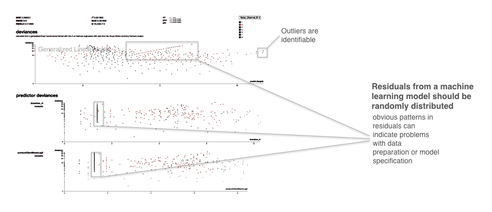
Residuals refer to the difference between the recorded value of a dependent variable and the predicted value of a dependent variable for every row in a data set. Generally, the residuals of a well-fit model should be randomly distributed because good models will account for most phenomena in a data set, except for random error. Plotting the residual values against the predicted values is a time-honored model assessment technique and a great way to see all your modeling results in two dimensions. If strong patterns are visible in plotted residuals, this is a dead giveaway that there are problems with your data, your model, or both. Vice versa, if models are producing randomly distributed residuals, this a strong indication of a well-fit, dependable, trustworthy model, especially if other fit statistics (i.e., R2, AUC, etc.) are in the appropriate ranges.
In Figure 6, the callouts point to a strong linear pattern in the residuals. The plot shows the traditional residual plot and residuals plotted by certain independent variables. Breaking out the residual plot by independent variables can expose more granular information about residuals and assist in reasoning through the cause of non-random patterns. Figure 6 also points to outliers, which residual plots can help to identify. As many machine learning algorithms seek to minimize squared residuals, observations with high residual values will have a strong impact on most models, and human analysis of the validity of these outliers can have a big impact on model accuracy.
Now that several visualization techniques have been presented, they can be tied back to the overarching concepts scope, complexity, understanding and trust by asking a few simple questions. These questions will be asked of techniques presented in later sections as well.
Do visualizations provide global or local interpretability?
Both. Most forms of visualizations can be used to see a courser view of the entire data set, or they can provide granular views of local portions of the data set. Ideally, advanced visualization tool kits enable users to pan, zoom, and drill-down easily. Otherwise, users can plot different parts of the data set at different scales themselves.
What complexity of functions can visualizations help interpret?
Visualizations can help explain functions of all complexities.
How do visualizations enhance understanding?
For most people, visual representations of structures (clusters, hierarchy, sparsity, outliers) and relationships (correlation) in a data set are easier to understand than scrolling through plain rows of data and looking at each variable’s values.
How do visualizations enhance trust?
Seeing structures and relationships in a data set usually makes those structures and relationships easier to understand. An accurate machine learning model should create answers that are representative of the structures and relationships in a data set. Understanding the structures and relationships in a data set is a first step to knowing if a model’s answers are trustworthy.
In certain cases, visualizations can display the results of sensitivity analysis, which can also enhance trust in machine learning results. In general, visualizations themselves can sometimes be thought of as a type of sensitivity analysis when they are used to display data or models as they change over time, or as data are intentionally changed to test stability or important corner cases for your application.
Part 2: Using machine learning in regulated industry
For analysts and data scientists working in regulated industries, the potential boost in predictive accuracy provided by machine learning algorithms may not outweigh their current realities of internal documentation needs and external regulatory responsibilities. For these practitioners, traditional linear modeling techniques may be the only option for predictive modeling. However, the forces of innovation and competition don’t stop because you work under a regulatory regime. Data scientists and analysts in the regulated verticals of banking, insurance, and other similar industries face a unique conundrum. They must find ways to make more and more accurate predictions, but keep their models and modeling processes transparent and interpretable.
The techniques presented in this section are newer types of linear models or models that use machine learning to augment traditional, linear modeling methods. Linear model interpretation techniques are highly sophisticated, typically model specific, and the inferential features and capabilities of linear models are rarely found in other classes of models. These techniques are meant for practitioners who just can’t use machine learning algorithms to build predictive models because of interpretability concerns. These models produce linear, monotonic response functions (or at least monotonic ones) with globally interpretable results like those of traditional linear models, but often with a boost in predictive accuracy provided by machine learning algorithms.
OLS regression alternatives
Penalized regression
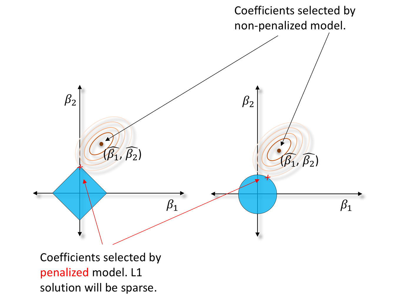
Ordinary least squares (OLS) regression is about 200 years old. Maybe it’s time to move on? As an alternative, penalized regression techniques can be a gentle introduction to machine learning. Contemporary penalized regression techniques usually combine L1/LASSO penalties for variable selection purposes and Tikhonov/L2/ridge penalties for robustness in a technique known as elastic net. They also make fewer assumptions about data than OLS regression. Instead of solving the classic normal equation or using statistical tests for variable selection, penalized regression minimizes constrained objective functions to find the best set of regression parameters for a given data set. Typically, this is a set of parameters that model a linear relationship but also satisfy certain penalties for assigning correlated or meaningless variables to large regression coefficients. You can learn all about penalized regression in Elements of Statistical Learning, but for our purposes here, it’s just important to know when you might want to try penalized regression.
Penalized regression has been applied widely across many research disciplines, but it is a great fit for business data with many columns, even data sets with more columns than rows, and for data sets with a lot of correlated variables. L1/LASSO penalties drive unnecessary regression parameters to zero, selecting a small, representative subset of regression parameters for the regression model while avoiding potential multiple comparison problems that arise in forward, backward, and stepwise variable selection. Tikhonov/L2/ridge penalties help preserve parameter estimate stability, even when many correlated variables exist in a wide data set or important predictor variables are correlated. It’s also important to know penalized regression techniques don’t always create confidence intervals, t-statistics, or p-values for regression parameters. These types of measures are typically only available through iterative methods or bootstrapping that can require extra computing time.
Generalized Additive Models (GAMs)

Generalized Additive Models (GAMs) enable you to hand-tune a tradeoff between increased accuracy and decreased interpretability by fitting standard regression coefficients to certain variables and nonlinear spline functions to other variables. Also, most implementations of GAMs generate convenient plots of the fitted splines. Depending on your regulatory or internal documentation requirements, you may be able to use the splines directly in predictive models for increased accuracy. If not, you may be able to eyeball the fitted spline and switch it out for a more interpretable polynomial, log, trigonometric or other simple function of the predictor variable that may also increase predictive accuracy. You can learn more about GAMs in Elements of Statistical Learning, too.
Quantile regression

Quantile regression allows you to fit a traditional, interpretable, linear model to different percentiles of your training data, allowing you to find different sets of variables with different parameters for modeling different behaviors across a customer market or portfolio of accounts. It probably makes sense to model low-value customers with different variables and different parameter values from those of high-value customers, and quantile regression provides a statistical framework for doing so.
Do alternative regression techniques provide global or local interpretability?
Alternative regression techniques often produce globally interpretable linear, monotonic functions that can be interpreted using coefficient values or other traditional regression measures and statistics.
What are the complexity of alternative regression functions?
Alternative regression functions are generally linear, monotonic functions. However, GAM approaches can create quite complex nonlinear functions.
How do alternative regression techniques enhance understanding?
It’s quite possible that the lessened assumption burden, the ability to select variables without potentially problematic multiple statistical significance tests, the ability to incorporate important but correlated predictors, the ability to fit nonlinear phenomena, or the ability to fit different quantiles of the data’s conditional distribution (and not just the mean of the conditional distribution) could lead to more accurate understanding of modeled phenomena.
How do alternative regression techniques enhance trust?
Basically, these techniques are trusted linear models, but used in new and different ways. Trust could be increased further if these techniques lead to more accurate results for your application.
Build toward machine learning model benchmarks

Two of the main differences between machine learning algorithms and traditional linear models are that machine learning algorithms incorporate many implicit, high-degree variable interactions into their predictions and that machine learning algorithms create nonlinear, non-polynomial, non-monotonic, and even non-continuous response functions.
If a machine learning algorithm is seriously outperforming a traditional linear model, fit a decision tree to your inputs and target and generate a plot of the tree. The variables that are under or over one another in each split typically have strong interactions. Try adding some of these interactions into the linear model, including high-degree interactions that occur over several levels of the tree. If a machine learning algorithm is vastly outperforming a traditional, linear model, also try breaking it into several piecewise linear models. GAMs or partial dependence plots are ways to see how machine-learned response functions treat a variable across its domain and can give insight into where and how piecewise models could be used. Multivariate adaptive regression splines is a statistical technique that can automatically discover and fit different linear functions to different parts of a complex, nonlinear conditional distribution. You can try multivariate adaptive regression splines to fit piecewise models directly.
Does building toward machine learning model benchmarks provide global or local interpretability?
If linearity and monotonicity are maintained, this process will result in globally interpretable linear, monotonic functions. If piecewise functions are used, building toward machine learning model benchmarks could provide local interpretability, but potentially at the expense of global interpretability.
What complexity of function does building toward machine learning model benchmarks create?
With caution, testing, and restraint, building toward machine learning benchmarks can preserve the linearity and monotonicity of traditional linear models. However, adding many interactions or piecewise components will result in extremely complex response functions.
How does building toward machine learning model benchmarks enhance understanding?
This process simply uses traditional, understandable models in a new way. Building toward machine learning model benchmarks could lead to greater understanding if more data exploration or techniques such as GAMs, partial dependence plots, or multivariate adaptive regression splines lead to deeper understanding of interactions and nonlinear phenomena in a data set.
How does building toward machine learning model benchmarks enhance trust?
This process simply uses traditional, trusted models in a new way. Building toward machine learning model benchmarks could lead to increased trust in models if additional data exploration or techniques such as GAMs, partial dependence plots, or multivariate adaptive regression splines create linear models that represent the phenomenon of interest in the data set more accurately.
Machine learning in traditional analytics processes
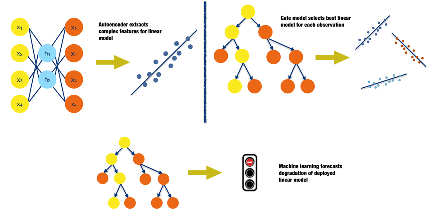
Instead of using machine learning predictions directly for analytical decisions, traditional analytical lifecycle processes (such as data preparation and model deployment) can be augmented with machine learning techniques leading to potentially more accurate predictions from regulator-approved linear, monotonic models. Figure 11 outlines three possible scenarios in which analytical processes can be augmented with machine learning:
- Introduce complex predictors into traditional, linear models: Introducing interactions, polynomials, or simple functional transformations into linear models is a standard practice. Machine learning algorithms can be used to create different types of nonlinear and non-polynomial predictors that can also represent high-degree interactions between independent variables. There are many options for creating these predictors. Examples include the nonlinear features extracted by autoencoder networks or the optimal bins represented by the terminal node labels of a decision tree.
- Use multiple gated linear models: Very often, segmenting data into smaller groups based on important data attributes or time and building linear models for each segment can lead to more accurate results. It is not uncommon for organizations to use several deployed linear models to handle different market segments or different times of year. Deciding how to manually fuse the predictions of these different models can be a tedious task for analysts and data scientists. However, if data is collected about past model performance, this process can be automated by allowing a gate model to decide which linear model an observation should be delegated to for a decision.
- Predict linear model degradation: In most cases, models are trained on static snapshots of data and then validated on later snapshots of similar data. Though an accepted practice, this process leads to model degradation when the real-world phenomena represented in the training and validation data start to change. Such degradation could occur when competitors enter or leave a market, when macroeconomic factors change, or when consumer fads change, and for many other common reasons. If data is collected about market and economic factors and about past model performance, another model can be used to predict when traditional deployed models need to be retrained or replaced. Like changing an expensive mechanical component before it requires maintenance, models can be retrained or replaced before their predictive power lessens. (I’ve written previously about the topic of test error in applied machine learning and ways that machine learning should be used in the real world.)
Of course, there are many other opportunities for incorporating machine learning into the lifecycle of a traditional model. You may have better ideas or implementations in place already!
Does incorporation of machine learning into traditional analytical processes provide global or local interpretability?
It generally attempts to retain the global interpretability of traditional linear models. However, adding features extracted by machine learning algorithms into a linear model can reduce global interpretability.
What complexity of function does incorporating machine learning into traditional analytical processes create?
The goal is to continue using linear, monotonic response functions, but in more efficient and automated ways.
How does the incorporation of machine learning into traditional analytical processes enhance understanding?
Incorporating machine learning models into traditional analytical processes aims to use linear, understandable models more efficiently and accurately. Understanding can be enhanced further if the process of adding nonlinear features to a linear model, using gated models, or forecasting model degradation leads to deeper knowledge of driving phenomena that create nonlinearity, trends, or changes in your data.
How does the incorporation of machine learning into traditional analytical processes enhance trust?
It can help make our understandable models more accurate, and if augmentation does lead to increased accuracy, this is an indication that the pertinent phenomena in the data have been modeled in a more trustworthy, dependable fashion.
Small, interpretable ensembles
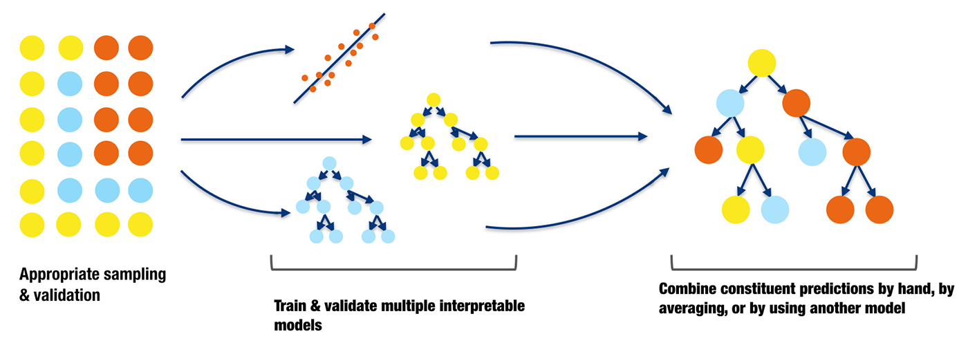
Many organizations are so adept at traditional linear modeling techniques that they simply cannot squeeze much more accuracy out of any single model. One potential way to increase accuracy without losing too much interpretability is to combine the predictions of a small number of well-understood models. The predictions can simply be averaged, manually weighted, or combined in more mathematically sophisticated ways. For instance, predictions from the best overall model for a certain purpose can be combined with another model for the same purpose that excels at rare event detection. An analyst or data scientist could do experiments to determine the best weighting for the predictions of each model in a simple ensemble, and partial dependency plots could be used to ensure that the model inputs and predictions still behave monotonically with respect to one another.
If you prefer or require a more rigorous way to combine model predictions, then super learners are a great option. Super learners are a specific implementation of stacked generalization introduced by Wolpert in the early 1990s. Stacked generalization uses a combiner model to decide the weighting for the constituent predictions in the ensemble. Overfitting is a serious concern when stacking models. Super learners prescribe an approach for cross-validation and add constraints on the prediction weights in the ensemble to limit overfitting and increase interpretability. Figure 12 is an illustration of cross-validated predictions from two decision trees and a linear regression being combined by another decision tree in a stacked ensemble.
Do small, interpretable ensembles provide global or local interpretability?
They provide increased accuracy, but may decrease overall global interpretability. They do not affect the interpretability of each individual constituent model, but the resulting ensemble model may be more difficult to interpret.
What complexity of function do small, interpretable ensembles create?
They can create very complex response functions. To ensure interpretability is preserved, use the lowest possible number of individual constituent models, use simple, linear combinations of constituent models, and use partial dependence plots to check that linear or monotonic relationships have been preserved.
How do small, interpretable ensembles enhance understanding?
They enhance understanding if the process of combining interpretable models leads to greater awareness and familiarity with phenomena in your data that positively impacts generalization and predictions on future data.
How do small, interpretable ensembles enhance trust?
They allow us to boost the accuracy of traditional trustworthy models without sacrificing too much interpretability. Increased accuracy is an indication that the pertinent phenomena in the data have been modeled in a more trustworthy, dependable fashion. Trust can be further enhanced by small, interpretable ensembles when models complement each other in ways that conform to human expectations and domain knowledge.
Monotonicity constraints
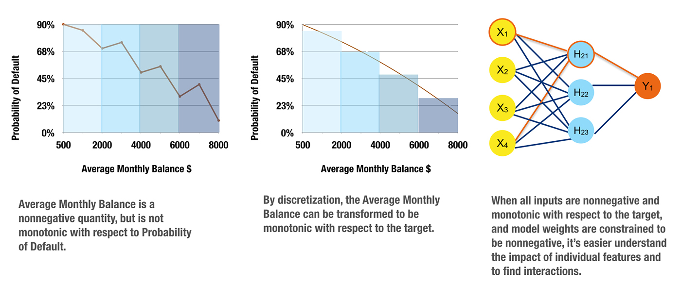
Monotonicity constraints can turn difficult-to-interpret nonlinear, non-monotonic models into highly interpretable, and possibly regulator-approved, nonlinear, monotonic models. Monotonicity is very important for at least two reasons:
- Monotonicity is often expected by regulators: no matter what a training data sample says, regulators may still want to see monotonic behavior. Consider savings account balances in credit scoring. A high savings account balance should be an indication of creditworthiness, whereas a low savings account balance should be an indicator of potential default risk. If a certain batch of training data contains many examples of individuals with high savings account balances defaulting on loans or individuals with low savings account balances paying off loans, of course a machine-learned response function trained on this data would be non-monotonic with respect to savings account balance. This type of predictive function could be unsatisfactory to regulators because it defies decades of accumulated domain expertise and thus decreases trust in the model or sample data.
- Monotonicity enables consistent reason code generation: consistent reason code generation is generally considered a gold standard of model interpretability. If monotonicity is guaranteed by a credit scoring model, reasoning about credit applications is straightforward and automatic. If someone’s savings account balance is low, their credit worthiness is also low. Once monotonicity is assured, reasons for credit decisions can then be reliably ranked using the max-points-lost method. The max-points-lost method places an individual on the monotonic, machine-learned response surface and measures their distance from the maximum point on the surface (i.e., the ideal, most creditworthy possible customer). The axis (e.g., independent variable) on which an individual is the farthest from the ideal customer is the most important negative reason code for a credit decision. The axis (e.g., independent variable) on which an individual is the closest to the ideal customer is the least important negative reason code for a credit decision, and other independent variables are ranked as reason codes between these two given the position of the individual in relation to the ideal customer. Monotonicity simply ensures clear, logical reasoning using the max-points-lost method: under a monotonic model, an individual who was granted a loan could never have a lower savings account balance than an individual who was denied a loan.
Monotonicity can arise from constraints on input data, constraints on generated models, or from both. Figure 13 represents a process where carefully chosen and processed non-negative, monotonic independent variables are used in conjunction with a single hidden layer neural network training algorithm that is constrained to produce only positive parameters. This training combination generates a nonlinear, monotonic response function from which reason codes can be calculated, and by analyzing model parameter values, high-degree interactions can be identified. Finding and creating such non-negative, monotonic independent variables can be a tedious, time-consuming, trial-and-error task. Luckily, neural network and tree-based response functions can usually be constrained to be monotonic with respect to any given independent variable without burdensome data preprocessing requirements. Monotonic neural networks often entail custom architecture and constraints on the values of the generated model parameters. For tree-based models, monotonicity constraints are usually enforced by a uniform splitting strategy, where splits of a variable in one direction always increase the average value of the dependent variable in the resultant child node, and splits of the variable in the other direction always decrease the average value of the dependent variable in resultant child node. As implementations of monotonicity constraints vary for different types of models in practice, they are a model-specific interpretation technique.
Do monotonicity constraints provide global or local interpretability?
Monotonicity constraints create globally interpretable response functions.
What complexity of function do monotonicity constraints create?
They create nonlinear, monotonic response functions.
How do monotonicity constraints enhance understanding?
They enable automatic generation of reason codes and for certain cases (i.e., single hidden-layer neural networks and single decision trees) important, high-degree variable interactions can also be automatically determined.
How do monotonicity constraints enhance trust?
Trust is increased when monotonic relationships, reason codes, and detected interactions are parsimonious with domain expertise or reasonable expectations. Sensitivity analysis can also increase trust in the model if results remain stable when input data undergoes minor perturbations and if the model changes in dependable, predictable ways over time.
Part 3: Understanding complex machine learning models
The techniques presented in this part can create interpretations for nonlinear, non-monotonic response functions. They can be used alongside techniques discussed in Parts 1 and 2 to increase the interpretability of all model types. Practitioners might need to use more than one of the interpretability techniques described below to derive satisfactory explanations for their most complex models.
Surrogate models
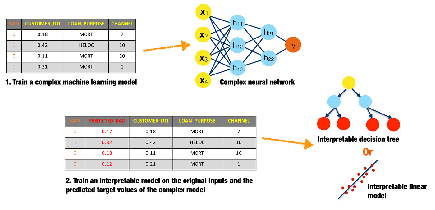
A surrogate model is a simple model that is used to explain a complex model. Surrogate models are usually created by training a linear regression or decision tree on the original inputs and predictions of a complex model. Coefficients, variable importance, trends, and interactions displayed in the surrogate model are then assumed to be indicative of the internal mechanisms of the complex model. There are few, possibly no, theoretical guarantees that the simple surrogate model is highly representative of the more complex model.
What is the scope of interpretability for surrogate models?
Generally, surrogate models are global. The globally interpretable attributes of a simple model are used to explain global attributes of a more complex model. However, there is nothing to preclude fitting surrogate models to more local regions of a complex model’s conditional distribution, such as clusters of input records and their corresponding predictions, or deciles of predictions and their corresponding input rows. Because small sections of the conditional distribution are more likely to be linear, monotonic, or otherwise well-behaved, local surrogate models can be more accurate than global surrogate models. Local Interpretable Model-agnostic Explanations (discussed in the next section) is a formalized approach for local surrogate models. Of course, global and local surrogate models can be used together to foster both global and local interpretability.
What complexity of functions can surrogate models help explain?
Surrogate models can help explain machine learning models of any complexity, but they are probably most helpful for nonlinear, non-monotonic models.
How do surrogate models enhance understanding?
Surrogate models enhance understanding because they provide insight into the internal mechanisms of complex models.
How do surrogate models enhance trust?
Surrogate models enhance trust when their coefficients, variable importance, trends, and interactions are in line with human domain knowledge and reasonable expectations of modeled phenomena. Surrogate models can increase trust when used in conjunction with sensitivity analysis to test that explanations remain stable and in line with human domain knowledge, and reasonable expectations when data is lightly and purposefully perturbed, when interesting scenarios are simulated, or as data changes over time.
Local Interpretable Model-agnostic Explanations (LIME)
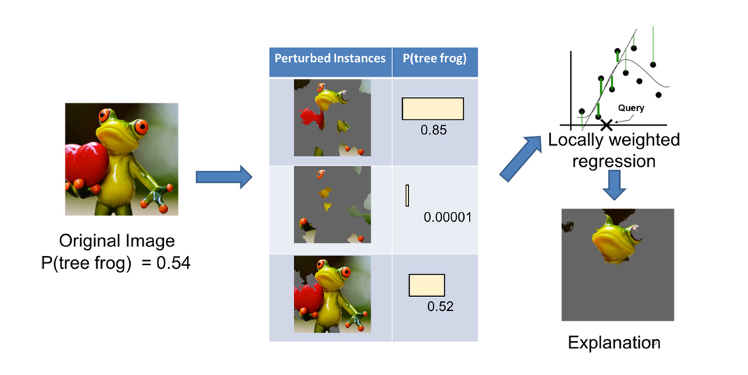
LIME is a prescribed method for building local surrogate models around single observations. It is meant to shed light on how decisions are made for specific observations. LIME requires that a set of explainable records be found, simulated, or created. This set of well-understood records is used to explain how machine learning algorithms make decisions for other, less well-understood records. An implementation of LIME may proceed as follows. First, the set of explainable records are scored using the complex model. Then, to interpret a decision about another record, the explanatory records are weighted by their closeness to that record, and an L1 regularized linear model is trained on this weighted explanatory set. The parameters of the linear model then help explain the prediction for the selected record.
LIME was originally described in the context of explaining image or text classification decisions. It could certainly also be applied to business or customer data, for instance by explaining customers at every decile of predicted probabilities for default or churn, or by explaining representative customers from well-known market segments. Multiple implementations of LIME are available. Two I see the most often are from the original authors of LIME and from the eli5 package, which implements several handy machine learning interpretability tools.
What is the scope of interpretability for LIME?
LIME is a technique for local interpretability.
What complexity of functions can LIME help explain?
LIME can help explain machine learning models of any complexity, but it is probably most appropriate for nonlinear, non-monotonic models.
How does LIME enhance understanding?
LIME provides insight into the important variables and their linear trends around specific, important observations, even for extremely complex response functions.
How does LIME enhance trust?
LIME increases trust when the important variables and their linear trends around specific records conform to human domain knowledge and reasonable expectations of modeled phenomena. LIME can also enhance trust when used in conjunction with maximum activation analysis to see that a model treats obviously different records using different internal mechanisms and obviously similar records using similar internal mechanisms. LIME can even be used as a type of sensitivity analysis to determine whether explanations remain stable and in line with human domain knowledge and expectations when data is intentionally and subtly perturbed, when pertinent scenarios are simulated, or as data changes over time.
Maximum activation analysis
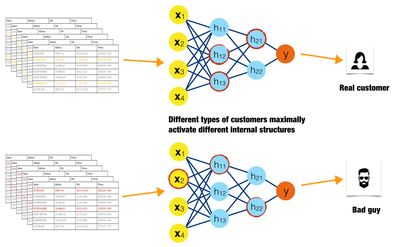
In maximum activation analysis, examples are found or simulated that maximally activate certain neurons, layers, or filters in a neural network or certain trees in decision tree ensembles. For the purposes of maximum activation analysis, low residuals for a certain tree are analogous to high-magnitude neuron output in a neural network. Like monotonicity constraints in Part 2, maximum activation analysis is a general idea that is likely a model-specific interpretation technique in-practice.
Maximum activation analysis elucidates internal mechanisms of complex models by determining the parts of the response function that specific observations or groups of similar observations excite to the highest degree, either by high-magnitude output from neurons or by low residual output from trees. Maximum activation analysis can also find interactions when different types of observations consistently activate the same internal structures of a model.
Figure 16 is an idealized illustration of a good customer causing high-magnitude outputs from a different set of neurons than a fraudulent customer. Here the red highlighting indicates the three maximally activated neurons for each type of input. The maximally activated neurons are different for these two very different inputs, indicating that the internal structure of the model treats input classes differently. If this pattern were to be consistent for many different examples of good customers and fraudulent customers, it would also indicate that internal model mechanisms are stable and dependable.
What is the scope of interpretability for maximum activation analysis?
Maximum activation analysis is local in scope because it illustrates how certain observations or groups of observations are treated by discernible aspects of a complex response function.
What complexity of functions can maximum activation analysis help explain?
Maximum activation analysis can help explain machine learning models of any complexity, but it is probably best suited for nonlinear, non-monotonic models.
How does maximum activation analysis enhance understanding?
Maximum activation analysis increases understanding because it exposes the internal structures of complex models.
How does maximum activation analysis enhance trust?
LIME, discussed above, helps explain the predictions of a model in local regions of the conditional distribution. Maximum activation analysis helps enhance trust in localized, internal mechanisms of a model. The two make a great pair for creating detailed, local explanations of complex response functions. Maximum activation analysis enhances trust when a complex model handles obviously different records using different internal mechanisms and obviously similar records using similar internal mechanisms. It enhances trust when these internal mechanisms are consistently and repeatedly different for many input examples. It enhances trust when found interactions match human domain knowledge or expectations, and maximum activation analysis also enhances trust when used as a type of sensitivity analysis. It can be used to investigate if internal treatment of observations remains stable when data is lightly perturbed, when interesting situations are simulated, or as data changes over time.
Sensitivity analysis

Sensitivity analysis investigates whether model behavior and outputs remain stable when data is intentionally perturbed or other changes are simulated in data. Beyond traditional assessment practices, sensitivity analysis of machine learning model predictions is perhaps the most important validation technique for machine learning models. Machine learning models can make drastically differing predictions from minor changes in input variable values. In practice, many linear model validation techniques focus on the numerical instability of regression parameters due to correlation between input variables or between input variables and the dependent variable. It may be prudent for those switching from linear modeling techniques to machine learning techniques to focus less on numerical instability of model parameters and to focus more on the potential instability of model predictions.
Sensitivity analysis can also test model behavior and outputs when interesting situations or known corner cases are simulated. Different techniques, including those presented in this article and many others, can be used to conduct sensitivity analysis. Output distributions, error measurements, plots, and interpretation techniques can be used to explore the way models behave in important scenarios, how they change over time, or if models remain stable when data is subtly and intentionally corrupted.
What is the scope of interpretability for sensitivity analysis?
Sensitivity analysis is a global interpretation technique when global interpretation techniques are used, such as using a single, global surrogate model to ensure major interactions remain stable when data is lightly and purposely corrupted.
Sensitivity analysis is a local interpretation technique when local interpretation techniques are used, for instance using LIME to determine if the important variables in a credit allocation decision remain stable for a given customer segment under macroeconomic stress testing.
What complexity of functions can sensitivity analysis help explain?
Sensitivity analysis can help explain the predictions of any type of response function, but is probably most appropriate for nonlinear response functions and response functions that model high degree variable interactions. For both cases, small changes in input variable values can result in large changes in a predicted response.
How does sensitivity analysis enhance understanding?
Sensitivity analysis enhances understanding because it shows a model’s likely behavior and output in important situations, and how a model’s behavior and output may change over time.
How does sensitivity analysis enhance trust?
Sensitivity analysis enhances trust when a model’s behavior and outputs remain stable when data is subtly and intentionally corrupted. It also increases trust if models adhere to human domain knowledge and expectations when interesting situations are simulated, or as data changes over time.
Variable importance measures
For nonlinear, non-monotonic response functions, variable importance measures are often the only commonly available quantitative measure of the machine-learned relationships between independent variables and the dependent variable in a model. Variable importance measures rarely give insight into even the average direction that a variable affects a response function. They simply state the magnitude of a variable’s relationship with the response as compared to other variables used in the model.
Global variable importance measures
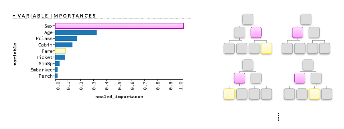
Variable importance measures are typically seen in tree-based models but are sometimes also reported for other models. As illustrated in Figure 18, a simple heuristic rule for variable importance in a decision tree is related to the depth and frequency at which a variable is split on in a tree, where variables used higher in the tree and more frequently in the tree are more important. For a single decision tree, a variable’s importance is quantitatively determined by the cumulative change in the splitting criterion for every node in which that variable was chosen as the best splitting candidate. For a gradient boosted tree ensemble, variable importance is calculated as it is for a single tree but aggregated for the ensemble. For a random forest, variable importance is also calculated as it is for a single tree and aggregated, but an additional measure of variable importance is provided by the change in out-of-bag accuracy caused by shuffling the independent variable of interest, where larger decreases in accuracy are taken as larger indications of importance. (Shuffling is seen as zeroing-out the effect of the given independent variable in the model, because other variables are not shuffled.) For neural networks, variable importance measures are typically associated with the aggregated, absolute magnitude of model parameters for a given variable of interest. Global variable importance techniques are typically model specific, and practitioners should be aware that unsophisticated measures of variable importance can be biased toward larger scale variables or variables with a high number of categories.
Leave-One-Covariate-Out (LOCO)

A recent preprint article put forward a local, model-agnostic generalization of mean accuracy decrease variable importance measures called Leave-One-Covariate-Out, or LOCO. LOCO was originally described in the context of regression models, but the general idea of LOCO is model agnostic and can be implemented in various ways. A general implementation of LOCO may proceed as follows. LOCO creates local interpretations for each row in a training or unlabeled score set by scoring the row of data once and then again for each input variable (e.g., covariate) in the row. In each additional scoring run, one input variable is set to missing, zero, its mean value, or another appropriate value for leaving it out of the prediction. The input variable with the largest absolute impact on the prediction for that row is taken to be the most important variable for that row’s prediction. Variables can also be ranked by their impact on the prediction on a per-row basis. LOCO also creates global variable importance measures by estimating the mean change in accuracy for each variable over an entire data set and can even provide confidence intervals for these global estimates of variable importance.
What is the scope of interpretability for variable importance measures?
Variable importance measures are usually global in scope; however, the LOCO approach offers local variable importance measures for each row in a training set or in new data.
What complexity of functions can variable importance measures help explain?
Variable importance measures are most useful for nonlinear, non-monotonic response functions but can be applied to many types of machine-learned response functions.
How do variable importance measures enhance understanding?
Variable importance measures increase understanding because they tell us the most influential variables in a model and their relative rank.
How do variable importance measures enhance trust?
Variable importance measures increase trust if they are in line with human domain knowledge and reasonable expectations. They also increase trust if they remain stable when data is lightly and intentionally perturbed, and if they change in acceptable ways as data changes over time or when pertinent scenarios are simulated.
Treeinterpreter
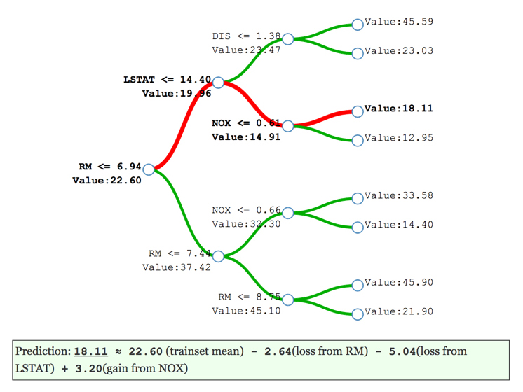
Several average tree interpretation approaches have been proposed over the years, but the simple, open source package known as treeinterpreter has become popular in recent months. Treeinterpreter decomposes decision tree and random forest predictions into bias (overall training data average) and component terms from each independent variable used in the model. Tree interpreter is model specific to algorithms based on decision trees. Figure 20 portrays the decomposition of the decision path into bias and individual contributions for a decision tree. The red branches in Figure 20 illustrate the decision path for a certain record of data through this single decision tree created from the results of treeinterpreter. (Treeinterpreter simply outputs a list of the bias and individual contributions for a variable in a given model or the contributions the input variables in a single record make to a single prediction.) The eli5 package also has an implementation of treeinterpreter.
What is the scope of interpretability for treeinterpreter?
Treeinterpreter is global in scope when it represents average contributions of independent variables to an overall decision tree or random forest model prediction. It is local in scope when used to explain certain predictions.
What complexity of functions can treeinterpreter help explain?
Treeinterpreter is meant to explain the usually nonlinear, non-monotonic response functions created by decision tree and random forest algorithms.
How does treeinterpreter enhance understanding?
Treeinterpreter increases understanding by displaying average, ranked contributions of independent variables to the predictions of decision tree and random forest models.
How does treeinterpreter enhance trust?
Treeinterpreter enhances trust when displayed variable contributions conform to human domain knowledge or reasonable expectations. Treeinterpreter also enhances trust if displayed explanations remain stable when data is subtly and intentionally corrupted, and if explanations change in appropriate ways as data changes over time or when interesting scenarios are simulated.
Conclusion
Over the last few months, as my friends and colleagues heard that I was compiling this article, the pace at which they emailed, texted, tweeted, and slacked me regarding new work in this field has only accelerated. Currently, I probably see two new libraries, algorithms, or papers a day, and I can’t possibly keep up with adding them into this overview article. The fact is, this article will always be a finite document and has to stop somewhere. So, it stops here for now. I believe the article has put forward a useful ontology for understanding machine learning interpretability techniques moving into the future by categorizing them based on four criteria: their scope (local versus global), the complexity of response function they can explain, their application domain (model specific versus model agnostic), and how they can enhance trust and understanding. I also believe the article has covered the main categories of techniques, especially from an applied and commercial usage perspective. If I had more time and could keep adding to the article indefinitely, I think two topics I would prioritize for readers today would be RuleFit and the multiple advances in making deep learning more interpretable, one example of many being learning deep k-Nearest Neighbor representations. These are two things I’m certainly looking forward to learning more about myself.
With so many new developments occurring so quickly, it’s truly an exciting time to be working on this subject. I hope you find the information in this article helpful. For those of us working on the subject, I hope you are as inspired as I am about the future of making machine learning and artificial intelligence more useful and transparent to users and consumers of these revolutionary technologies.
Related resources:
