How to design bot conversations
Tools to fine-tune the wording, formatting, and other aspects of conversation to render rich interactions.
 Speech bubbles (source: Pixabay)
I love taking an idea to a prototype, and then to a product that millions of people use.
SUSAN WOJCICKI
There are a lot of ways to design a conversation. One option is to just expand on the Wizard of Oz technique demonstrated in Chapter 15, and mimic the scripts by impersonating the bot. While this is a very easy and quick method to get your product in front of your users and other stakeholders, it provides low fidelity when it comes to rendering rich interactions. This is because the chat platforms limit the types of rich controls available to humans. Users can post simple images, GIFs, and even videos, but they cannot display buttons, for example.
When it comes to software solutions, there are also a lot of design tools that provide you with different levels of fidelity and ease of use. There are many good options, and you should pick the ones that suit you. I have chosen two tools as examples, one for designing bots for Facebook Messenger and the other for Slack.
In the next few sections, we will go over the scripts we created in the previous chapter and use these design tools to visualize these scripts. For each script, we will try to fine-tune the wording, formatting, and other aspects of the conversation. This is an iterative process that will demonstrate design in real life.
Designing VacationBot for Facebook Messenger with Botsociety
Let’s start with a tool called Botsociety (https://botsociety.io). Botsociety is a super-easy and quite full-featured design tool for bots. At the time of writing Botsociety supports only Facebook Messenger, but the team have told me they are planning to launch support for other platforms very soon.
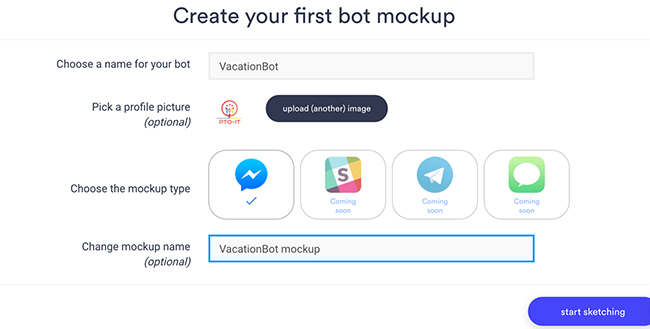
After registering, we will choose a name for our bot, select a platform, and start sketching (Figure 1-1).
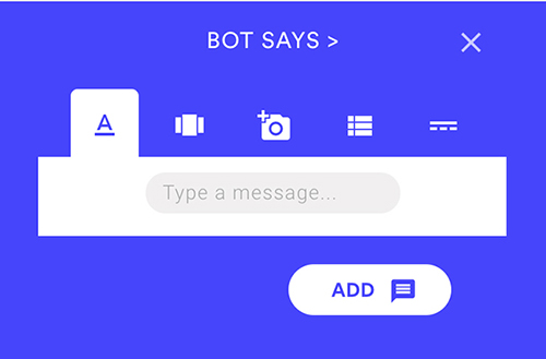
Next, we’ll go into the main designing area. As you can see, the tool uses a super-simple “Bot Says”/“User Says” paradigm (Figure 1-2).

Clicking on the “Bot Says” button provides you with a choice of the common types of output bots on the Facebook Messenger platform can provide (Figure 1-3).
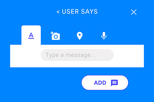
Similarly, clicking on “User Says” offers you a choice of the types of input available to users on Facebook Messenger (Figure 1-4).
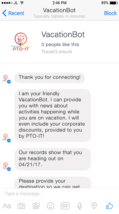
From a quick browse of the elements on both sides of the conversation, it looks like we have everything we need to start designing our scripts. So let’s give it a try! I have taken the onboarding script outlined in the previous chapter for our VacationBot and entered the first part of it into the tool. Immediately, I notice an issue with the original script—it’s so long that it runs below the fold (meaning you need to scroll read it all). This makes for a bad user experience, as it is hard to understand at a glance what the bot is and what it wants from the user (Figure 1-5).
I have a bad feeling about this: if users do not see the entire value proposition up front, they might just back out of the conversation. Let’s make it shorter (Figure 1-6).
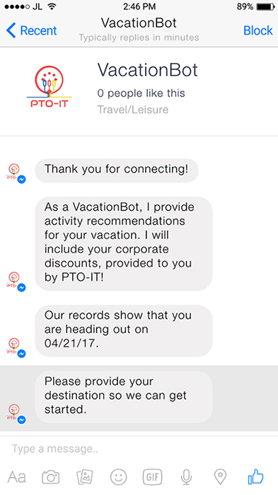
I made the bot’s value proposition a little more concise (which is a good thing on its own), and now everything fits well within the window without scrolling. We will, of course, need to test it on several devices, both mobile and desktop, but this is a good start.
Note
Key takeaway
The difference between a good experience and a poorly executed one can be in the small details, such as how long the text is and whether the user has to scroll to read all of it.
Some designers will prefer to do all of their scripting in tools like this, for the benefit of seeing immediately how the script looks in real life—if you feel more comfortable doing so, please do. I prefer to start with written scripts, as it enables me to really think about the flow in the context of multiple scripts and use cases. It is also easier to cut, paste, and share initial scripts written as text rather than as a GIF, which is the output of this tool.
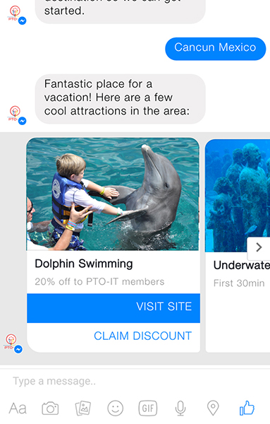
Now we can continue with the script and see if the rich interaction we envisioned works well. Botsociety provides you with the ability to render more than plain text: it also enables you to render rich controls like carousels. Near the end of our onboarding script, we have a section where we demonstrate the value of the bot with a carousel of activities at the vacation destination. We might need to wait for user feedback, but I think the outcome is quite nice (Figure 1-7).
Finally, we can explore the call to action at the end of our onboarding script (Figure 1-8).
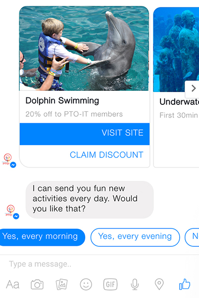
As you can see, not all the buttons are visible, and the user needs to scroll to see all the options. This could actually be a blessing in disguise, as the last option—the one the users need to scroll to pick—is the one that we do not want them to click on (the option that declines the offer). The positioning of the UX elements, both on the screen and off, subtly encourages the user to pick one of the “right” choices and subscribe to the bot’s feed. Of course, users are still able to decline by clicking on “No thanks” or just not clicking on anything.
This brings to light another consideration we will need to take into account—if the user does not click on any of the buttons, we will have to treat it as a “No thanks” after a certain amount of time, and continue on to provide the user with a way to ask for recommendations manually at any time.
By now we have tested all of the rich controls we have planned for our VacationBot, for this use case. Let’s finish up the onboarding design, and pick the “No thanks” Quick Reply (Figure 1-9).
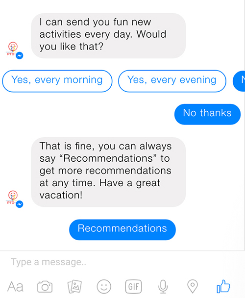
It looks like we can do a little better—we are missing the opportunity to let the user schedule reminders at a later stage. Let’s add that now (Figure 1-10).
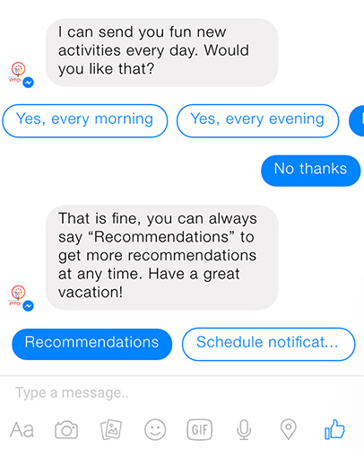
This looks much better now, and the user has another option to subscribe to the service. Note that in the previous design, after users have declined the offer to subscribe, they do not have a way to back out of that decision. It is always recommended to give the user the option to reconsider and do the right thing.
Now we will implement VacationBot’s main flow (Figure 1-11).
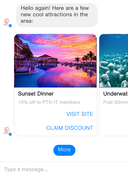
I think it looks pretty good. Remember, we will have a “Schedule notifications” option in case the user has not done so. Here, we assume the user has subscribed to receive notifications; the top text saying “Hello again!” would not be visible in cases where notifications are turned off.
Now let’s design the help script. We will add Quick Replies at the end of the help text to prevent a dead end (Figure 1-12).
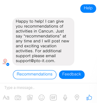
This is better than the original script because it is more consistent and always provides the user with options for what to do next.
Now let’s implement the feedback script of our VacationBot (Figure 1-13).
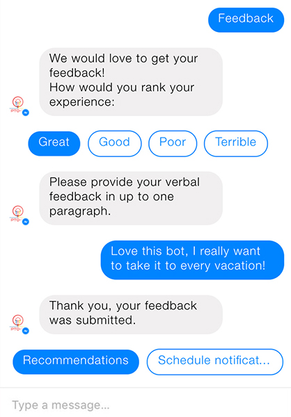
I have added the consistent ending that gives the user a hint about what to do next. I really like the outline of the Great…Terrible Quick Replies. One issue is that the bot does not acknowledge the user’s feedback rating; this might be fine, but we might want to test if users find that awkward or not.
Finally, we will design a generic error script. From the design up to now, I already know to add the standard “Recommendations” Quick Reply at the end of the conversation (Figure 1-14).
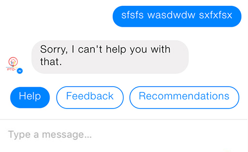
The last thing I’ve noticed is that the logo looks really bad—the text is not visible, and it looks small. We will fix this for both bots later in this chapter.
As you can see, we have learned a lot from just doing a simple visualization of our scripting. We have noticed places where we can improve user engagement by adding Quick Replies and avoiding dead ends. We have also seen how the rich controls look, in an environment that is close to real life, and have modified our text to improve the layout of our conversations.
Designing PTOBot for Slack with Walkie
In order to design our PTOBot on Slack, I am going to use a design tool called Walkie (https://walkiebot.co). Walkie is a flexible and a feature-rich tool that lets you script multiple flows. It all starts with setting up your bot and user (Figure 1-15).

After saving the settings, we go into a Slack-like user experience (Figure 1-16).
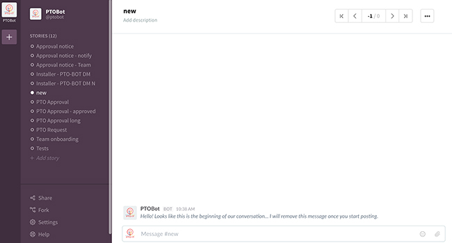
On the left there is a list of bots that we’ve created (in this case, PTOBot), then there is a list of flows which are distinct scripts (PTO approval, for example). The main area to the right is the design section, with a place to enter user and bot inputs. Clicking on the “User” button toggles between bot and user. There is also a control at the bottom right to create rich interactions through message attachments. Clicking on it opens up a fully configurable message attachment, including buttons (technically called attachment actions; see Figure 1-17).
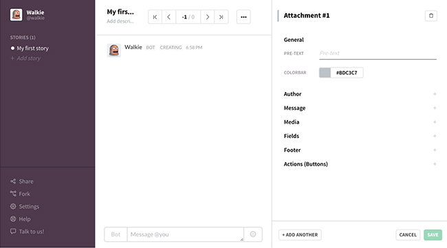
The tool does a good job of supporting multiple bots, but does not support multiple users (user personas) interacting with a bot. So, I will create a few bot configurations to work around that limitation.
Let’s start with the onboarding script. The first conversation is with the user who installed the bot (Figure 1-18).
As you might recall, the onboarding script shows a GIF of the PTO request process, in order to demo the bot’s usage. Showing this in a printed book is a challenge on its own, so I have cheated a little and used a screenshot of the PTO request process.
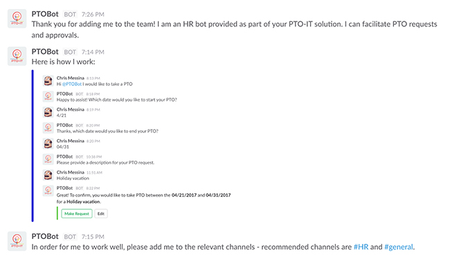
The script looks okay, but it suffers from the opposite problem our VacationBot had in its onboarding script—the script here seems too dry and too short, and I am not sure it is clear and actionable enough.
Let’s try to fix that (Figure 1-19).
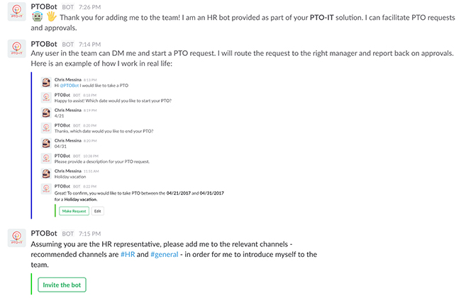
I added a few emojis, made the text a little more descriptive, and added a button at the bottom of the script that lets the installer invite the bot to the right channels with a single click. Because the Slack API lets us to add a bot to a channel programmatically, we can use this button to shortcut the need for the user to go into the relevant channels and invite the bot manually. We will use the API to add the bot automatically, while still giving the control to the installer, by only adding the bot after the button has been clicked.
I also started to add a color convention: blue will be informative (like the blue color next to the demo GIF) and green actionable, for actions we want the user to perform.
The entire onboarding fits on a single page, without scrolling, on a web interface. You should not be too worried about this in a work context, but it is still best practice to keep the initial conversation above the fold.
Let’s continue to the next step, the team onboarding script, shown after the bot is invited to a channel by the installer (Figure 1-20).
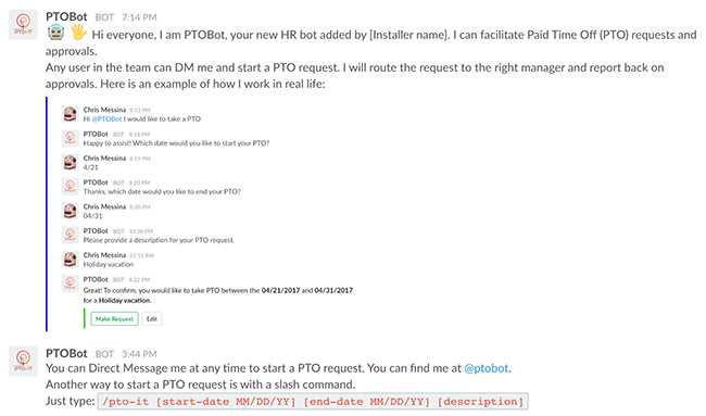
The text is very similar to the installer script, but you will notice I have added a little text decoration at the end of the team onboarding text. I surrounded the slash command with backticks (“) to render the text as a code block. This hints to the user that the slash command is like a short command line that they can use, and that they should pay attention to the parameters the command accepts (in the same way one does when running a script on the command line).
Now, let’s move on to the main flow. To remind you, the main functionality of our PTOBot is as follows:
-
Employee requests PTO in a direct message with the bot (or a slash command).
-
Manager gets a notification and approves/rejects the request.
-
Employee gets notification of approval/rejection.
-
Team gets notification of PTO.
This is by no means a simple “Hello World”–style process. I did not want to avoid complexity, but wanted to demonstrate the flexibility and unique attributes possible in bots for a work environment. We will design each step in this process, learning and improve each step along the way.
We’ll design each of these steps in a separate Walkie flow, starting with the PTO request (Figure 1-21).
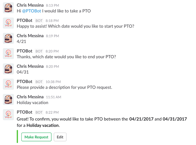
You will notice that I have used some lightweight formatting by making the dates and the description captured stand out in bold (surrounding them with *s) and kept the green color coding for actions we would like the user to take.
As you can see, the conversation is long with a few places for potential errors. This is where our Slack command comes into play. Let’s see the same conversation compacted to a couple of lines (Figure 1-22).

In a single line the user has provided all the necessary information to the bot, initiating a PTO request without the need for a lengthy conversation. Slash commands are great when you have a small and structured set of entities (variables) your bot needs to extract, and a savvy set of users who can remember how to use the commands.
Now, let us continue to the manager approval step (Figure 1-23).

This is OK, but it could be better. The name of the game here is get things done as fast as possible. This mean rendering the information in the easiest possible way to digest. We made the important parts bold, but I think the way the message is currently structured forces the user to read through it in order to get the necessary information. Let’s see if we can enter the details in Slack’s structured template (called a message attachment) and make it easier to digest and act upon. Figure 1-24 shows the result.
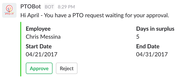
I think this might be an easier way for the manager to pull out the relevant data. Of course, we will have to test it with actual users, as this is only an assumption.
Now let us finish up the approval step (Figure 1-25).
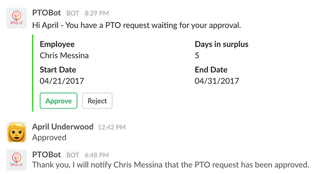
Now that we have designed the script, you might notice a few shortcomings with this design. The buttons are still there, and there is a chance the user will click on them by mistake. There is also a good chance that this design will be messy in a real-life scenario, when multiple requests might come in concurrently. It will be hard to manage the requests and keep track of which have been approved and which were rejected. Let’s try another approach (Figure 1-26).

In this design I replaced the buttons, once the user has clicked “Approve,” with an approval confirmation. I think this is a better way to implement the process. Replacing the buttons ensures the user does not press one of them again by mistake. It also removes some of the cognitive load, if a lot of messages like this one appear in a conversation, and gives the user the feeling of accomplishment that users love in todo lists.
In the Walkie tool itself, I have forked the approval flow into “request approved” and “request rejected.” Figure 1-27 shows what the “rejected” flow looks like.
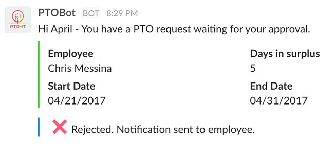
Now it is easy to see at a glance which requests have been accepted or rejected, and the user does not need to read through a text conversation to see which requests have been handled. In more advanced versions we might want to add a reason for rejection, but let’s keep it simple for now.
Next, in the employee notification flow, we will implement what we’ve learned about message formatting and button replacement (Figure 1-28).

Notice that the bot is actually rendering two message attachments—one is informational, color coded in blue, and the other is actionable, color coded in green. Clicking on “Notify Team” will follow the same practice of replacing the buttons with a confirmation that the notification has been sent (Figure 1-29).
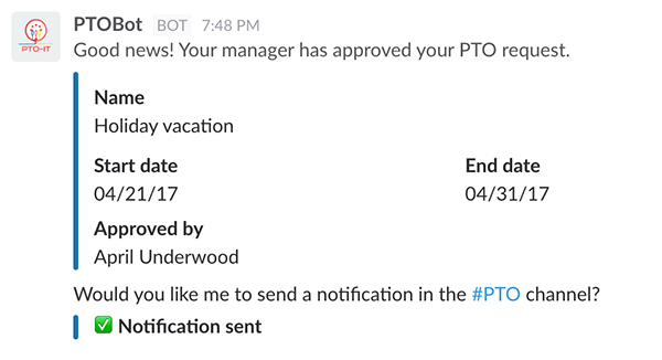
Note that we also changed the color coding of the second attachment to blue as it moved from actionable to informational. I chose to use this color schema as an example of how color coding can help with mental load reduction. We will have to test if this resonates with our users later on.
Let’s finish this step by suggesting that the user install VacationBot (Figure 1-30).

This is a unique pattern of one bot recommending another bot to the user, and on a different platform. Clicking on the link will take the user straight to an onboarding conversation with VacationBot on Facebook Messenger.
Meanwhile, let’s finish the main flow by designing the team PTO notification (Figure 1-31).
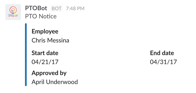
A PTO process like this is traditionally done manually, using paper forms, spreadsheets, or web tracking tools; it can be messy and require a lot of time. Our assumption is that users will find this process easier, more intuitive, and more productive.
The last thing to take care of is the logo. As mentioned earlier, particularly in our VacationBot, it looks small and indistinct. We also want the logo to be consistent in both bots. Moving forward, I will use the simple logo shown in Figure 1-32.

User Testing
Now that we have designed the main flow of both bots, it is time to put them in front of actual users. First, we need to decide how we want to test our design.
There are a few options:
-
Show users a video or a step-by-step replay of the conversation and get their inputs.
-
Create a mock (fake) bot and let users play with it.
-
Create a working alpha and let users work with it.
Both Botsociety and Walkie support replaying the conversation either as a movie or a step-by-step walkthrough. Showing potential clients/users these videos can get you very valuable feedback. You will not be able to see users perform tasks themselves, which might be the most important indication of good design, but you will get feedback fast and with little development cost.
As for mocking a bot, Walkie goes a step further and lets you export the conversations into a JSON-format file. An engineer can plug this file into a script that mimics an actual bot. A mock bot is a great tool for testing interactions, and it doesn’t really matter that the bot is not connected to the real backend system. In our case, we don’t care that the bot is not connected to a real PTO system, or that the data is fake. Getting a user to go through the request process and a manager to go through the approval process in real life will surely teach us a lot.
Note
Key takeaway
A mock bot is a great tool for testing interactions. It doesn’t really matter that the bot is not connected to the real backend system.
Alternatively, if you are confident with your design, you might even start building the actual bot and get feedback from live alpha users. This is useful because it is the shortest path to production, if you get it right. Users test the real bot, with real data, and you get live and super-accurate feedback. This option will work well if you have clients who are willing and able to be your alpha users and use your software in real life.
Laura Klein has written a great “Step-by-Step Usability Testing Guide” (https://guides.co/g/usability-testing-guide/7996) that outlines the steps in usability testing. Assuming that we will create a mock that users can play with, let’s discuss the usability testing steps for our PTOBot.
Before You Start—Prototyping a Mockup Bot
First let’s create a mockup of our PTOBot. In order to prototype simple processes we will use a tool I developed called ProtoBot, which you can install freely by searching for ProtoBot in the Slack app directory (https://slack.com/apps).
ProtoBot does not require coding skills, and it is really easy to create mockups of bots with it. You install ProtoBot in a testing team of your choice, and start a conversation with it. ProtoBot provides a detailed description of how to use it, but we’ll go through a short example here.
ProtoBot can mimic multiple bots—that is why I initially called it “Dr Jekyl.” These bots are called personas, and ProtoBot can assume a persona with the following steps.
In a direct message with ProbotBot:
-
Type /new-persona PTOBot to start a new bot persona script.
-
Type /set-persona-name PTOBot to set the name the bot will use in this script.
-
Type /set-persona-icon-url [URL] to set the icon the bot will use in this script.
-
Say hello to your new bot (Figure 1-33).
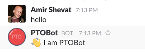
The way to teach ProtoBot a new script is simple: you just start talking to the bot and follow its instructions (Figure 1-34).

/learn is a slash command you can use to teach ProtoBot what to say when the user says something. It follows this pattern:
-
/learn [user says]
-
[bot says]
Note the newline between what the user says and what the bot says (use Shift+Enter to create this newline in Slack). Let’s teach PTOBot what the script replies when the user says “I want to take a PTO” (Figure 1-35).

Now, after we have trained ProtoBot with this step in the script, let’s run the same script again (Figure 1-36).

Yes! ProtoBot is starting to learn how to mimic the PTOBot persona.
In this way, using the /learn slash command, you can teach ProtoBot the entire script. It is important to note that ProtoBot does very little pattern matching, when it comes to user inputs—it is case insensitive and ignores characters like question marks or periods, but you will need to teach it the various permutations of possible user inputs for a given script. In this example, for instance, you can also teach the bot to handle inputs like “I want PTO” or “Start PTO request” to start the PTO request script.
ProtoBot has more advanced functionality, such as the ability to import JSON files from tools such as Walkie and support for multiple concurrent personas, but you can read all about it by just saying “help” to the bot in a direct message at any time. ProtoBot is a good tool for basic mockups, but it does not support complex scripts like contextual help. If you want to implement these, you might want to code your mockup or find a tool that supports these advanced features.
Once we have taught ProtoBot a section of the script, we can start thinking about the next steps in our usability testing.
Planning the Test
To test PTOBot we would like to find existing PTO-IT users—preferably friendly ones and early adopters—and invite them to PTO-IT’s office to do this experiment. We will also invite a few non-clients to see if VacationBot can be used as a standalone product.
We would like to invite users who are already using Slack, because we do not want to have to teach them how to direct message or how a channel works during the usability testing.
Creating Tasks and Discussion Guides
We will focus on two tasks: PTO requests and PTO approvals. We will create an overview of our PTOBot and collect responses to the following background questions from our participants:
-
Managers:
-
How many people do you manage?
-
How many PTO requests do you handle in a month?
-
What system or tool do you use for this today?
-
Do you use bots for your day-to-day tasks?
-
Do you use bots/Slack mainly on the web or on mobile?
-
-
Employees:
We will also create a task for each participant:
- Manager
-
You are a busy exec with little time for paperwork. Show me how you use PTOBot to quickly get through your PTO approval tasks and get back to what’s important.
- Employee
-
You want to take a vacation to Cancun for 10 days starting 04/21/17. Use PTOBot to get your paperwork in order.
Recruiting Participants
We will recruit four managers and four employees. Half of them should be current PTO-IT users and half of them will be new potential users who have not worked with PTO-IT in the past.
Setting Up the Environment
We will set up a clean computer with Slack installed and a test team setup. We will add ProtoBot to that team and teach it the PTO request script and the PTO approval script. Note that if it is easier for you to mock up the bot using any other tool, that’s fine too!
You can also set up the environment by opening Slack and showing the onboarding message from the bot in the HR channel, as that is the most likely place that users will come to learn how to use the bot.
Moderating the Sessions
Make sure to explain that this is just a prototype, and might not work perfectly or look final. Let each user try to perform the assigned task, and possibly fail, without interfering. Make sure to train ProtoBot well beforehand so that it can handle many permutations of user inputs. Also make sure to support the help script so that the user can get help if needed.
Make sure the users are comfortable and know it is OK to fail in these tasks. Ask them to speak their thoughts out loud while performing the task, and follow up with questions—for example, when a user makes a statement like “That was easy,” ask “What was easy about it?” Keep the same pattern for all types of comments. Take notes on all actions and comments made by the users.
Analyzing the Data
Mark each user test with “Task Completed,” “Task Completed with Difficulty,” or “Task Failed.” Correlate your notes on the comments and find patterns that signal issues. Here are some examples:
-
Two employees had a hard time entering the start date of their PTO in a way the bot can understand.
-
Three managers thought the PTO approval process was “very easy.”
-
One employee started a PTO request in the channel rather than in a direct message.
Improving and Iterating
Order the problems you identify by frequency of them happening and their severity, and start fixing these issues. For the examples we outlined above, here are the correlated fixes:
-
Two employees had a hard time entering the start date of their PTO in a way the bot can understand. Support multiple ways to enter a date. Use AI solutions if necessary.
-
One employee started a PTO request in the channel rather than in a direct message. Create an error script that lets the user know that PTO requests only work in direct messages, and guide the users to start a direct message.
Once you’ve fixed these issues, run the test again with fresh test users, and enjoy the fact that you are making your bot better with each iteration.
This was an example of running a usability test to learn about and improve your bot before you launch it. There might be other types of tests you would like to run; ones that check user satisfaction or brand impact, for example. You might also use a different tool to prototype or create an alpha of your bot in order to run these tests. The most important thing is to iterate and learn.
Learning and iterating does not stop when you launch your bot in production—quite the opposite. Most bot builders I’ve spoken with have told me they have learned the most from looking at users using their bots in production, and collecting logs and analytics that they can use to constantly improve their bots. This will be the topic of our next chapter.
