Exploring data with Pandas
Learn to use Pandas to explore a dataset looking for anything that could form the basis for an interesting visualization.
 Closeup of the London Science Museum's difference engine (source: Carsten Ullrich, CC-BY-SA-2.5)
In the previous chapter, we cleaned the Nobel Prize dataset that we scraped from Wikipedia in not available. Now it’s time to start exploring our shiny new dataset, looking for interesting patterns, stories to tell, and anything else that could form the basis for an interesting visualization.
First off, let’s try to clear our minds and take a long, hard look at the data to hand to get a broad idea of the visualizations suggested. Example 1-1 shows the form of the Nobel dataset, with categorical, temporal, and geographical data.
Example 1-1. Our cleaned Nobel Prize dataset
[{'category':u'Physiology or Medicine','date_of_birth':u'8 October 1927','date_of_death':u'24 March 2002','gender':'male','link':u'http://en.wikipedia.org/wiki/C%C3%A9sar_Milstein','name':u'C\xe9sar Milstein','country':u'Argentina','place_of_birth':u'Bah\xeda Blanca , Argentina','place_of_death':u'Cambridge , England','year':1984},...}]
The data in Example 1-1 suggests a number of stories we might want to investigate, among them:
-
Gender disparities among the prize winners
-
National trends (e.g., which country has most prizes in Economics)
-
Details about individual winners, such as their average age on receiving the prize or life expectancy
-
Geographical journey from place of birth to adopted country using the
born_inandcountryfields
These investigative lines form the basis for the coming sections, which will probe the dataset by asking questions of it, such as “How many women other than Marie Curie have won the Nobel Prize for Physics?”, “Which countries have the most prizes per capita
rather than absolute?”, and “Is there a historical trend to prizes by nation, a changing of the guard from old (science) world (big European
nations) to new (US and upcoming Asians)?”
Before beginning our explorations, let’s set up IPython and load our Nobel Prize dataset.
Starting to Explore
Before starting our exploration, we need to set up our IPython environment. First fire up an IPython Notebook or Qt console session from the Nobel work directory:
$ ipython [notebook | qt]
If using the latest IPython Jupyter Notebook, you’ll need to run this:
$ jupyter notebook
In your IPython Qt console or Notebook, use the magic matplotlib command to enable inline plotting:
%matplotlibinline
Then import the standard set of data exploration modules:
importpandasaspdimportnumpyasnpimportmatplotlib.pyplotaspltimportjsonimportseabornassbplt.rcParams['figure.figsize']=8,4

-
Importing Seaborn will apply its arguably superior looks to all the plots, not just the Seaborn-specific.

-
Sets the default plotting size to eight inches by four.
At the end of not available, we saved our clean dataset to MongoDB using a utility function (see not available). Let’s load the clean data into a Pandas DataFrame, ready to begin exploring.
df=mongo_to_dataframe('nobel_prize','winners_clean')
Let’s get some basic information about our dataset’s structure:
df.info()<class'pandas.core.frame.DataFrame'>Int64Index:858entries,0to857Datacolumns(total12columns):award_age858non-nullint64category858non-nullobjectcountry858non-nullobjectdate_of_birth858non-nullobjectdate_of_death559non-nullobjectgender858non-nullobjectlink858non-nullobjectname858non-nullobjectplace_of_birth831non-nullobjectplace_of_death524non-nullobjecttext858non-nullobjectyear858non-nullint64dtypes:int64(2),object(10)memoryusage:87.1+KB
Note that our dates of birth and death columns have the standard Pandas datatype of object. In order to make date comparisons, we’ll need to convert those to the datetime type, datetime64. We can use Pandas’ to_datetime method to achieve this conversion:
df.date_of_birth=pd.to_datetime(df.date_of_birth)df.date_of_death=pd.to_datetime(df.date_of_death)
Running df.info() should now show two datetime columns:
df.info()...date_of_birth858non-nulldatetime64[ns]date_of_death559non-nulldatetime64[ns]...
to_datetime usually works without needing extra arguments, but it’s worth checking the converted columns to make sure. In the case of our Nobel Prize dataset, everything checks out.
Plotting with Pandas
Both Pandas Series and DataFrames have integrated plotting, which wraps the most common Matplotlib charts, a few of which we explored in the last chapter. This makes it easy to get quick visual feedback as you interact with your DataFrame. And if you want to visualize something a little more complicated, the Pandas containers will play nicely with vanilla Matplotlib. You can also adapt the plots produced by Pandas using standard Matplotlib customizations.
Let’s look at an example of Pandas’ integrated plotting, starting with a basic plot of gender disparity in Nobel Prize wins.
Notoriously, the Nobel Prize has been distributed unequally among the sexes. Let’s get a quick feel for that disparity by using a bar plot on the gender category. Example 1-2 produces Figure 1-1, showing the huge difference, with men receiving 811 of the 858 prizes in our dataset.
Example 1-2. Using Pandas’ integrated plotting to see gender disparities
by_gender=df.groupby('gender')by_gender.size().plot(kind='bar')
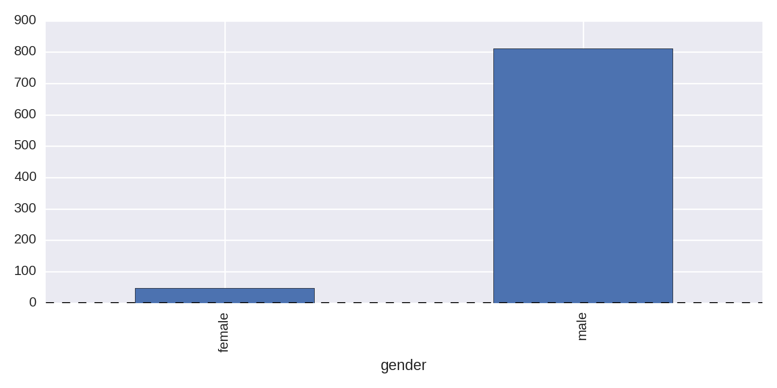
In Example 1-2, the Series produced by the gender group’s size method has its own integrated plot method, which turns the raw numbers into a chart:
by_gender.size()Out:genderfemale47male811dtype:int64
In addition to the default line plot, the Pandas plot method takes a kind argument to select among other possible plots. Among the more commonly used are:
-
barorbarh(h for horizontal) for bar plots -
histfor a histogram -
boxfor a box plot -
scatterfor scatter plots
You can find a full list of Panda’s integrated plots in the docs as well as some Pandas plotting functions that take DataFrames and Series as arguments.
Let’s extend our investigation into gender disparities and start extending our plotting know-how.
Gender Disparities
Let’s break down the gender numbers shown in Figure 1-1 by category of prize. Pandas’ groupby method can take a list of columns to group by, with each group being accessed by multiple keys.
by_cat_gen=df.groupby(['category','gender'])by_cat_gen.get_group(('Physics','female'))[['name','year']]Out:nameyear268MariaGoeppert-Mayer1963613MarieSkłodowska-Curie1903
Using the size method to get the size of these groups returns a Series with a MultiIndex that labels the values by both category and gender:
by_cat_gen.size()Out:categorygenderChemistryfemale4male167Economicsfemale1male74...PhysiologyorMedicinefemale11male191dtype:int64
We can plot this multi-indexed Series directly, using hbar as the kind argument to produce a horizontal bar chart. This code produces Figure 1-2:
by_cat_gen.size().plot(kind='barh')
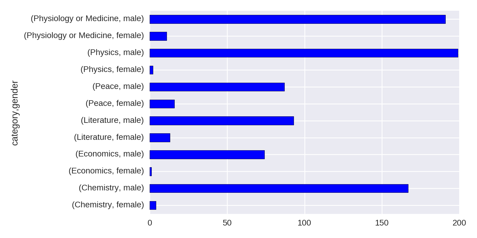
Figure 1-2 is a little crude and makes comparing gender disparities harder than it should be. Let’s go about refining our charts to make those disparities clearer.
Unstacking Groups
Figure 1-2 isn’t the easiest chart to read, even were we to improve the sorting of the bars. Handily, Pandas Series have a cool unstack method that takes the multiple indices—in this case, gender and category—and uses them as columns and indices, respectively, to create a new DataFrame. Plotting this DataFrame gives a much more usable plot, as it compares prize wins by gender. The following code produces Figure 1-3:
by_cat_gen.size().unstack().plot(kind='barh')
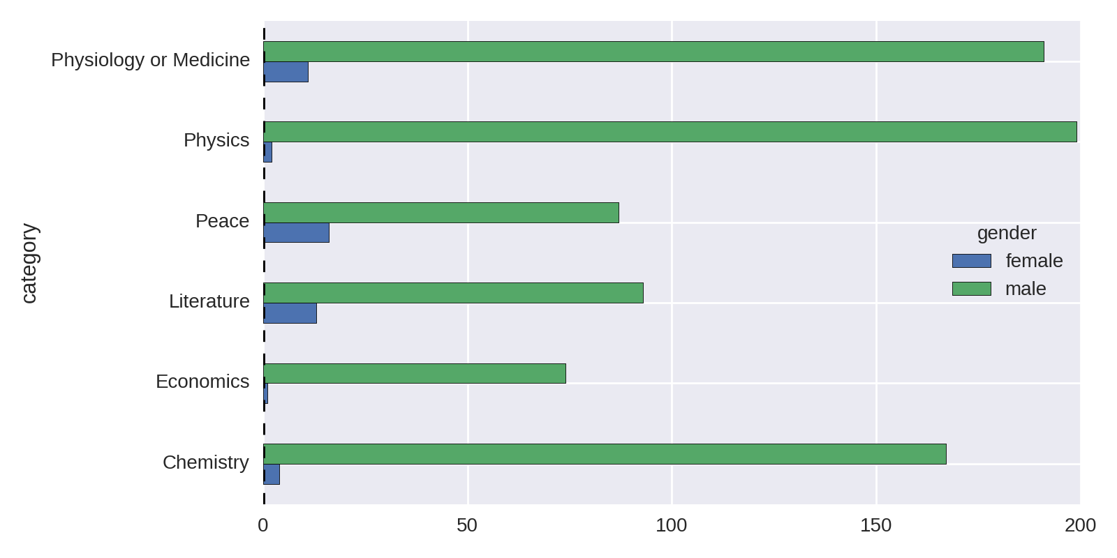
Let’s improve Figure 1-3 by ordering the bar groups by number of female winners (low to high) and adding a total winners bar group for comparison. Example 1-3 produces the chart in Figure 1-4.
Example 1-3. Sorting and summing our gender groups
cat_gen_sz=by_cat_gen.size().unstack()cat_gen_sz['total']=cat_gen_sz.sum(axis=1)cat_gen_sz=cat_gen_sz.sort_values(by='female',ascending=True)cat_gen_sz[['female','total','male']].plot(kind='barh')
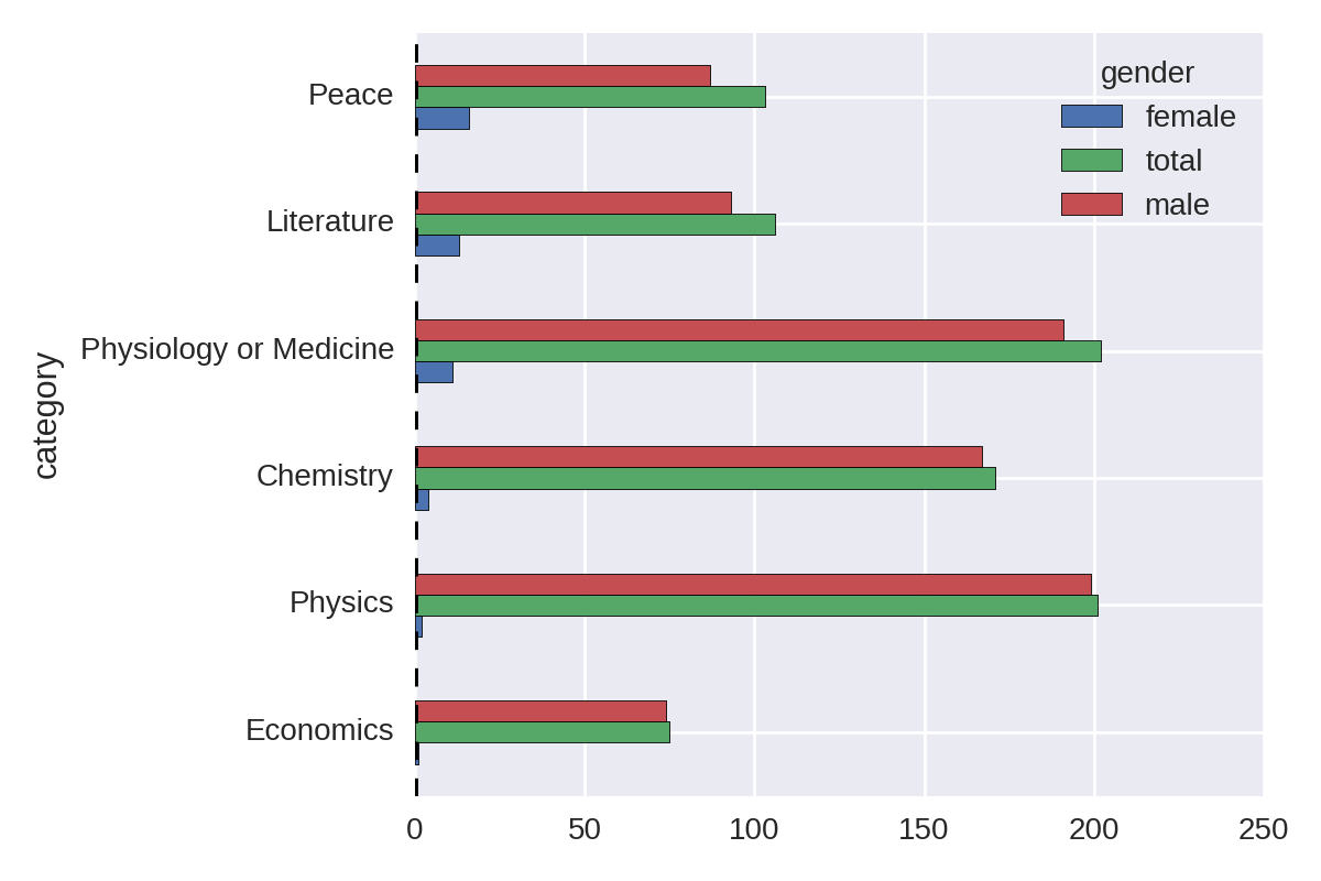
Ignoring Economics, a recent and contentious addition to the Nobel Prize categories, Figure 1-4 shows that the largest discrepancy in the number of male and female prize winners is in Physics, with only two female winners. Let’s remind ourselves who they are:
df[(df.category=='Physics')&(df.gender=='female')]\[['name','country','year']]Out:namecountryyear267MariaGoeppert-MayerUnitedStates1963611MarieSkłodowska-CuriePoland1903
While most people will have heard of Marie Curie, who is actually one of the four illustrious winners of two Nobel Prizes, few have heard of Maria Goeppert-Mayer.1 This ignorance is surprising, given the drive to encourage women into science. I would want my visualization to enable people to discover and learn a little about Maria Goeppert-Mayer.
Historical Trends
It would be interesting to see if there has been any increase in female prize allocation in recent years. One way to visualize this would be as grouped bars over time. Let’s run up a quick plot, using unstack as in Figure 1-3 but using the year and gender columns.
by_year_gender=df.groupby(['year','gender'])year_gen_sz=by_year_gender.size().unstack()year_gen_sz.plot(kind='bar',figsize=(16,4))
Figure 1-5, the hard-to-read plot produced, is only functional. The trend of female prize distributions can be observed, but the plot has many problems. Let’s use Matplotlib’s and Pandas’ eminent flexibility to fix them.

The first thing we need to do is reduce the number of x-axis labels. By default, Matplotlib will label each bar or bar group of a bar plot, which in the case of our hundred years of prizes creates a mess of labels. What we need is the ability to thin out the number of axis labels as desired. There are various ways to do this in Matplotlib; I’ll demonstrate the one I’ve found to be most reliable. It’s the sort of thing you’re going to want to reuse, so it makes sense to stick it in a dedicated function. Example 1-4 shows a function to reduce the number of ticks on our x-axis.
Example 1-4. Reducing the number of x-axis labels
defthin_xticks(ax,tick_gap=10,rotation=45):""" Thin x-ticks and adjust rotation """ticks=ax.xaxis.get_ticklocs()ticklabels=[l.get_text()\forlinax.xaxis.get_ticklabels()]ax.xaxis.set_ticks(ticks[::tick_gap])ax.xaxis.set_ticklabels(ticklabels[::tick_gap],\rotation=rotation)ax.figure.show()
As well as needing to reduce the number of ticks, the x-axis in Figure 1-5 has a discontinuous range, missing the years 1939–1945 of WWII, during which no Nobel Prizes were presented. We want to see such gaps, so we need to set the x-axis range manually to include all years from the start of the Nobel Prize to the current day.
The current unstacked group sizes use an automatic year index:
by_year_gender=df.groupby(['year','gender'])by_year_gender.size().unstack()Out:genderfemalemaleyear1901NaN61902NaN7...2014211[111rowsx2columns]
In order to see any gaps in the prize distribution, all we have to do is reindex this Series with one containing the full range of years:
new_index=pd.Index(np.arange(1901,2015),name='year')by_year_gender=df.groupby(['year','gender'])year_gen_sz=by_year_gender.size().unstack().reindex(new_index)

-
Here we create a full-range index named
year, covering all the Nobel Prize years. 
-
We replace our discontinuous index with the new continuous one.
Another problem with Figure 1-5 is the excessive number of bars. Although we do get male and female bars side by side, it looks messy and has aliasing artifacts too. It’s better to have dedicated male and female plots but stacked so as to allow easy comparison. We can achieve this using the subplotting method we saw in not available, using the Pandas data but customizing the plot using our Matplotlib know-how. Example 1-5 shows how to do this, producing the plot in Figure 1-6.
Example 1-5. Stacked gender prizes by year
new_index=pd.Index(np.arange(1901,2015),name='year')by_year_gender=df.groupby(['year','gender'])year_gen_sz=by_year_gender.size().unstack().reindex(new_index)fig,axes=plt.subplots(nrows=2,ncols=1,sharex=True,sharey=True)ax_f=axes[0]ax_m=axes[1]fig.suptitle('Nobel Prize-winners by gender',fontsize=16)ax_f.bar(year_gen_sz.index,year_gen_sz.female)ax_f.set_ylabel('Female winners')ax_m.bar(year_gen_sz.index,year_gen_sz.male)ax_m.set_ylabel('Male winners')ax_m.set_xlabel('Year')
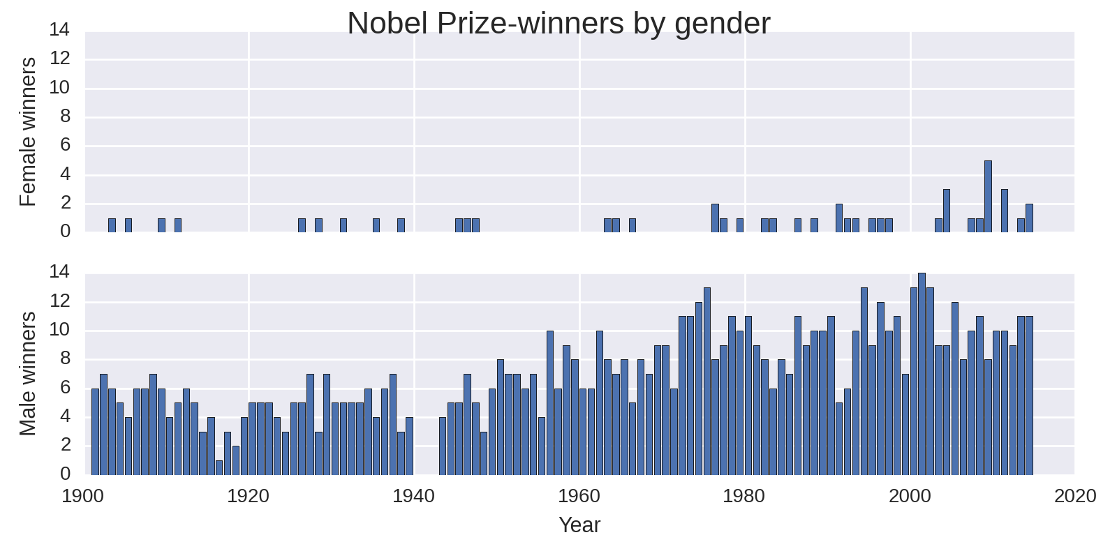
So the take-home from our investigation into gender distributions is that there is a huge discrepancy but, as shown by Figure 1-6, a slight improvement in recent years. Moreover, with Economics being an outlier, the difference is greatest in the sciences. Given the fairly small number of female prize winners, there’s not a lot more to be seen here.
Let’s now take a look at national trends in prize wins and see if there are any interesting nuggets for visualization.
National Trends
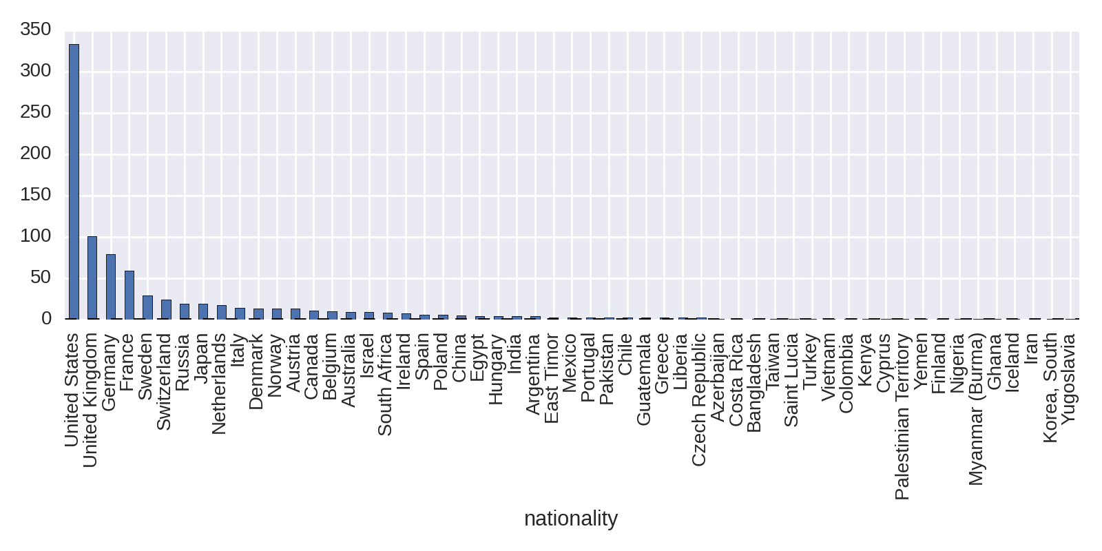
The obvious starting point in looking at national trends is to plot the absolute number of prize winners. This is easily done in one line of Pandas, broken up here for ease of reading:
df.groupby('country').size().order(ascending=False)\.plot(kind='bar',figsize=(12,4))
This produces Figure 1-7, showing the United States with the lion’s share of prizes.
The absolute number of prizes will be bound to favor countries with large populations. Let’s look at a fairer comparison, visualizing prizes per capita.
Prize Winners per Capita
The absolute number of prize winners is bound to favor larger countries, which raises the question, how do the numbers stack up if we account for population sizes? In order to test prize haul per capita, we need to divide the absolute prize numbers by population size. In not available, we downloaded some country data from the Web and stored it to MongoDB. Let’s retrieve it now and use it to produce a plot of prizes relative to population size.
First let’s get the national group sizes, with country names as index labels:
nat_group=df.groupby('country')ngsz=nat_group.size()ngsz.indexOut:Index([u'Argentina',u'Australia',u'Austria',u'Azerbaijan',...
Now let’s load our country data into a DataFrame using our utility function mongo_to_dataframe and remind ourselves of the data it contains:
df_countries=mongo_to_dataframe('nobel_prize','countries')df_countries.ix[0]# selects the first row by positionOut:alpha3CodeARGarea2.7804e+06capitalBuenosAiresgini44.5latlng[-34.0,-64.0]nameArgentinapopulation42669500Name:Argentina,dtype:object
If we set the index of our country dataset to its name column and add the ngsz national group-size Series, which also has a country name index, the two will combine on the shared indices, giving our country data a new nobel_wins column. We can then use this new column to create a nobel_wins_per_capita by dividing it by population size:
df_countries=df_nat.set_index('name')df_countries['nobel_wins']=ngszdf_countries['nobel_wins_per_capita']=\df_countries.nobel_wins/df_countries.population
We now need only sort the df_countries DataFrame by its new nobel_wins_per_cap column and plot the Nobel Prize wins per capita, producing Figure 1-8.
df_nat.sort('nobel_per_capita',ascending=False)\.nobel_per_capita.plot(kind='bar')
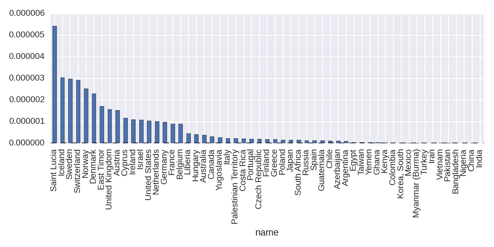
This shows the Caribbean Island of Saint Lucia taking top place. Home to the Nobel Prize–winning poet Derek Walcott, its small population of 175,000 gives it a high Nobel Prizes per capita.
Let’s see how things stack up with the larger countries by filtering the results for countries that have won more than two Nobel Prizes:
df_nat[df_nat.nobel_wins>2].sort('nobel_per_capita',ascending=False)\.nobel_per_capita.plot(kind='bar')
The results in Figure 1-9 show the Scandinavian countries and Switzerland punching above their weight.
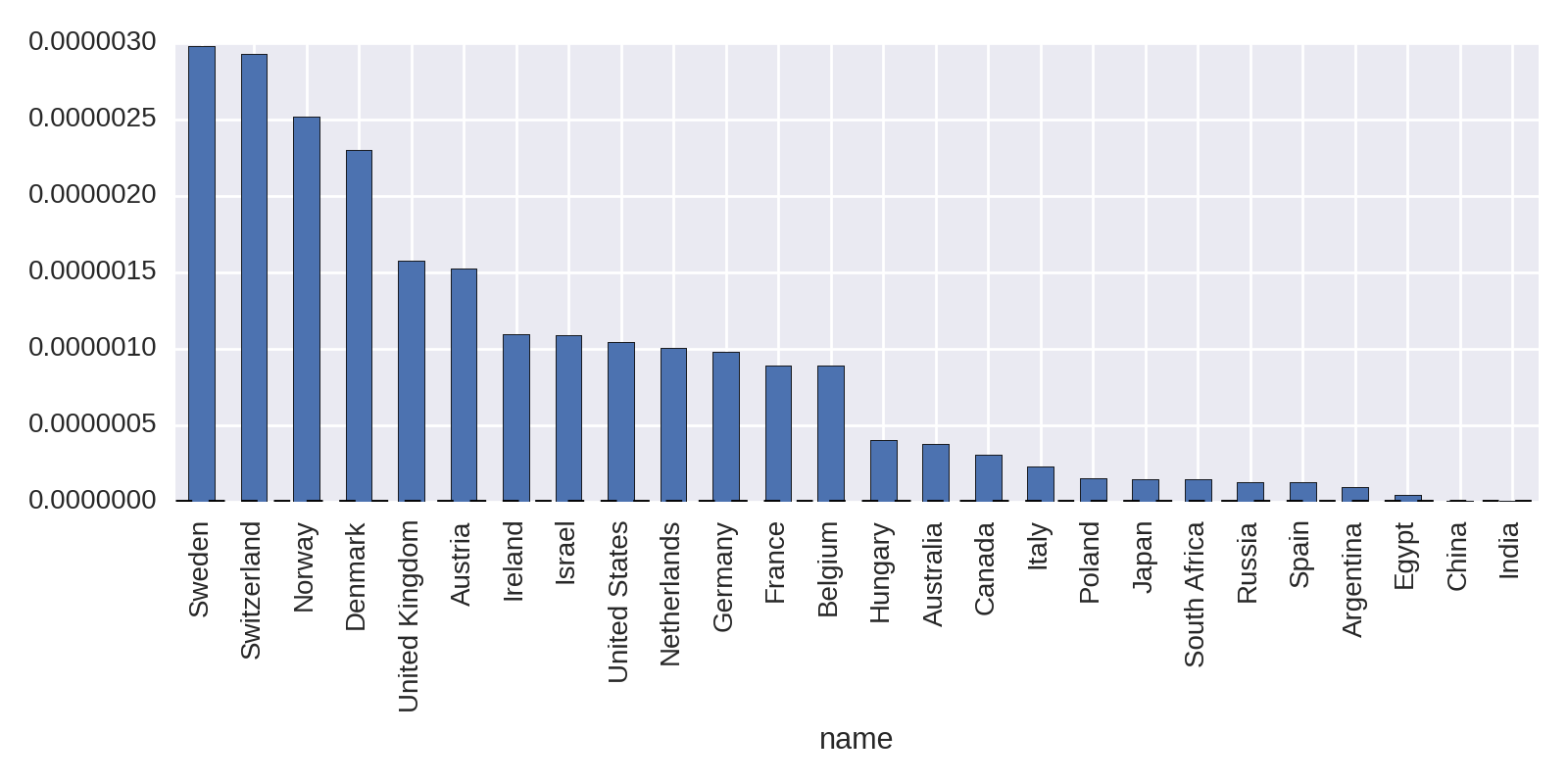
Changing the metric for national prize counts from absolute to per capita makes a big difference. Let’s now refine our search a little and focus on the prize categories, looking for interesting nuggets there.
Prizes by Category
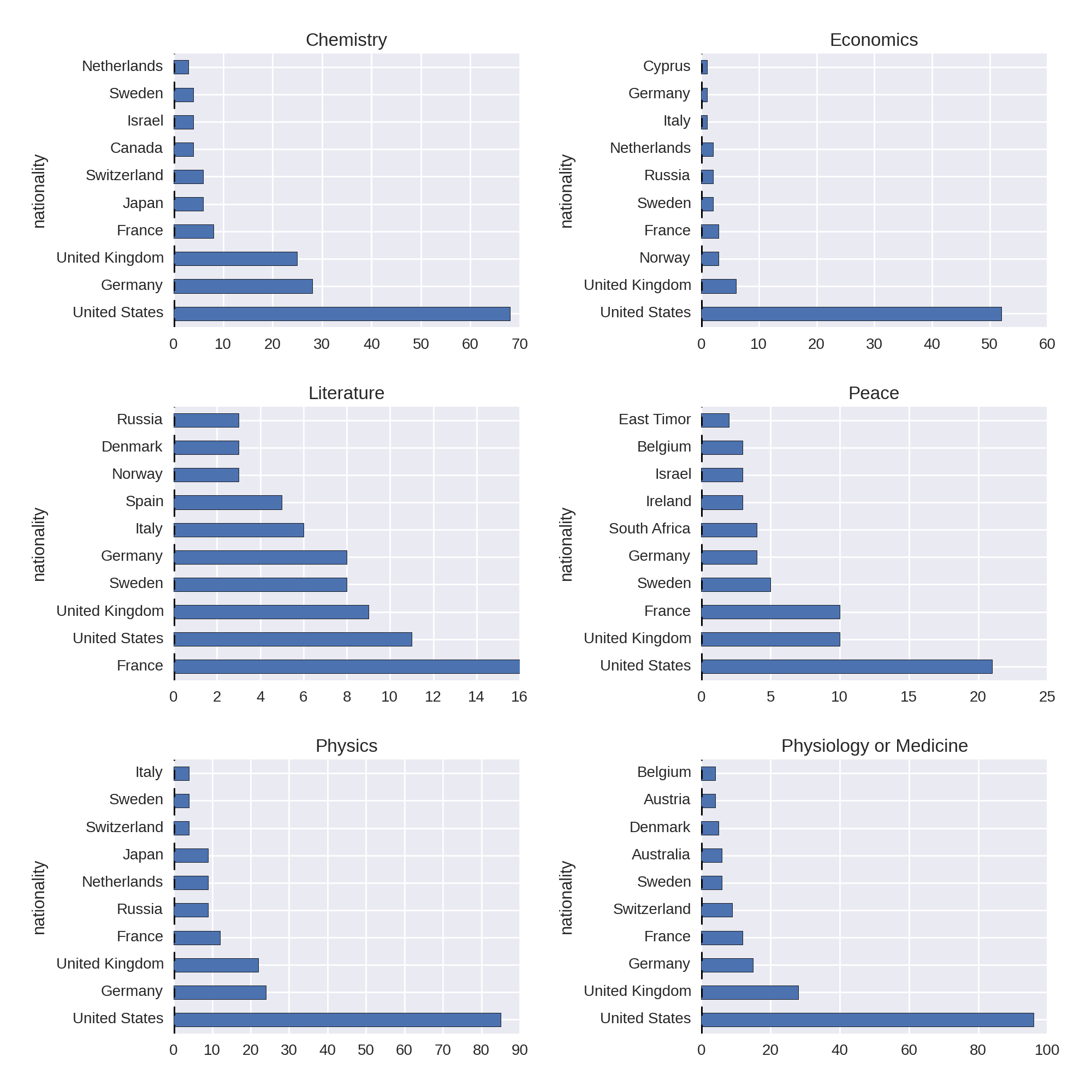
Let’s drill down a bit into the absolute prize data and look at wins by category. This will require grouping by country and category columns, getting the size of those groups, unstacking the resulting Series and then plotting the columns of the resulting DataFrame. First we get our categories with country group sizes:
nat_cat_sz=df.groupby(['country','category']).size().unstack()nat_cat_szOut:categoryChemistryEconomicsLiteraturePeace\...countryArgentina2NaNNaN4AustraliaNaN22NaNAustria6NaN24AzerbaijanNaNNaNNaNNaNBangladeshNaNNaNNaN2
We then use the nat_cat_sz DataFrame to produce subplots for the six Nobel Prize categories:
COL_NUM=2ROW_NUM=3fig,axes=plt.subplots(ROW_NUM,COL_NUM,figsize=(12,12))fori,(label,col)inenumerate(nat_cat_sz.iteritems()):ax=axes[i/COL_NUM,i%COL_NUM]col=col.order(ascending=False)[:10]col.plot(kind='barh',ax=ax)ax.set_title(label)plt.tight_layout()

-
iteritemsreturns an iterator for theDataFramescolumns in form of (column_label, column) tuples. 
-
orderorders the column’sSeriesby first making a copy. It is the equivalent ofsort(inplace=False). 
-
tight_layoutshould prevent label overlaps among the subplots. If you have any problems withtight_layout, see the end of not available.
This produces the plots in Figure 1-10.
A couple of interesting nuggets from Figure 1-10 are the United States’ overwhelming dominance of the Economics prize, reflecting a post-WWII economic consensus, and France’s leadership of the Literature prize.
Historical Trends in Prize Distribution
Now that we know the aggregate prize stats by country, are there any interesting historical trends to the prize distribution? Let’s explore this with some line plots.
First, let’s increase the default font size to 20 points to make the plot labels more legible:
plt.rcParams['font.size']=20
We’re going to be looking at prize distribution by year and country, so we’ll need a new unstacked DataFrame based on these two columns. As previously, we add a new_index to give continuous years:
new_index=pd.Index(np.arange(1901,2015),name='year')by_year_nat_sz=df.groupby(['year','country'])\.size().unstack().reindex(new_index)
The trend we’re interested in is the cumulative sum of Nobel Prizes by country over its history. We can further explore trends in individual categories, but for now we’ll look at the total for all. Pandas has a handy cumsum method for just this. Let’s take the United States column and plot it:
by_year_nat_sz['United States'].cumsum().plot()
This produces the chart in Figure 1-11.
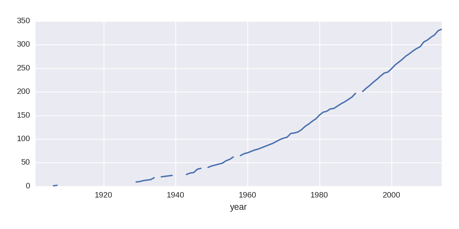
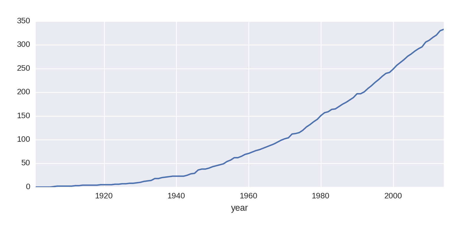
The gaps in the line plot are where the fields are NaN, years when the US won no prizes. The cumsum algorithm returns NaN here. Let’s fill those in with a zero to remove the gaps:
by_year_nat_sz['United States'].fillna(0).cumsum().plot()
This produces the cleaner chart shown in Figure 1-12.
Let’s compare the US prize rate with that of the rest of the world:
by_year_nat_sz=df.groupby(['year','country']).size().unstack().fillna(0)not_US=by_year_nat_sz.columns.tolist()not_US.remove('United States')by_year_nat_sz['Not US']=by_year_nat_sz[not_US].sum(axis=1)ax=by_year_nat_sz[['United States','Not US']]\.cumsum().plot()

-
Gets the list of country column names and removes United States.

-
Uses our list of non-US country names to create a
'Not_US'column, the sum of all the prizes for countries in thenot_USlist.
This code produces the chart shown in Figure 1-13.
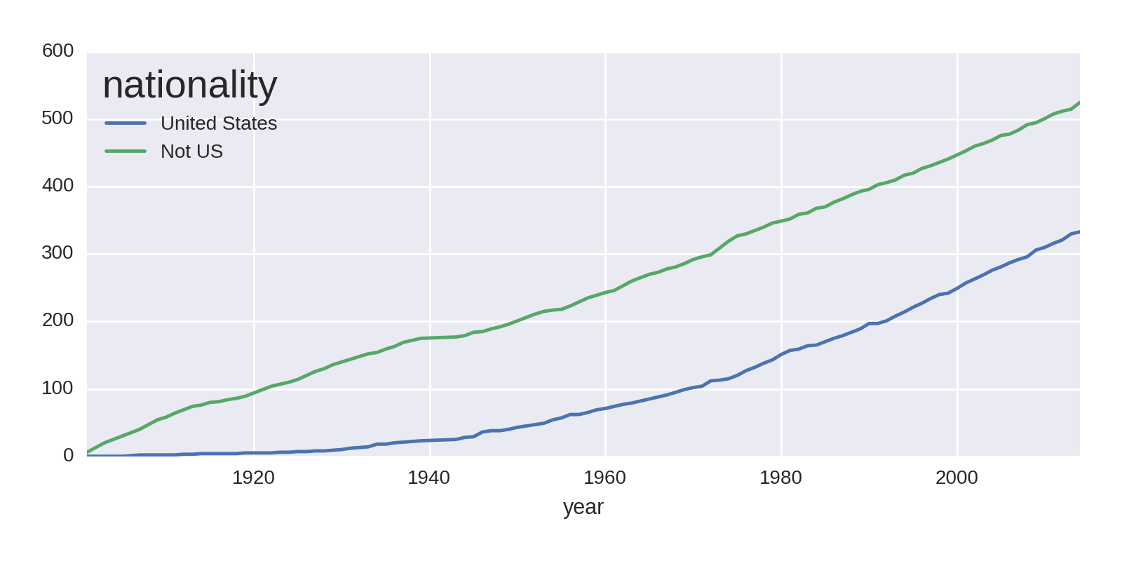
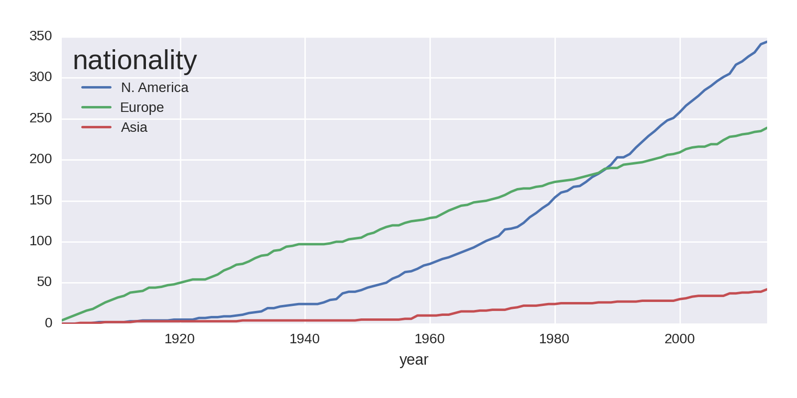
Where the 'Not_US' haul shows a steady increase over the years of the prize, the US shows a rapid increase around the end of World War II. Let’s investigate that further, looking at regional differences. We’ll focus on the two or three largest winners for North America, Europe, and Asia:
by_year_nat_sz=df.groupby(['year','country'])\.size().unstack().reindex(new_index).fillna(0)regions=[{'label':'N. America','countries':['United States','Canada']},{'label':'Europe','countries':['United Kingdom','Germany','France']},{'label':'Asia','countries':['Japan','Russia','India']}]forregioninregions:by_year_nat_sz[region['label']]=\by_year_nat_sz[region['countries']].sum(axis=1)by_year_nat_sz[[r['label']forrinregions]].cumsum()\.plot()

-
Our continental country list created by selecting the biggest two or three winners in the three continents compared.

-
Creates a new column with a region label for each
dictin theregionslist, summing itscountriesmembers. 
-
Plots the cumulative sum of all the new region columns.
This gives us the plot in Figure 1-14. The rate of Asia’s prize haul has increased slightly over the years, but the main point of note is North America’s huge increase in prizes around the mid-1940s, overtaking a declining Europe in total prizes around the mid-1980s.
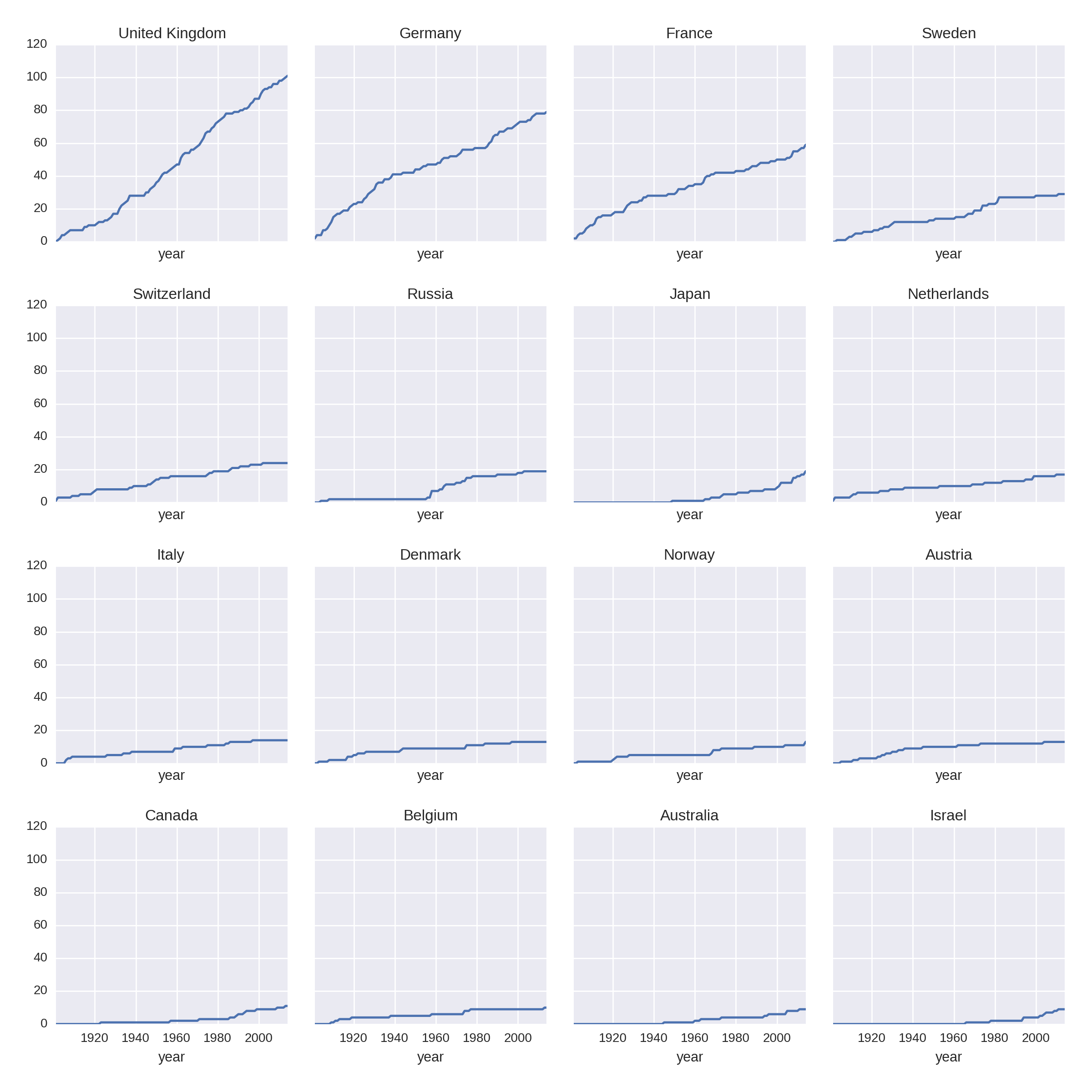
Let’s improve the resolution of the previous national plots by summarizing the prize rates for the 16 biggest winners, excluding the outlying United States:
COL_NUM=4ROW_NUM=4by_nat_sz=df.groupby('country').size()by_nat_sz.sort_values(ascending=False,\inplace=True)fig,axes=plt.subplots(COL_NUM,ROW_NUM,\sharex=True,sharey=True,figsize=(12,12))fori,natinenumerate(by_nat.index[1:17]):ax=axes[i/COL_NUM,i%ROW_NUM]by_year_nat_sz[nat].cumsum().plot(ax=ax)ax.set_title(nat)

-
Sorts our country groups from highest to lowest win hauls.

-
Gets a 4×4 grid of axes with shared x- and y-axes for normalized comparison.

-
Enumerates over the sorted index from second row (1), excluding the US (0).

-
Selects the
natcountry name column and plots its cumulative sum of prizes on the grid axisax.
This produces Figure 1-15, which shows some nations like Japan, Australia, and Israel on the rise historically, while others flatten off.
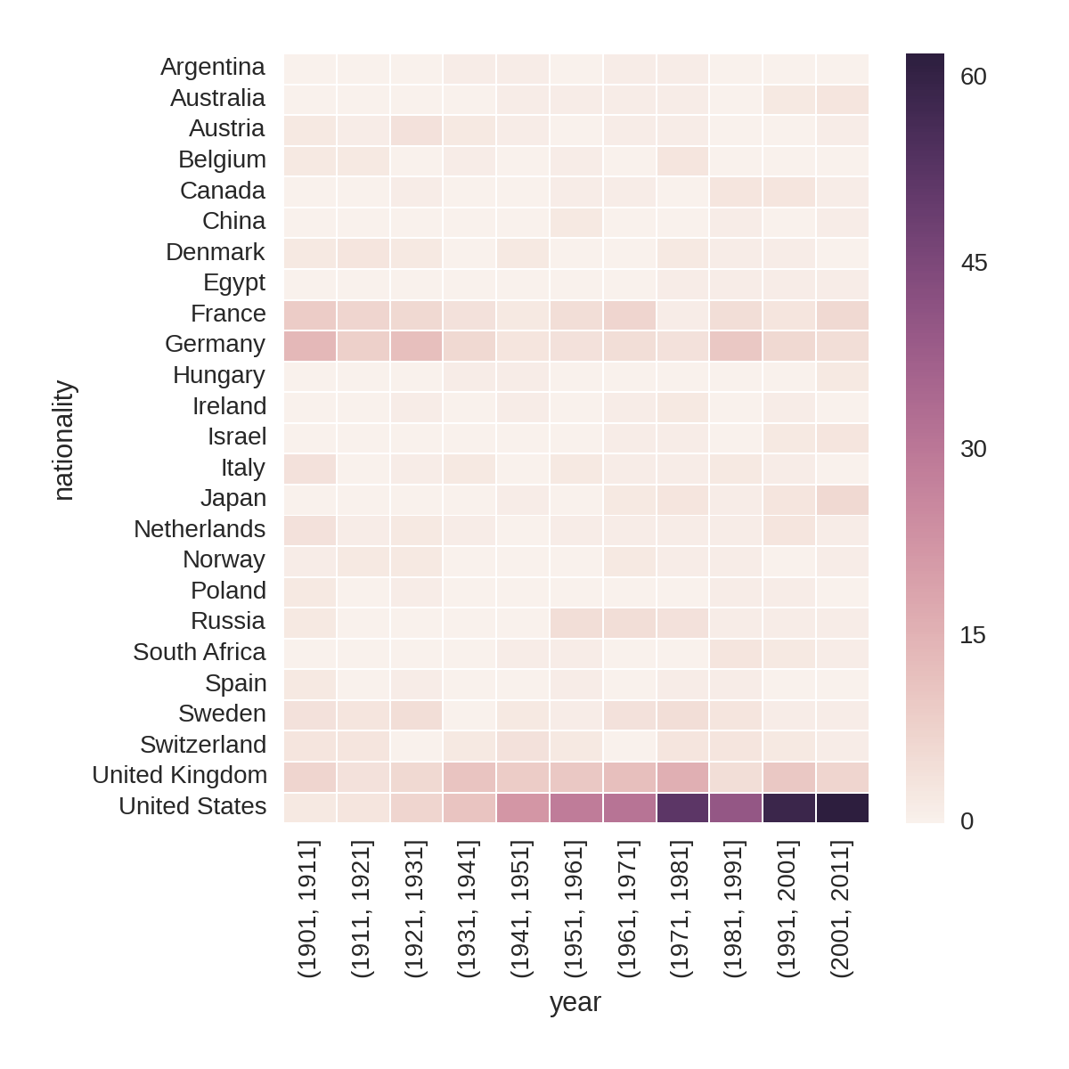
Another good way to summarize national prize rates over time is by using a heatmap and dividing the totals by decade. This division is also known as binning, as it creates bins of data. Pandas has a handy cut method for just this job, taking a column of continuous values—in our case, Nobel Prize years—and returning ranges of a specified size. You can supply the DataFrame‘s groupby method with the result of cut and it will group by the range of indexed values. The following code produces Figure 1-16.
bins=np.arange(df.year.min(),df.year.max(),10)by_year_nat_binned=df.groupby([pd.cut(df.year,bins,precision=0),'country'])\.size().unstack().fillna(0)plt.figure(figsize=(8,8))sns.heatmap(\by_year_nat_binned[by_year_nat_binned.sum(axis=1)>2])

-
Gets our bin ranges for the decades from 1901 (1901, 1911, 1921…).

-
Cuts our Nobel Prize years into decades using the
binsranges withprecisionset to0, to give integer years. 
-
Before heatmapping, we filter for those countries with over two Nobel Prizes.
Figure 1-16 captures some interesting trends, such as Russia’s brief flourishing in the 1950s, which petered out around the 1980s.
Now that we’ve investigated the Nobel Prize nations, let’s turn our attention to the individual winners. Are there any interesting things we can discover about them using the data at hand?
Age and Life Expectancy of Winners
We have the date of birth for all our winners and the date of death for 559 of them. Combined with the year in which they won their prizes, we have a fair amount of individual data to mine. Let’s investigate the age distribution of winners and try to glean some idea of the winners’ longevity.
Age at Time of Award
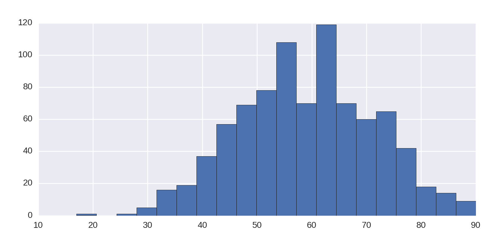
In not available we added an 'award_age' column to our Nobel Prize dataset by subtracting the winners’ ages from their prize years. A quick and easy win is to use Pandas’ histogram plot to assess this distribution:
df['award_age'].hist(bins=20)
Here we require that the age data be divided into 20 bins. This produces Figure 1-17, showing that the early 60s is a sweet spot for the prize and if you haven’t achieved it by 100, it probably isn’t going to happen. Note the outlier around 20, which is the recently awarded 17-year-old recipient of the Peace Prize, Malala Yousafzai.
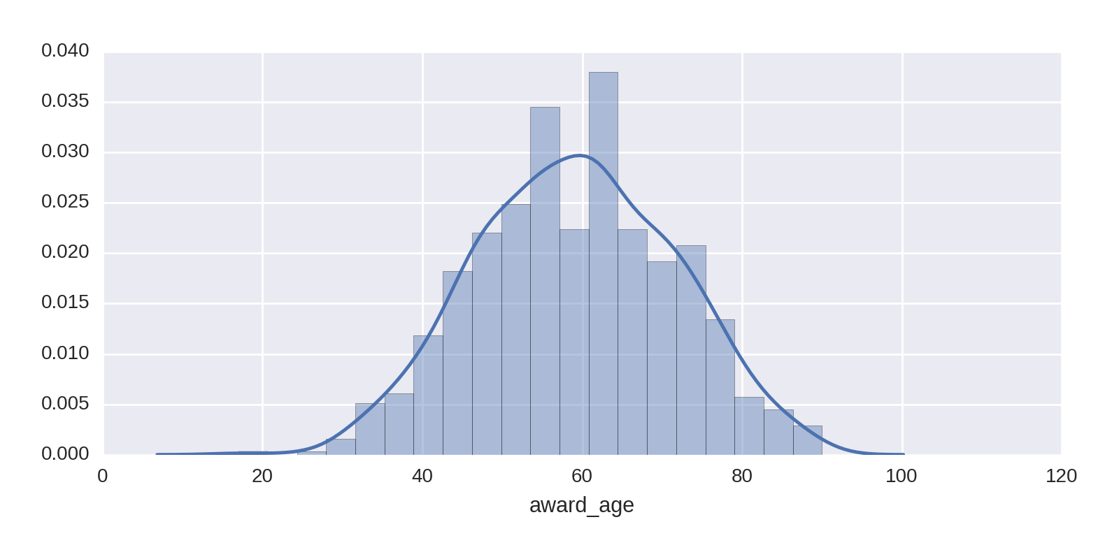
We can use Seaborn’s distplot to get a better feel for the distribution, adding a kernel density estimate (KDE)2 to the histogram. The following one-liner produces Figure 1-18, showing that our sweet spot is around 60 years of age:
sns.distplot(df['award_age'])
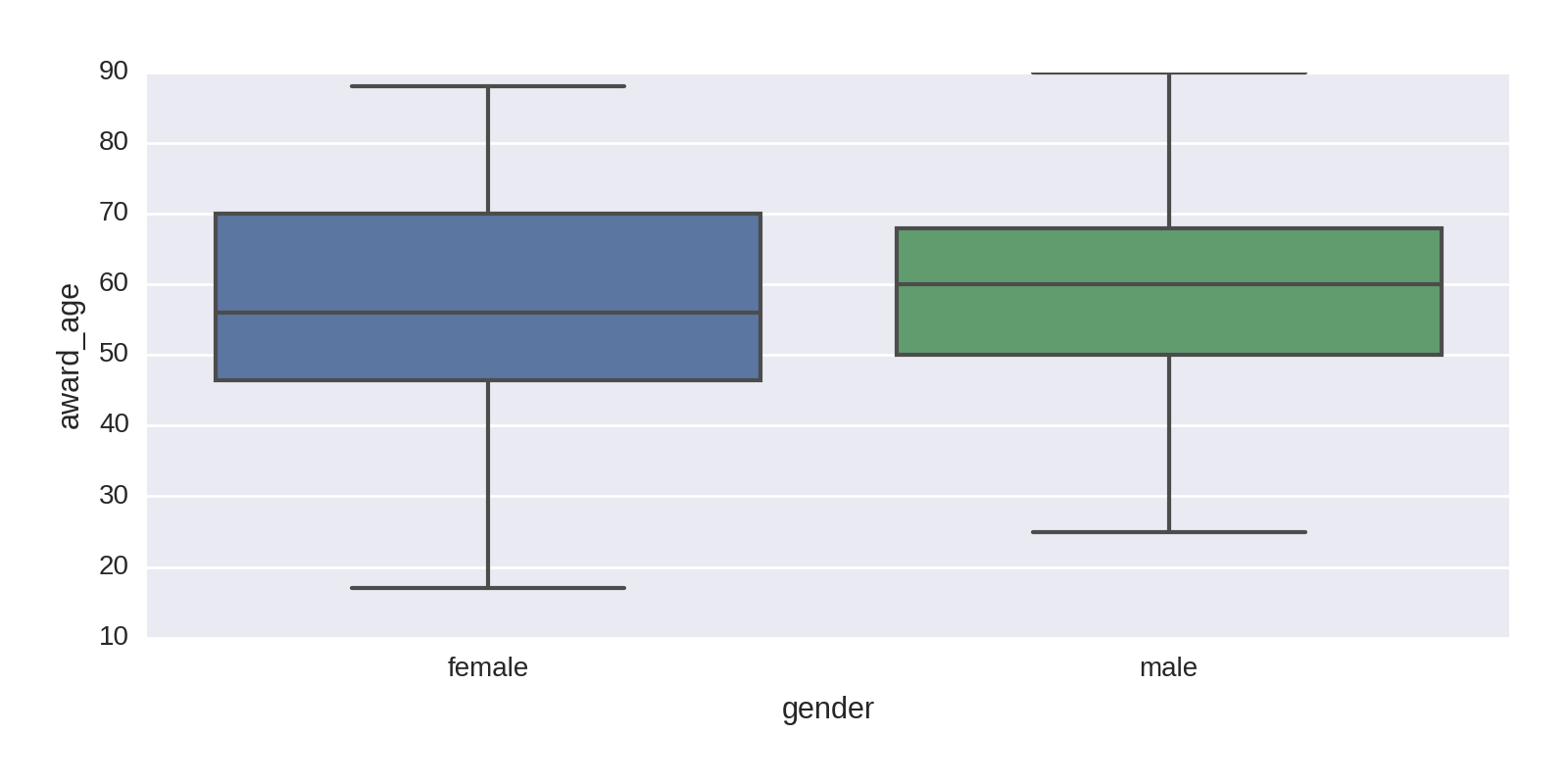
A box plot is a good way of visualizing continuous data, showing the quartiles, the first and third marking the edges of the box and the second quartile (or median average) marking the line in the box. Generally, as in Figure 1-19, the horizontal end lines (known as the whisker ends) indicate the max and min of the data. Let’s use a Seaborn box plot and divide the prizes by gender:
sns.boxplot(df.gender,df.award_age)
This produces Figure 1-19, which shows that the distributions by gender are similar, with women having a slightly lower average age. Note that with far fewer female prize winners, their statistics are subject to a good deal more uncertainty.
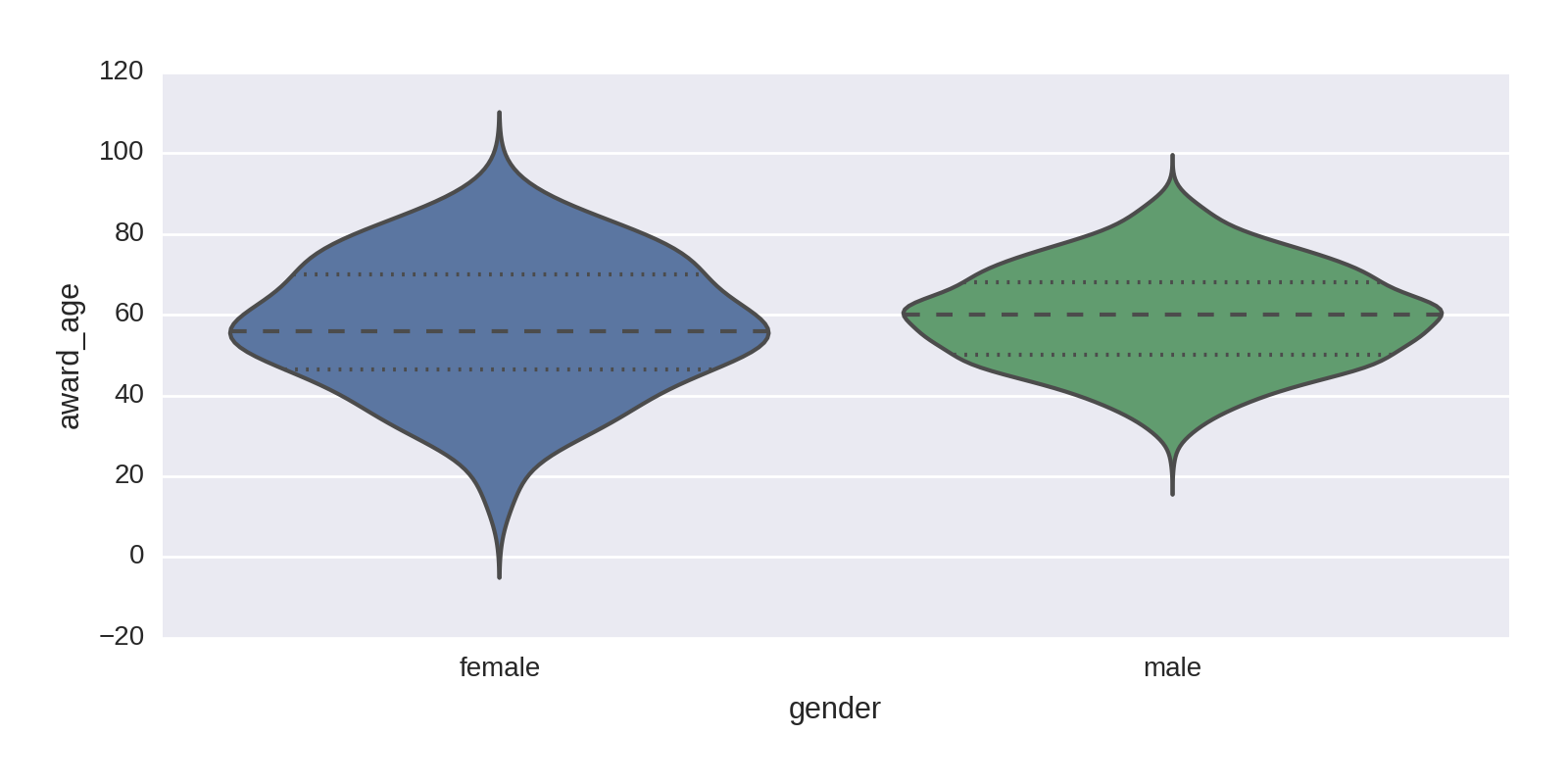
Seaborn’s rather nice violinplot combines the conventional box plot with a kernel density estimation to give a more refined view of the breakdown by age and gender. The following code produces Figure 1-20.
sns.violinplot(df.gender,df.award_age)
Life Expectancy of Winners
Now let’s look at the longevity of Nobel Prize winners, by subtracting the available dates of death from their respective dates of birth. We’ll store this data in a new 'age_at_death' column:
df['age_at_death']=(df.date_of_death-df.date_of_birth)\.dt.days/365

-
datetime64data can be added and subtracted in a sensible fashion, producing a Pandastimedeltacolumn. We can use itsdtmethod to get the interval in days, dividing this by 365 to get the age at death as a float.
We make a copy of the 'age_at_death' column,3 removing all empty NaN rows. This can then be used to make the histogram and KDE shown in Figure 1-21.
age_at_death=df[df.age_at_death.notnull()].age_at_deathsns.distplot(age_at_death,bins=40)
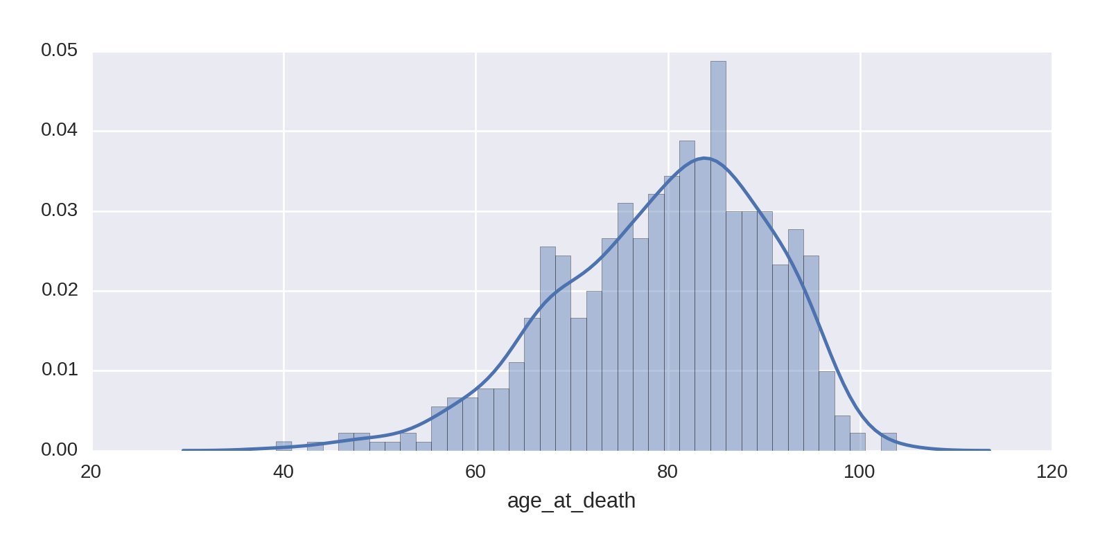
Figure 1-21 shows the Nobel Prize winners to be a remarkably long-lived bunch, with an average age in the early 80s. This is all the more impressive given that the large majority of winners are men, who have considerably lower average life expectancies in the general population than women. One contributary factor to this longevity is the selection bias we saw earlier. Nobel Prize winners aren’t generally honored until they’re in their late 50s and 60s, which removes the subpopulation who died before having the chance to be acknowledged, pushing up the longevity figures.
Figure 1-21 shows some centenarians among the prize winners. Let’s find them:
df[df.age_at_death > 100][['name', 'category', 'year']]
Out:
                     name                category  year
68   Rita Levi-Montalcini  Physiology or Medicine  1986
103          Ronald Coase               Economics  1991
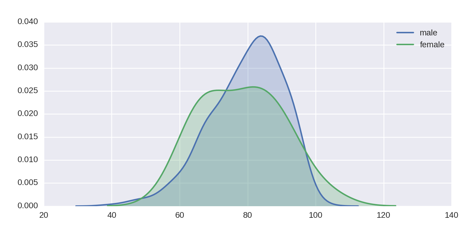
Now let’s superimpose a couple of KDEs to show differences in mortality for male and female recipients:
df2=df[df.age_at_death.notnull()]sns.kdeplot(df2[df2.gender=='male'].age_at_death,shade=True,label='male')sns.kdeplot(df2[df2.gender=='female'].age_at_death,shade=True,label='female')plt.legend()
This produces Figure 1-22, which, allowing for the small number of female winners and flatter distribution, shows the male and female averages to be close. Female Nobel Prize winners seem to live relatively shorter lives than their counterparts in the general population.
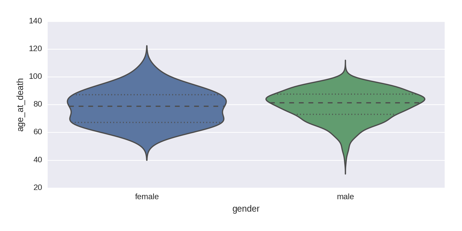
A violinplot provides another perspective, shown in Figure 1-23.
sns.violinplot(df.gender,age_at_death)
Increasing Life Expectancies over Time
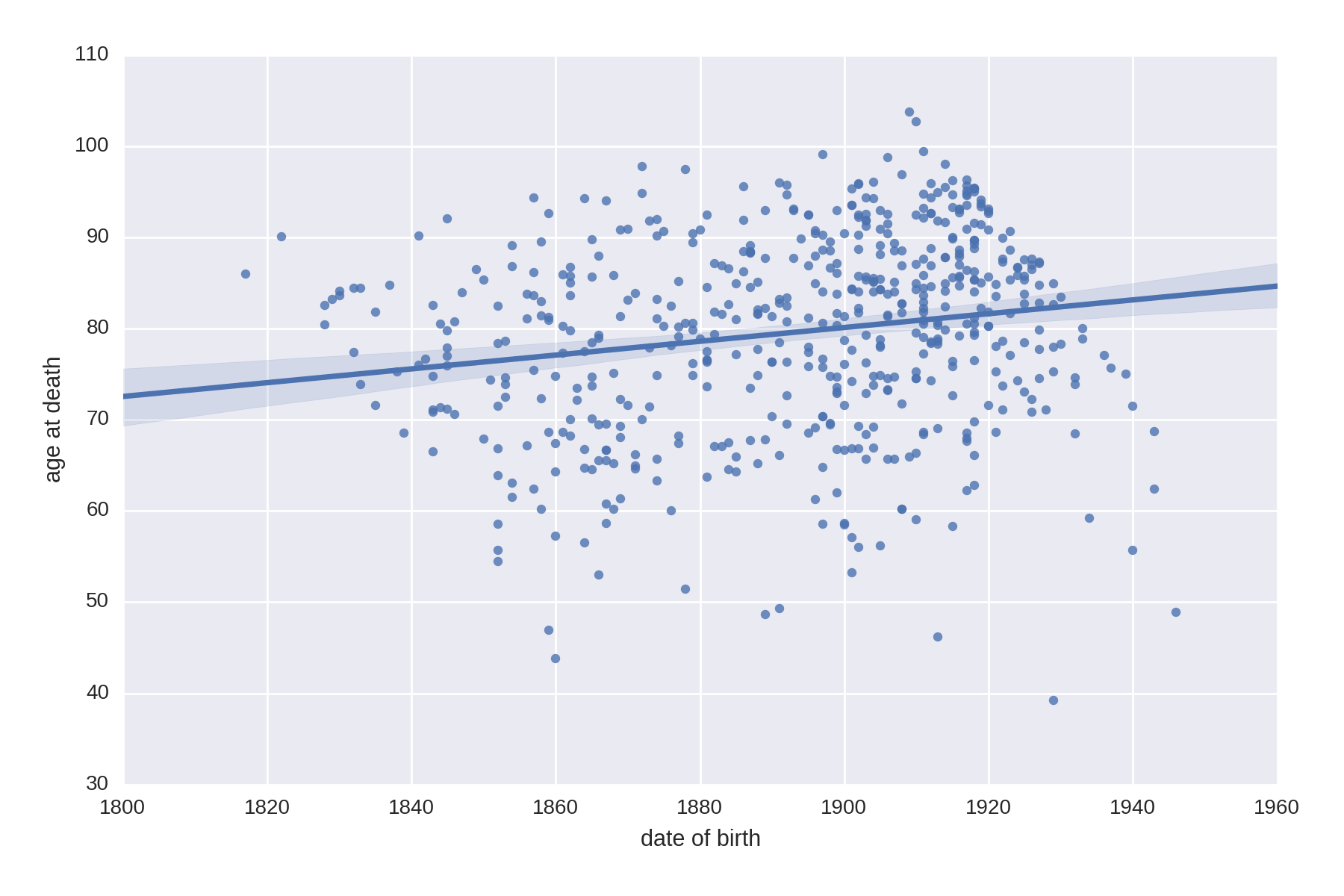
Let’s do a little historical demographic analysis by seeing if there’s a correlation between the date of birth of our Nobel Prize winners and their life expectancy. We’ll use one of Seaborn’s lmplots to provide a scatter plot and line-fitting with confidence intervals (see not available).
df_temp=df[df.age_at_death.notnull()]data=pd.DataFrame({'age at death':df_temp.age_at_death,'date of birth':df_temp.date_of_birth.dt.year})sns.lmplot('date of birth','age at death',data,\size=6,aspect=1.5)

-
Creates a temporary
DataFrame, removing all the rows with no'age_at_death'field. 
-
Creates a new
DataFramewith only the two columns of interest from the refineddf_temp. We grab only the year from thedate_of_birth, using itsdtaccessor.
This produces Figure 1-24, showing an increase in life expectancy of a decade or so over the prize’s duration.
The Nobel Diaspora
While cleaning our Nobel Prize dataset in not available, we found duplicate entries recording the winner’s place of birth and country at time of winning. We preserved these, giving us 104 winners whose country at time of winning was different from their country of birth. Is there a story to tell here?
A good way to visualize the movement patterns from the winners’ country of birth to their adopted country is by using a heatmap to show all born_in/country pairs. The following code produces the heatmap in Figure 1-25:
by_bornin_nat=df[df.born_in.notnull()].groupby(\['born_in','country']).size().unstack()by_bornin_nat.index.name='Born in'by_bornin_nat.columns.name='Moved to'plt.figure(figsize=(8,8))ax=sns.heatmap(by_bornin_nat,vmin=0,vmax=8)ax.set_title('The Nobel Diaspora')

-
Selects all rows with a
'born_in'field, and forms groups on this and the country column. 
-
We rename the row index and column names to make them more descriptive.

-
Seaborn’s
heatmapattempts to set the correct bounds for the data, but in this case, we must manually adjust the limits (vminandvmax) to see all the cells.
Figure 1-25 shows some interesting patterns, which tell a tale of persecution and sanctuary. First, the United States is the overwhelming recipient of relocated Nobel winners, followed by the United Kingdom. Note that the biggest contingents for both (except cross-border traffic from Canada) are from Germany. Italy, Hungary, and Austria are the next largest groups. Examining the individuals in these groups shows that the majority were displaced as a result of the rise of antisemitic fascist regimes in the run-up to World War II and the increasing persecution of Jewish minorities.
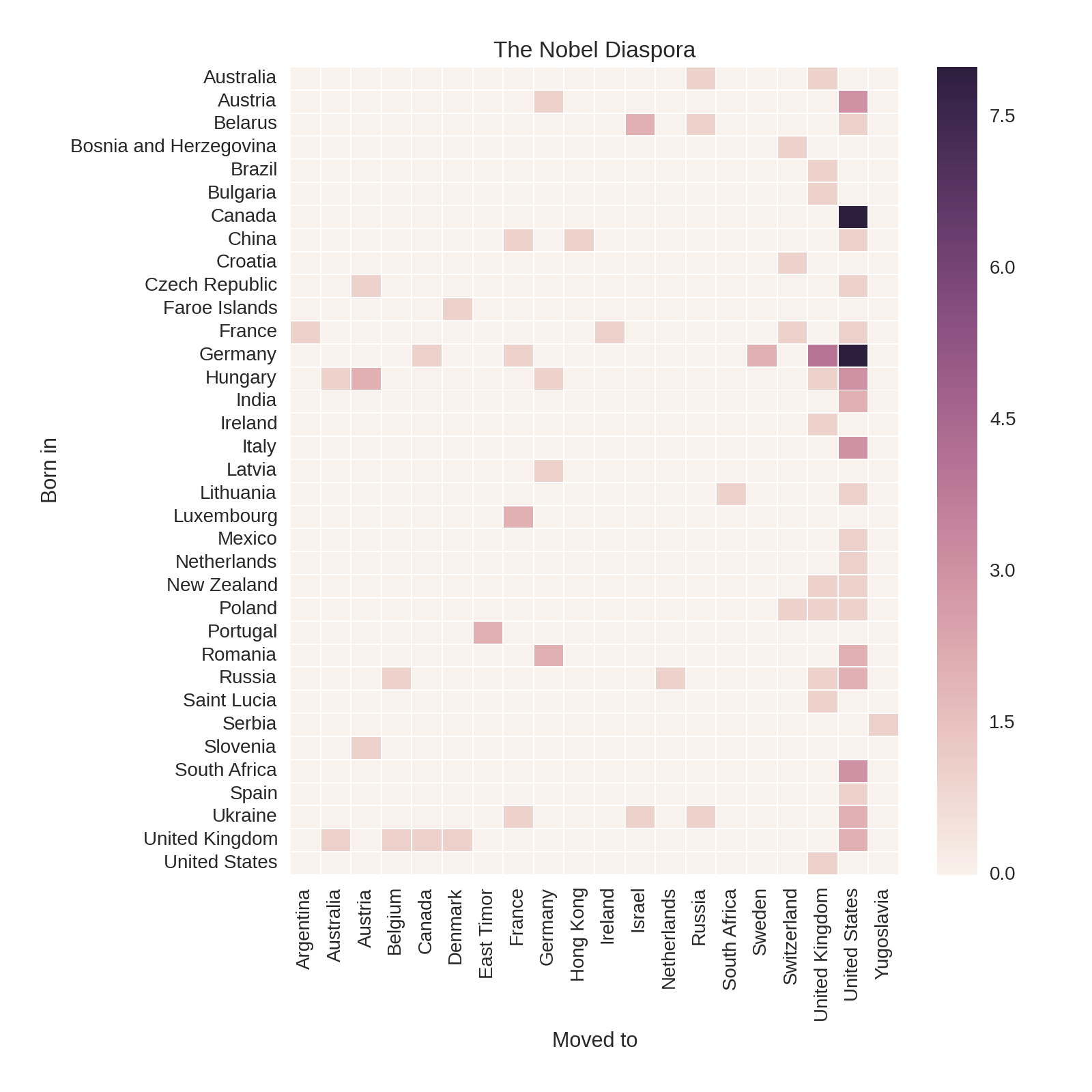
To take an example, all four of the Nobel winners who moved from Germany to the United Kingdom were German research scientists with Jewish ancestry who moved in response to the Nazis’ rise to power:
df[(df.born_in=='Germany')&(df.country=='United Kingdom')][['name','date_of_birth','category']]Out:namedate_of_birthcategory976ErnstBorisChain1906-06-19PhysiologyorMedicine1342HansAdolfKrebs1900-08-25PhysiologyorMedicine1344MaxBorn1882-12-11Physics1360BernardKatz1911-03-26PhysiologyorMedicine
Ernst Chain pioneered the industrial production of penicillin. Hans Krebs discovered the Krebs cycle, one of the most important discoveries in biochemistry, which regulates the energy production of cells. Max Born was one of the pioneers of quantum mechanics, and Bernard Katz uncovered the fundamental properties of synaptic junctions in neurons.
There are many such illustrious names among the winning emigrants. One interesting discovery is the number of prize winners who were part of the famous Kindertransport, an organized rescue effort that took place nine months before the outbreak of WWII and saw 10,000 Jewish children from Germany, Austria, Czechoslovakia, and Poland transported to the United Kingdom. Of these children, four went on to win a Nobel Prize.
Summary
In this chapter, we explored our Nobel Prize dataset, probing the key fields of gender, category, country, and year (of prize) looking for interesting trends and stories we can tell or enable visually. We used a fair number of Matplotlib (by way of Pandas) and Seaborn’s plots, from basic bar charts to more complicated statistical summaries like violinplots and heatmaps. Mastery of these tools and the others in the Python chart armory will allow you to quickly get the feel of your datasets, which is a prerequisite to building a visualization around them. We found more than enough stories in the data to suggest a web visualization. In the next chapter we will imagine and design just such a Nobel Prize winner visualization, cherry-picking the nuggets gained in this chapter.
1Anecdotally, no one I have asked in person or in talk audiences has known the name of the other female Nobel Prize winner for Physics.
2See Wikipedia for details. Essentially the data is smoothed and a probability density function derived.
3We are ignoring leap years and other subtle, complicating factors in deriving years from days.
