Design for understanding
How Information Architecture helps create environments that are understandable and useable by human beings.
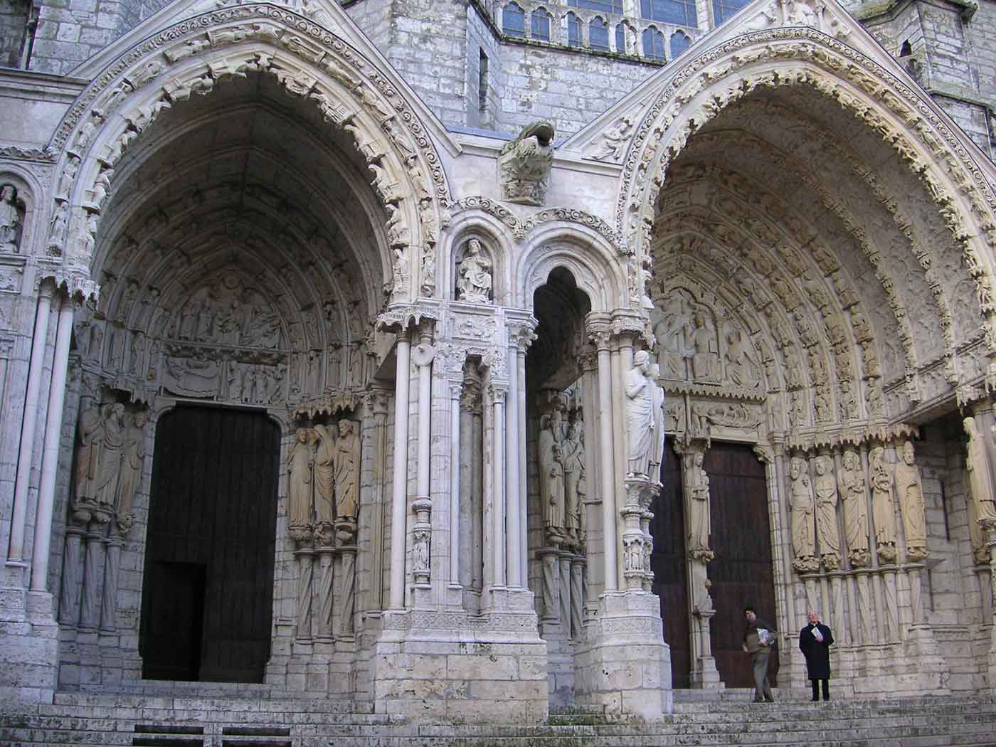
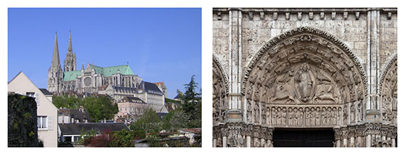
 Chartres cathedral porch (source: Wikimedia Commons)
Register for the O’Reilly Design Conference, which will be held January 19-22, 2016, in San Francisco. Jorge Arango will be speaking at the event about information architecture and semantic environments.
Editor’s note: This post is an excerpt from “Information Architecture, 4th Edition,” by Jorge Arango, Louis Rosenfeld, and Peter Morville.
We only understand things in relationship to something else. The frame around a painting changes how we perceive it, and the place the frame is hanging in changes it even more: we understand an image displayed in New York’s Museum of Modern Art differently than one hanging in a shared bathroom in a ratty hotel. Context matters.
When designing an information architecture, we are engaging in a new type of placemaking: one that alters how we perceive and understand information. As with (building) architects, information architects are concerned with creating environments that are understandable and useable by human beings, and which can grow and adapt over time to meet their needs and those of their organizations.
In the previous chapter, we saw how the lens of information architecture can help designers make stuff easier to find by setting it in structures made of language. Now, we’ll explore how these structures can make stuff more understandable by molding the context that we perceive it in.
A sense of place
You get out of bed. You stumble clumsily to the bathroom for a morning toilet, then walk to the kitchen to brew a cup of coffee and toast some bread. It’s not even 6 a.m. yet, and you have already transversed three distinct places with different uses and configurations: bedroom, bathroom, and kitchen.
Humans — perceptive, self-ambulatory organisms that we are — have a complex, symbiotic relationship with our surroundings. We have senses that allow us to detect where we are at any given moment, and to move around from place to place. We can also change these places to suit our needs. The differences between places play a critical role in how we understand each other and the things we can (or can’t) do in them: this is where we get food, this is where we sleep, this is where we defecate. As a result, our ability to perceive and make places has been very important in our evolution as a species, and is deeply ingrained in who we are. Over time, our ability to set apart and reconfigure places for special use has evolved along with us: we have gone from “this is the clearing where we worship” to building Chartres cathedral in a relatively short amount of time. (Figure 4–1.)

We bring this awareness of place — and the placemaking drive — to information environments as well. When we talk about digital media, we use metaphors that betray a sense of place: we “go” online, “visit” a website, “browse” amazon.com. Increasingly, these environments are also taking over many of the functions we’ve traditionally associated with physical places: we meet with our friends in WhatsApp, pay our bills on our bank’s website, learn in Khan Academy. As with physical places, we experience them as contexts that differ from each other, supporting different needs.
The architecture of (real-world) places
We go from one place to another in our day-to-day lives without paying too much attention to where we are: we subconsciously know when we’re in the bedroom, and that it is a place for resting, and we know when we’re in the kitchen, and that it is a place for nourishing. The kitchen has a refrigerator, sink, stove-top, and counter, set in a particular configuration, while the bedroom has a bed and dresser in a configuration specific to it. Our senses and nervous systems pick up environmental cues that let us know the difference between one and the other.
The world outside our home also has a variety of different places, with configurations and signs of their own that give us clues to their use. Churches are different from banks, which are different from police stations, which are different from fast food restaurants, and so on. Over time, cultural convention and patterns of use have led to the evolution of these spaces, objects, and forms into the structures we recognize today. The differences between them make it possible for us to navigate and make sense of the world around us; we learn them when we are very young, and they become second nature.
In the “real” world, the discipline of (building) architecture has advanced and guided this cultural evolution of placemaking forms. Working from historical models, architects — both those trained and untrained — adapt building and urban models that work well to new contexts and uses as required by the needs of society in a particular moment in time. Architects must make sure that a bank’s building functions well as a bank. This means they must accommodate both the things that all buildings must have in common to make them usable by human beings — for example, ceilings with enough height clearance to allow people to walk around — with those that are specific to banks and that make them different from other building types, such as having a large, secure vault in the middle of the space.
Places made of information
We also experience information environments as types of places. When you visit a bank’s website and peruse its navigation structures, headlines, section heading, images, and other information elements, your senses and nervous system are picking up semantic cues that tell you that you are now “in a bank.” You would be hard pressed to confuse the bank’s site from that of a teaching hospital; just as you can tell the difference between a bank and a hospital in the real world by picking up on features of their respective physical environments, you can tell the difference between a bank’s website and a hospital’s website by picking up on semantic elements of their user interfaces. (Figure 4–2.) You understand the information presented in the site differently because you perceive it as “a bank.”

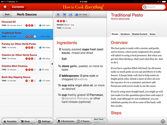
It’s worth noting that because banks are also places in the real world, and because their information needs tend to be transactional, we think of their information environments as more place-like than we would a collection of recipes, as shown in Figure 4–3, which we perceive as being more analogous to a book or magazine.

Some information environments exist primarily to allow people to interact and socialize with each other. Facebook, for example, serves to bring together people who already know each other in an information environment where they can share pictures, videos, and stories, play games, chat in real time, and more. We perceive these social information environments as places as well. Like their real-world counterparts, they also offer places within places — sub-environments — for groups of people to congregate around shared interests. For example, there is a Facebook group for people who are interested in information architecture.
While building architects design physical environments so they can serve and communicate their social functions effectively, information architects do the same for information environments. The main difference is that instead of defining compositions of forms, spaces, and objects such as walls, roofs, and furniture, information architecture defines compositions of semantic elements such as navigation labels, section headings, and key words, and produces the design principles, goals, and guidelines that capture the intended feeling of the place (e.g., is this a serious, solitary place, or a fun, social space?).
