Data APIs, design, and visual storytelling
One example of how using a data API can lead to better visualizations.
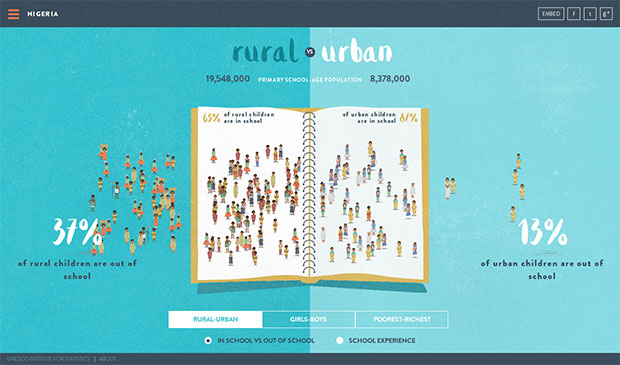
 Illustration from Out of School, an interactive data visualization by FFunction for UNESCO Institute for Statistics (source: FFunction)
Over the past five years, international agencies such as the World Bank, OECD, and UNESCO have created portals to make their data available for everyone to explore. Many non-profits are also visualizing masses of data in the hope that it will give policymakers, funders, and the general public a better understanding of the issues they are trying to solve.
Data visualization plays a key role in telling the stories behind the data. For most audiences, data sets are hard to use and interpret — the average user will need a technical guide just to navigate through the complicated hierarchies of categories let alone interpret the information. But data visualizations trigger interest and insight because they are immediate, clear, and tangible.
At FFunction, we visualize a lot of data. Most of the time our clients send us Excel spreadsheets or CSV files, so we were happily surprised when we started to work with UNESCO Institute for Statistics on two fascinating education-related projects — Out-of-School Children and Left Behind — and realized that they had been working on a data API. As we began to work through the data ourselves, we uncovered several reasons why using an API helps immeasurably with data visualization.
Why APIs are the best way to share data
If you look at the data available in most data portals, you’re likely to find XML, CSV files, Excel spreadsheets (for those who haven’t heard of Open Document format), or PDF documents (god forbid!). Although many organizations do have an API, more should.
If you’ve worked a little bit with data, whether internal corporate data or open data, you’ll probably know from experience that data very rarely comes in an ideal format. Very often, you’ll find your data contains a multitude of formats (dates are a common offender there, where you’ll find YYYY-MM-DD along with DD/MM/YYY and, for good measure, MM/DD/YYYY).
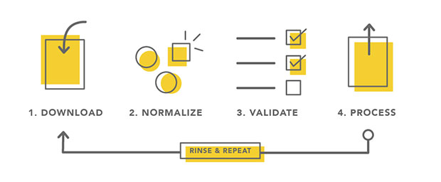
As a result, you almost always need to normalize your data to ensure that all the fields are in the same format. Normalization is not the only chore, though. If you want to keep your data up to date, you’ll also need to make sure that your new data format hasn’t changed since the last time (fields shuffled, added, removed, etc.), which means you’ll need to create a program to validate your new data. And this necessitates having an automated way to retrieve the data. Once you finally have valid, normalized data, you can eventually process the data into a format that is suitable for a visualization.

Pipeline to prepare data for visualization
However, when you are working with an API, you can skip the normalization and validation phases and go directly to processing. Here is why:
- API data is URL accessible: instead of preparing and sending a data file, you just send the URL. Getting the most up-to-date data is a breeze.
- API data is already normalized: because it is machine generated, it follows a format that is usually documented. For instance, here is the documentation for the U.S. Consumer Complaints Database.
- API data is already validated: because it is extracted from an underlying, structured, information system, you eliminate the risk of inconsistent information. The content is already structured (as opposed to a tabular format) because APIs output either XML or JSON.
Why using an API improves visualizations
The two projects we recently worked on with UNESCO were complex. Let’s take Out-of-School Children as a case study: our brief was to create an interactive visualization that allows the user to explore UNESCO data on children who are out of school in different regions around the world. The main idea of the visualization was to show the proportion of children in school (compared to the children out of school) among different sub-groups of a country’s population (e.g. girls versus boys, children living in rural areas versus urban zones, etc.). You can check out the end result here.
Through experience, we have found that one of the key factors in creating a successful visualization is how quickly you can “get” the data. And by “get,” I mean both getting access to the data files and being able to understand the data’s structure, dimensions, and meaning.
Having an API to query made it incredibly easy for us to quickly dive into the material. UNESCO’s online data center, UIS.Stats, allows you to browse the data to get an overview of the numbers. Most importantly for our purposes, the data are also available through an API. With a JSON “prettyfier” plug-in, the data look like this:

This might not look very clear if you’re not familiar with JSON, but compared to the raw data, the structure is relatively clear, so you can quickly create tools to assess and visualize the data. For the UNESCO Out of School project, one of the first things to assess was the number of countries with complete (100%) coverage for the key indicators versus the number with missing data.
Having instant access to the data and being able to feed it live to the tools really made a big difference in our ability to explore the material and quickly start prototyping.
Data APIs allow us to focus on storytelling
By live-querying the API, our interactive visualization was able to immediately incorporate changes to the data as we went. This meant we had the freedom to create unique, specific design elements to differentiate the data and heighten the impact of the visualization.
For instance, in Out of School Children, you can see how many children living in rural locations go to school versus children living in urban areas, how boys’ access to education compares to girls’, or if the richest and poorest of children have equal chances for education.

In the example above, we’re looking at Nigeria’s rural versus urban children, divided into out-of-school and in-school groups. The approximate numbers of children in each group are displayed at the top (19.5 million rural versus 8.3 million urban), and the corresponding rates appear in the lower section of the product (e.g. 37% of children living in rural areas in Nigeria are out of school compared to 13% of urban children).
Now, what’s interesting is that each little animated character that you see on the page represents the same number of individuals. In the example above, there are around two rural children for each urban child, so you have twice as many little characters on the left side (rural) as the right side (urban).
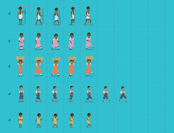
If you look closely, you’ll also notice that the characters are dressed differently depending on their group and gender (pictured below). Indeed, we’ve created many different characters to give a feeling of variety in the visualization — and also to stress that these numbers represent actual people.

The client perspective
By now, you probably have a good understanding of the benefits of an API accruing to the developer. But the client also benefits considerably in terms of investment, reputation, and outreach.
UNESCO’s education database is updated three times each year. “With the API, our data visualizations are being automatically updated with the latest available data,” explains Amy Otchet, head of communications at the UNESCO Institute for Statistics. “This means that our data visualizations are basically maintenance free, and we avoid the limitations of a shelf-life. This results in clear gains in terms of human and financial resources.”
“The API also helps to protect our reputation and credibility,” Otchet says. “As the official source of international education data, we have to be certain that our audiences get the latest data available. This also helps with outreach. Partners can directly embed our products as permanent resources without any concerns about maintenance in the long term.”
Tips to successfully create an API for data publication
If you decide to make your data accessible through an API, here are some key points to help you succeed:
- Technology (platform) does not really matter too much. This is the beauty of the Web: all that matters is that you output your data in an open format that is developer friendly (i.e. JSON, XML or CSV).
- JSON is more readable than XML, which is easier to parse than CSV. This might sound weird, as XML is actually more a document format than a data format, but in practice, XML is very verbose and does a poor job at representing the structure, especially when you have numeric data types. JSON is the better choice, provided you have plug-ins to doll it up.
- APIs can have different formats (if you feel the need), but JSONP is probably the most important. The main reason is that it allows for cross-domain query. For instance, our Out of School interactive is pulling live data from UNESCO’s API, which is only possible because the API offers a JSONP format (P=Procedure call).
- Be mindful of performance. In the case of the Out of School visualization, the UNESCO data API is queried live by the browser, which means that the API needs to support a potentially high number of queries. A side effect of that is that the visualization’s load time is directly dependent on the speed of the API.
If you want more information on how to turn an ordinary API into a great API, this slideshare from OSCON 2012 outlines five “keys” that might also prove useful.
