Create your graphs with R
A deep-dive into exploratory and presentation graphs.
Buy “Graphing Data with R: An Introduction” in early release. Editor’s note: this is an excerpt of “Graphing Data with R: An Introduction,” by John Jay Hilfiger.
Graphs are useful both for exploration and for presentation. Exploration is the process of analyzing the data and finding relationships and patterns. Presentation of your findings is making your case to others who have not studied the data as intensively as you have yourself. While one is exploring the data, graphs can be stark, lean, and somewhat unattractive. The data analyst, who knows the data and is getting to know it better with each graph made, does not need all the titles, labels, reference details, and colors that someone sitting through a presentation might expect, and might, indeed, find necessary. Furthermore, adding all this stuff just slows down the analyst. Also, some graphs will prove to be dead ends, or just not very interesting. Consequently, many graphs may be discarded during the discovery journey.
As the process of exploration continues, adding some details may make relationships a little clearer. As the analyst gets closer to presentation and/or publication, the graphs become more detailed and prettier. There probably will have been many plain graphs in the process of analysis and relatively few beautiful graphs that appear in the final report.
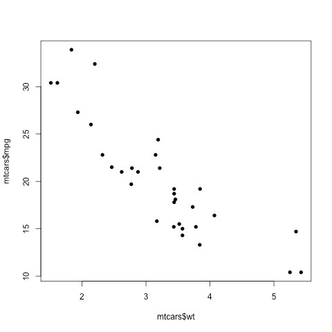
Following are two graphs of the mtcars data, showing the relationship between mpg (miles per gallon) and
One line of code produced the graph in Figure 2-1.
plot(mtcars$wt, mtcars$mpg, pch=16)
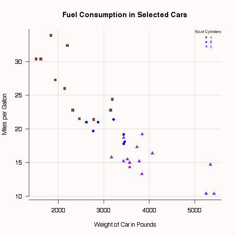
The more colorful and elaborate graph in Figure 2-2 required several more lines of code. It took more work, but its usefulness as a presentation object was worth the effort. The various types of commands that went into this graph are not explained here, but will be examined in several later chapters. The point is that simple and effective graphs are easy to make with R, but if you want very fancy graphs, you can get them with extra labor.
# Script producing Figure 2-2
library(car)
attach(mtcars)
par(bg="snow",fg="snow",col.axis="black",bty="l")
mtcars$wt2 = 1000*wt
attach(mtcars)
scatterplot(mpg~wt2|cyl,
     smoother=FALSE,
     reg.line=FALSE,
     col=c("indianred4","blue","purple"),
     pch=c(15,16,17),
     main="Fuel Consumption in Selected Cars",
     ylab="Miles per Gallon",
     xlab="Weight of Car in Pounds",las=1,
     legend.plot=FALSE,bty="l")
axis(2,col="black",at=c(10,15,20,25,30,35),las=2)
axis(1,col="black",at=c(1000,2000,3000,4000,5000,6000))
legend("topright",
     title="No.of Cylinders",
     c("4","6","8"),
     inset=-.005,
     text.col=c("indianred4",
     "blue","purple"),
     title.col="black",
     cex =.65,
     pch=c(15,16,17),
     col=c("indianred4","blue","purple"),
     bty="n")
detach(mtcars)
Several graphics systems in R
Base graphics and grid
There are several graphics systems available in R. Base R includes a graphics package that is automatically installed when you first install R. This package is also automatically loaded each time you start R. It is quite powerful in that it is able to produce many kinds of graphics that can be customized extensively. Many R users will never need more power or flexibility than what is provided in base R, so this is a good place to start. Most of the graphics in this book were produced by the base R graphics package.
Even though R base graphics are quite impressive, there are sometimes applications that call for more control over the details of graphic output. For this reason, a package called grid was developed for low-level graphics. “Low-level” means that grid provides a number of tools or materials that are used by developers of still other packages that will be used, in turn, to make finished graphs.
grid is a little like a lumber mill that makes boards (low-level material) that will be used by builders or homeowners for projects, such as floors or book shelves, in a house (high-level). One can be a fine builder without being concerned about how the lumber mill sections trees, rough cuts planks, and planes them smooth. The builder starts with the board, not the tree. grid provides processed materials used to make the other graphics systems discussed in this chapter as well as some graphic procedures included in various other R packages. grid does not provide any functions that we will use, directly, to make finished graphs. However, some of the graphic functions we will use have been built from grid functions. For detailed information about grid, see Murrell (2011). Because users generally do not write grid code directly, there is no grid example given here.
Lattice package
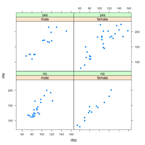
The lattice package was developed to provide improved graphics for multivariate data, i.e. for graphing more than two variables at a time. lattice is modeled on the trellis graphics described by Cleveland (1985, 1993). The idea here is that sometimes the most effective way to visualize relationships of several variables is not to attempt to put all of them in one graph, but to look at several related graphs, organized in a purposeful way. For example, Figure 2-3 shows a trellis plot of four windows, or panels from the BP data set in the epicalc package. In each panel, there is a plot of systolic blood pressure by diastolic blood pressure. Each panel shows the plot for a combination of sex and saltadd (whether salt was added to the diet). This is a way of examining the relationship of four variables at once by scanning four related graphs on one page.
# Figure 2-3
library(lattice)
library(epicalc)
attach(BP)
xyplot(sbp~dbp|saltadd*sex,pch=16)
detach(BP)
lattice comes with the R base installation, but it must be loaded during each session that it is needed. In addition to trellis graphics, it includes functions for many other graphic types as well. Although this book uses only a few examples of lattice, it is an excellent graphics package that extends the capabilities of R. You may find it worth the time to learn, after you become more familiar with R and base graphics.
ggplot2
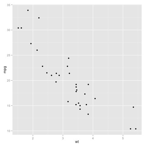
The ggplot2 package is designed to have a syntax that is consistent across all graphic types, i.e. the command language is surprisingly similar from one type of graph to another. This is a marked contrast to base R, where, although there are many arguments that can be used for several different kinds of graphs, there are also a number of inconsistencies. ggplot2 is also quite versatile, enabling the user to customize graphical displays relatively easily. Because the syntax of this package differs so much from that of base R graphics, very few examples appear in this book. I should mention, however, that there are a few commands designed to look similar to base R, so that some of the capabilities of ggplot2 can be tried without much effort. If you have need for some of the special features of this package, it may be something to learn after you have acquired more understanding of R. The aesthetic style of ggplot2 is rather different from base R graphics, and you may or may not like it. An example appears in Figure 2-4. ggplot2 does not come with base R, so if you want it, you will have to install it first and then load it during every session in which you wish to use it.
# Figure 2-4
library(ggplot2)
ggplot(mtcars, aes(x=wt, y=mpg)) + geom_point()
To learn more, buy the early release of “Graphing Data with R: An Introduction,” by John Jay Hilfiger.
